Anatomy of a Character
Behind every character that makes a brand feel warm, familiar and human is a series of very deliberate design decisions. So, we asked a selection of our illustrators and directors to break down the design of their favourite characters.
Brands are falling back in love with characters. Which makes sense, because their effectiveness as memorable, trustworthy devices has been proven time and time again.
In a saturated visual landscape, an off-the-shelf graphic or generic mascot will always be forgettable. A bespoke character, however, solves fundamental brand challenges by cutting through 'brand message' fatigue, bridging complex global communications without the need for translation, and building emotional trust with audiences.
Here is a look at how three of our directors turned distinct brand briefs into living, scalable character systems.
Charlie Toqué on 'Color is Weird' for Polaroid
Polaroid wanted to create a character, their very first ambassador, based on the red button you find on all their cameras.
The film was all about colour perception and how the same red can look different depending on what’s around it. That’s the idea behind Polaroid’s Retinex film, and it’s why our hero is a red circle whose colour seems to change as he travels. I usually keep to a really small palette, somewhere between eight and twelve colours, and I choose each one based on how it behaves next to the others.
The character had to capture two big things about the brand. First, nostalgia: analogue photography and the brand's long history, which goes all the way back to the 1970s. And second, the beauty in imperfection, which is really at the heart of instant photography.
When we look at the brand’s history, we see that it was hit hard by the rise of the digital age in the early 2000s, yet it managed to reinvent itself, driven by a growing community of enthusiasts who preferred a more unpredictable and tangible approach to photography. And imperfection has become a major component of this practice, going against the grain of digital photography, where you can take countless shots and then edit them.
"The brand itself stands out through its unique history, and it seemed natural to support it by creating characters whose imperfections are preserved and fully embraced."
Charlie ToquéIn terms of nostalgia and being inspired by the 1970s, there is something very lively and enthusiastic about the animation style of that era. Psychedelic worlds with vivid colors, wild and unexpected camera movements, and an overall approach that is often abstract or surreal. It’s a far cry from a monotonous representation of reality.
We can see the emergence of short-form lo-fi animation celebrating counterculture on the internet now. And there’s a convergence taking shape between the works of the past and today’s audience, which makes these vintage aesthetics more relevant than they might seem.
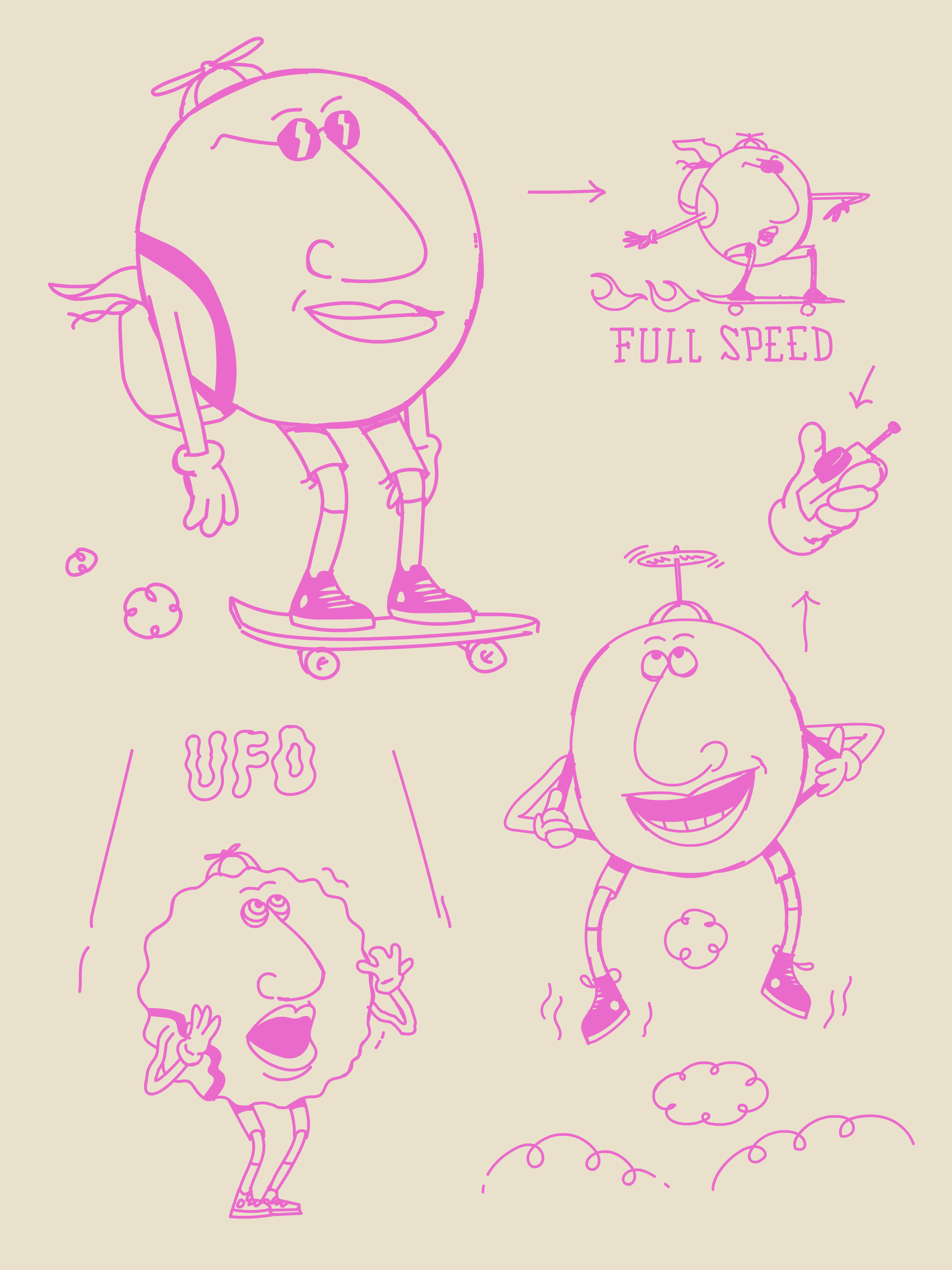
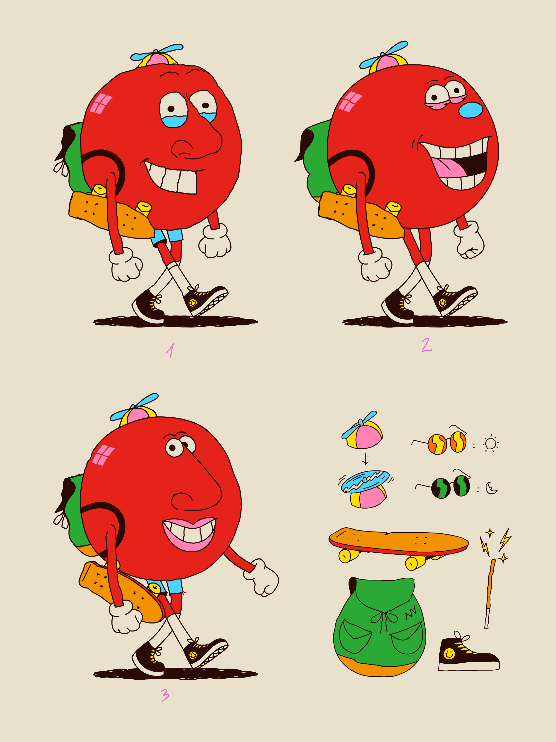
I've been using Polaroid cameras for as long as I can remember, so I already knew the brand well, and I knew what makes it feel unique and instantly recognisable. So I started by working on three different versions of this fun, charismatic little character, all inspired by the experimental animated films of the 1970s.
I didn't want to fake the accident that made the imperfection in the first place. That never really works. So instead I tried to loosen up the way I work, so I'd end up somewhere close to it naturally. I basically tried to get out of my own head and stop doing the things I always do. I drew with my weaker hand, on all sorts of different surfaces, and I used colours I wouldn't normally touch.
The skateboard and propellor hat allowed the character to move around the world quickly, while adding a cool and creative vibe - like the brand.
For the eyes, nose and mouth, I mixed my usual style with bits from lots of 70s character references. The big one was Sally Cruikshank's Quasi at the Quackadero, this mind-blowing, experimental, psychedelic short that I discovered while I was working on the film.
The whole idea was to get away from the polished, perfect character. Instead I looked for an unconventional balance in the face: small eyes, big nose, and how they sit in relation to each other.
"That gave me a character who's imperfect but still likeable, which ties back to one of the brand's mottos of finding the beauty in imperfection."
Charlie ToquéI trained in the classic Disney-style approach, so a lot of this was about unlearning all that. Animators in the 70s were doing the same thing.. bending the rules to find new ways to make things move.
Once we'd landed on the right design for the character, I went back to a more classic approach for pre-production. Turnarounds, expressions and poses, lots of quick sketches. It let me see the character from every angle and really get a feel for who they are, and just take my time bringing them to life.
KITCHEN on 'Meet The Super Pollutants' for Climate & Clean Air Coalition
We created four characters to highlight how pollutants invade our environment, and how CCAC are working to eradicate them.
When we got the initial brief we were told very little about what the character Black Carbon actually was and what the client wanted it to look like. It just had to be mean, menacing and lumpy.
To start, we gave them a large range of character designs on a page that could be used for the different pollutants and then once we found out a bit more about the characteristics of each of the pollutants later down the line we started honing in.
The beginning process might feel wide open but usually clients do have an idea about what they want, they just might not realise it. So working closely on our first character, Black Carbon, helped, and then once that was worked out we flew through the next phases as we began to understand the style they were looking for.
The agency had seen our previous work so it wasn't a complete stab in the dark as they knew they liked our style. So we just had to do our thing.
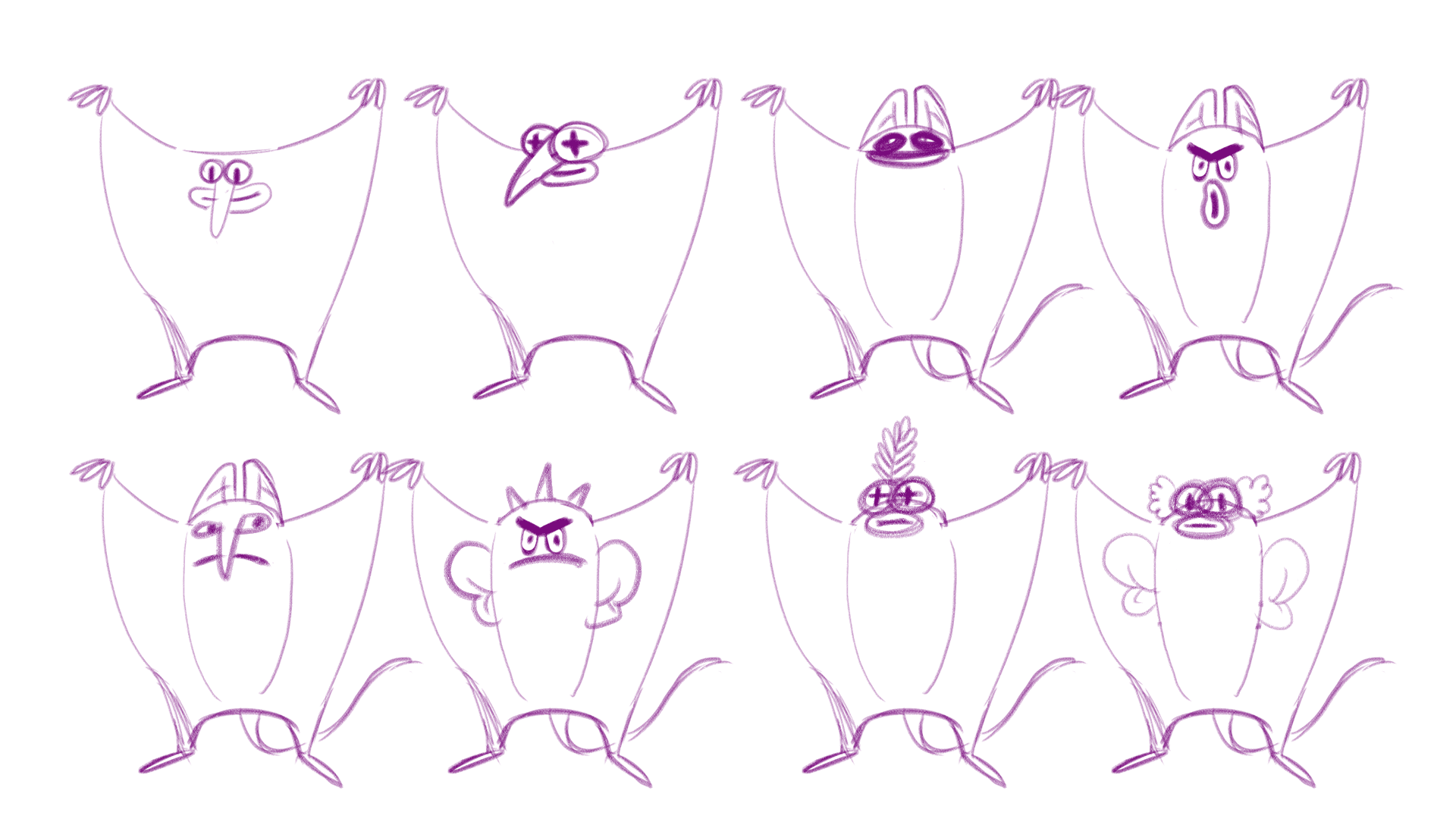
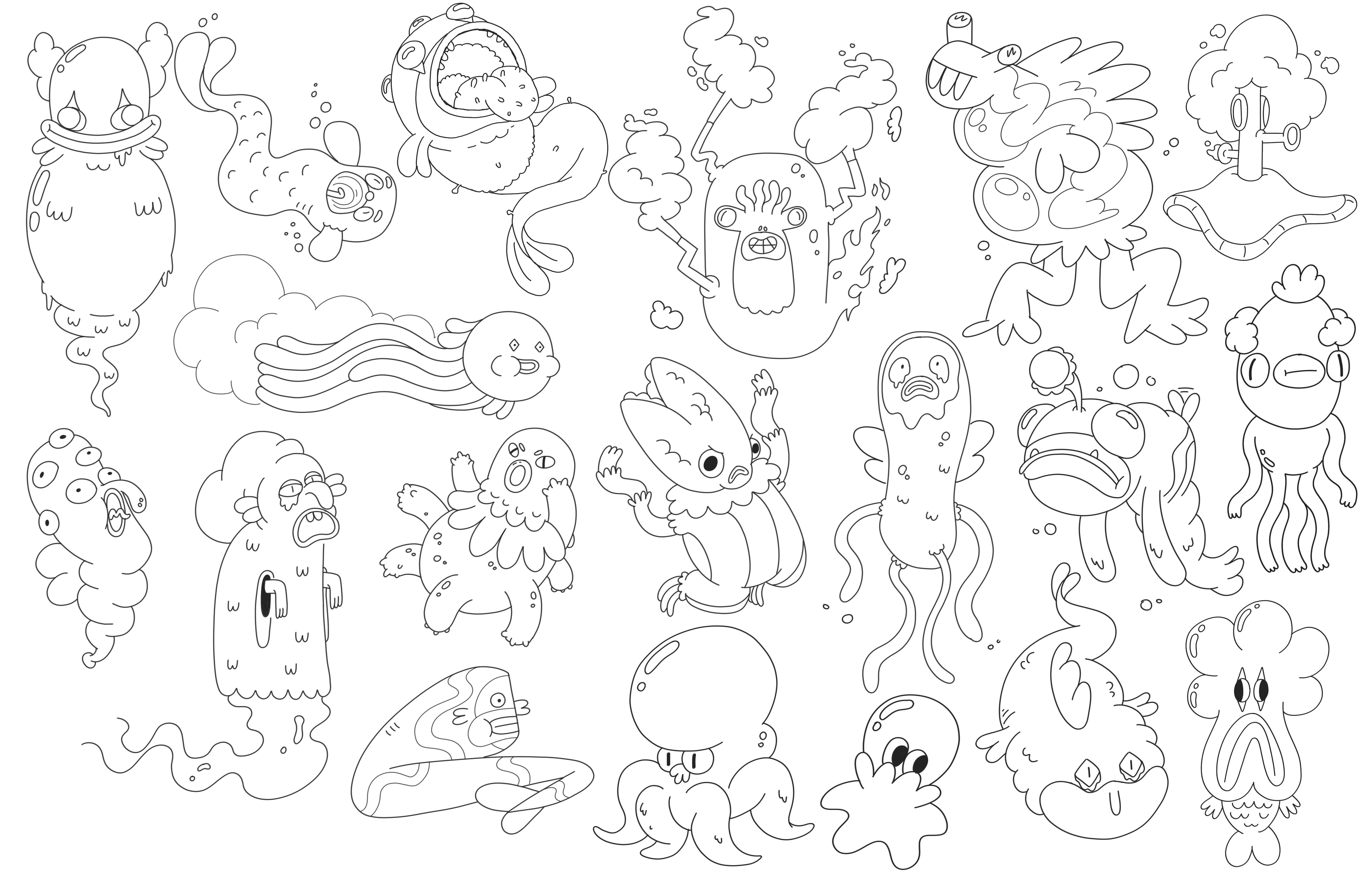

"People are often really tuned out of environmental and social impact brands that have an overly preachy tone, so one of the first things we considered was how to show you can still have fun with something serious."
With any project, engagement is paramount, and we wanted the characters to feel like characters you'd see on a TV series, that feel part of a bigger world that people can invest in.
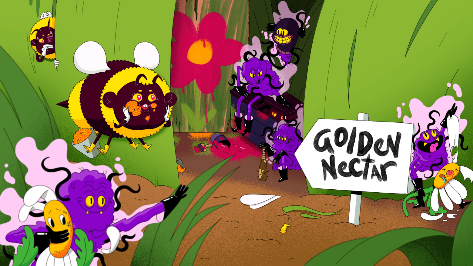
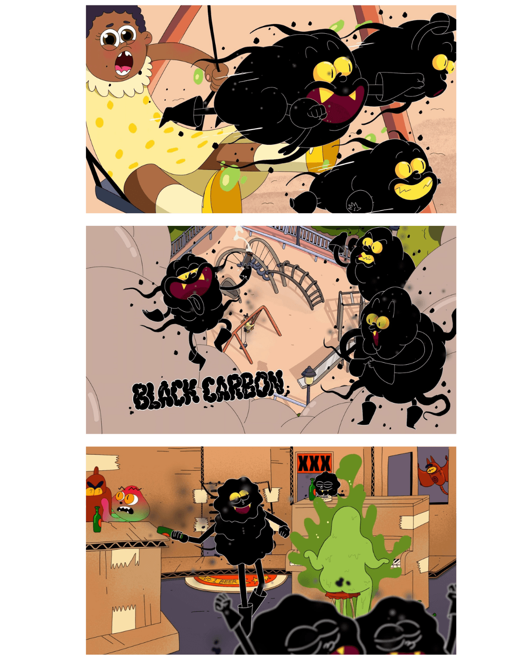
From as early as the pitch, we began with a character for Black Carbon that was already rather anthropomorphic. We thought the fact they had black leather boots and gloves, sinister smiles, and were walking around abusing flowers and bees, meant they would be seen as pretty murderous!
Those human touches like the boots and gloves give them a sense of sinister mayhem, almost like they’re a cleanup crew making sure they don’t leave any fingerprints behind in their destruction. We always try to give a character something that’s distinctively theirs. Whether it’s giving a happy pineapple character some roller skates or making all the hydro characters rusty with metal wings, it gives each group an instant identity.
"That silhouette-level recognition is super important for building a recognisable universe for a brand because people instantly know who they're looking at."
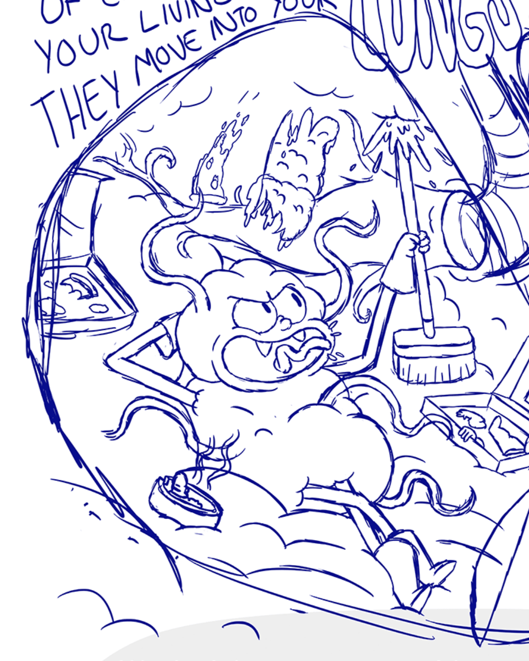
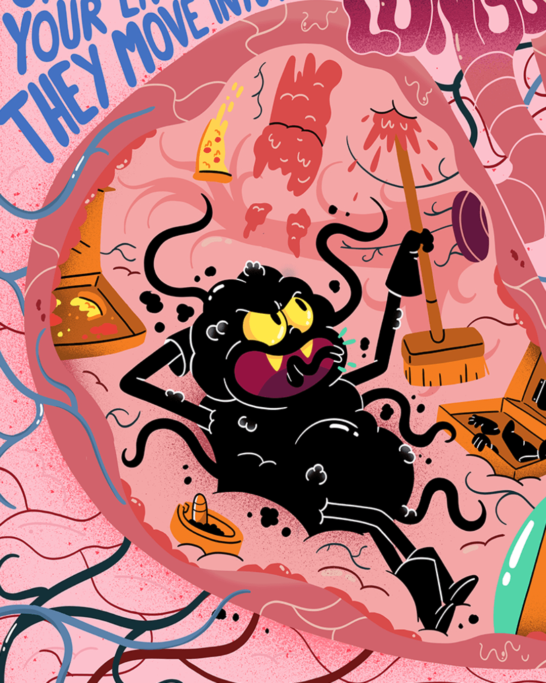
Once we won the job, we learnt a bit more about the black carbon characters and how the work. They float around in the atmosphere breaking apart getting smaller. So, we kept the gloves and boots, turned the carbon black and gave them the ability to fly. The tentacles also make them feel more creepy and little puffs of black emitting from them show how smoky they are.
When you're trying to design something inherently 'mean and menacing', it almost always comes down to the expression. We leaned into sharp, pointy edges for the smiles and teeth, taking cues from scary animals. But instead of just making them look angry, we gave them this evil happiness, where they’re fully aware of the damage they’re causing and find it hilarious. The inverted tilt on the eyebrows, the yellowed eyes that look sick from a lifetime in a smoky atmosphere, and distinct movement quirks (such as one smoking a cigar, one rubbing their hands together like a schemer, or one just hyper to destroy stuff) all add personality.
Ultimately, giving an abstract concept like 'Black Carbon' a physical personality is what makes the message land and brings real value to the project. People recognise human traits instantly and connect with them much faster than an ominous, nameless threat. Audiences don't want to be talked down to with purely literal, heavy-handed messaging, nor do they want generic graphics that their minds just blur past. By creating something that captures the imagination, people actually stop and engage. You can feel the human hours and craft put into the character design and animation, which makes the whole campaign far more memorable, elevates how people see the work, and turns a complex topic into a world anyone can recognise.
Dan Woodger on Peccy for Amazon
Peccy is the internal mascot of Amazon. Used across a wide range of applications within the business, from internal communications to warehouse signage, Peccy acts as a visual tool for communicating various messages without the need for translation across the company's global infrastructure.
While consumers rarely see Peccy, it's a deeply loved asset inside the company. I’m not an employee at Amazon, so obviously I can only answer this with a degree of speculation, but I did visit their offices in London and Seattle and was struck by the affection employees clearly had for the character. One of Peccy’s popular iterations is in the form of themed enamel pins, and the employees I met often shared their favourites. As far as I can tell, aside from Peccy’s practical uses, the character also carries a degree of in-house humour and camaraderie.
However, years without strict character guidelines had led to a chaotic range of uses, so Amazon brought me in to modernise Peccy, create an extensive asset library, and build a disciplined design toolkit to keep the character consistent moving forward.
"The benefit of creating a toolkit allows for that same frictionless usability, but with a stronger set of guidelines and a more uniform system. Ultimately, it gives people across the business the freedom to use the character independently, without compromising the consistency or quality of its identity."
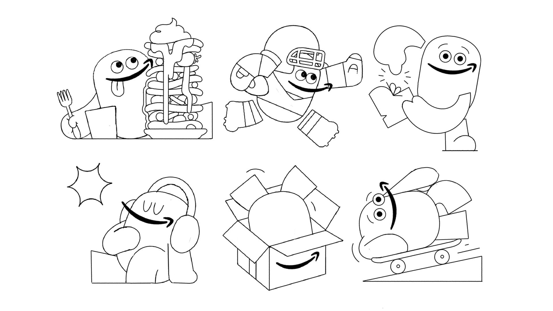
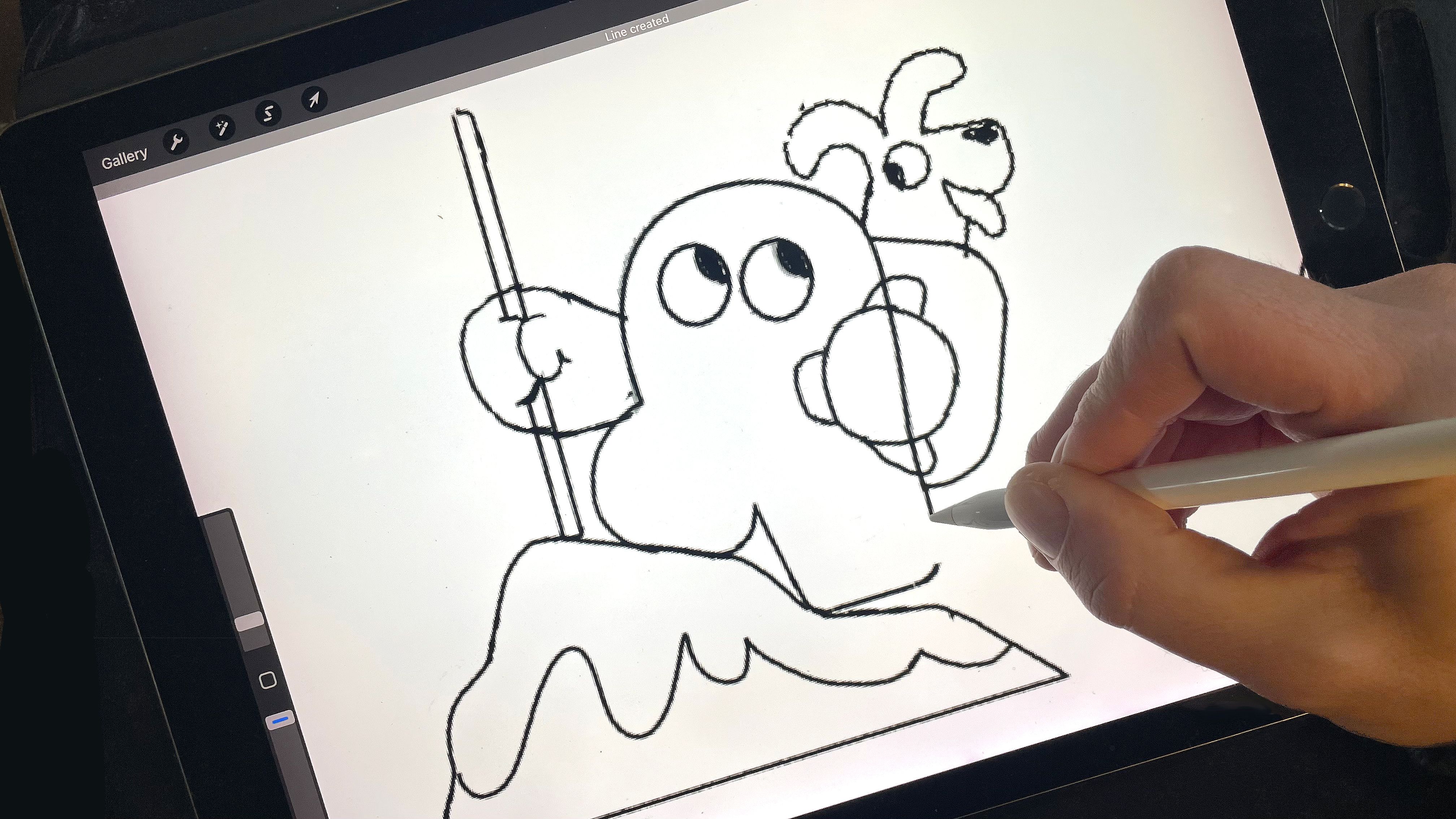
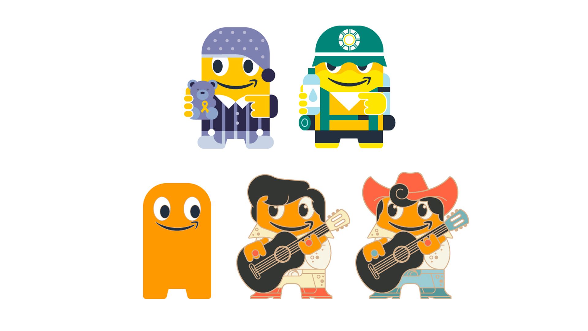
Building a lasting character system always comes down to balancing strict design rules with genuine personality. And to design a character system that doesn't need updating again in the future, it needs to be simple. I’m a firm believer in the ‘less is more’ school of design thought, and this project lends itself well to that philosophy. The main purpose of Peccy is to communicate, so the key objective is to make sure Peccy does that as clearly and effectively as possible.
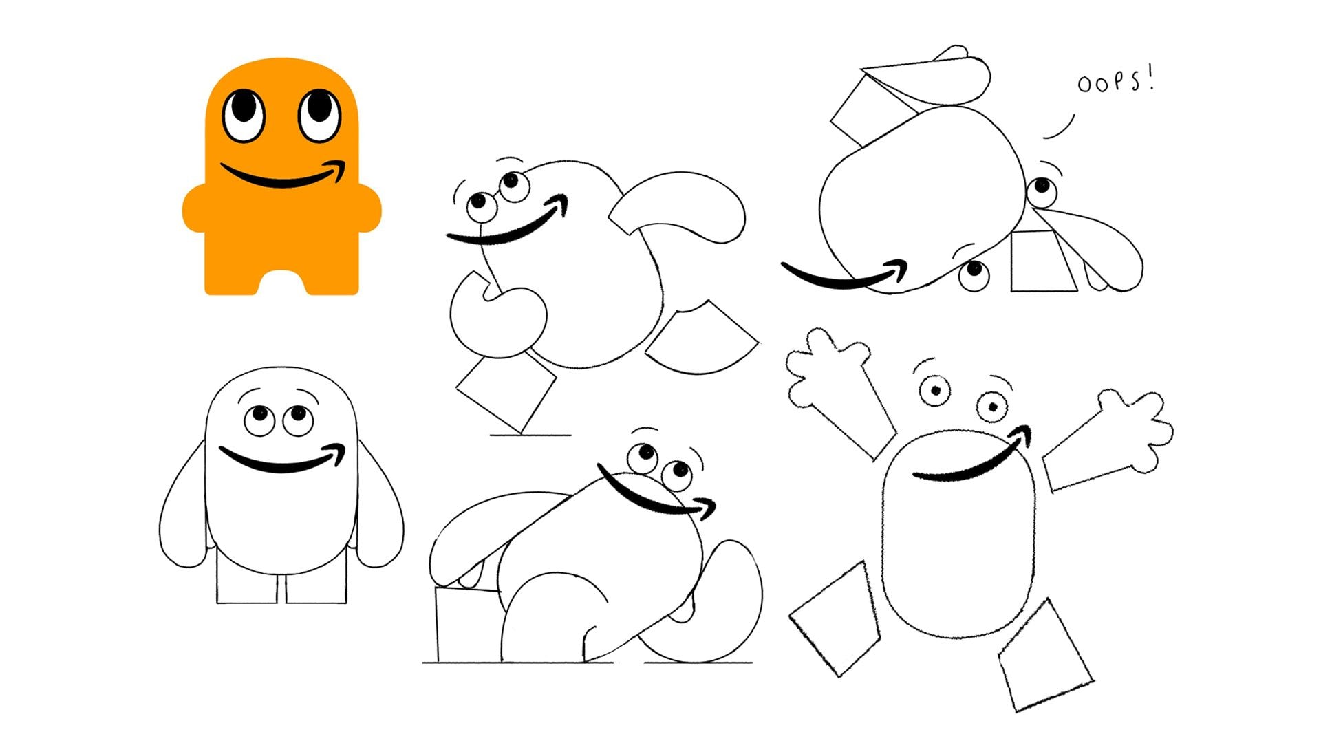
Lots of consideration was given to the placement of the facial features, for instance, raising Peccy’s face higher on the character to allow more space for objects to be incorporated. We also made sure the hands were created in a wide range of variations to allow for maximum usability.
There’s no guarantee the character will never need updating again in the future, but a huge amount of consideration was given to making the design as versatile and future-proof as possible.
We started with an extensive period of visual exploration, experimenting with forms whilst retaining the defining features of the original design. Because the underlying shape is quite rigid, the real creative challenge was pushing the playfulness and finding imaginative ways to exaggerate poses, gestures, and movement.
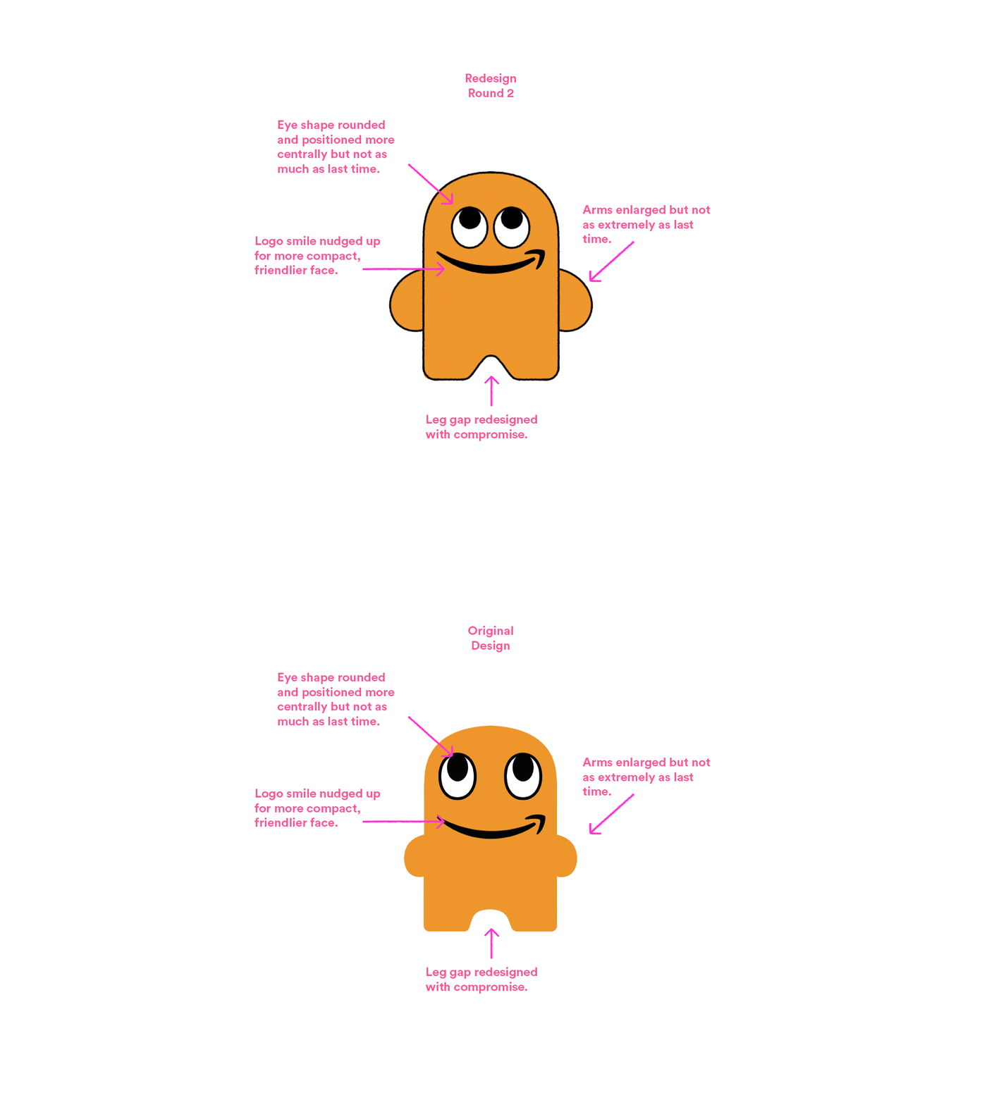
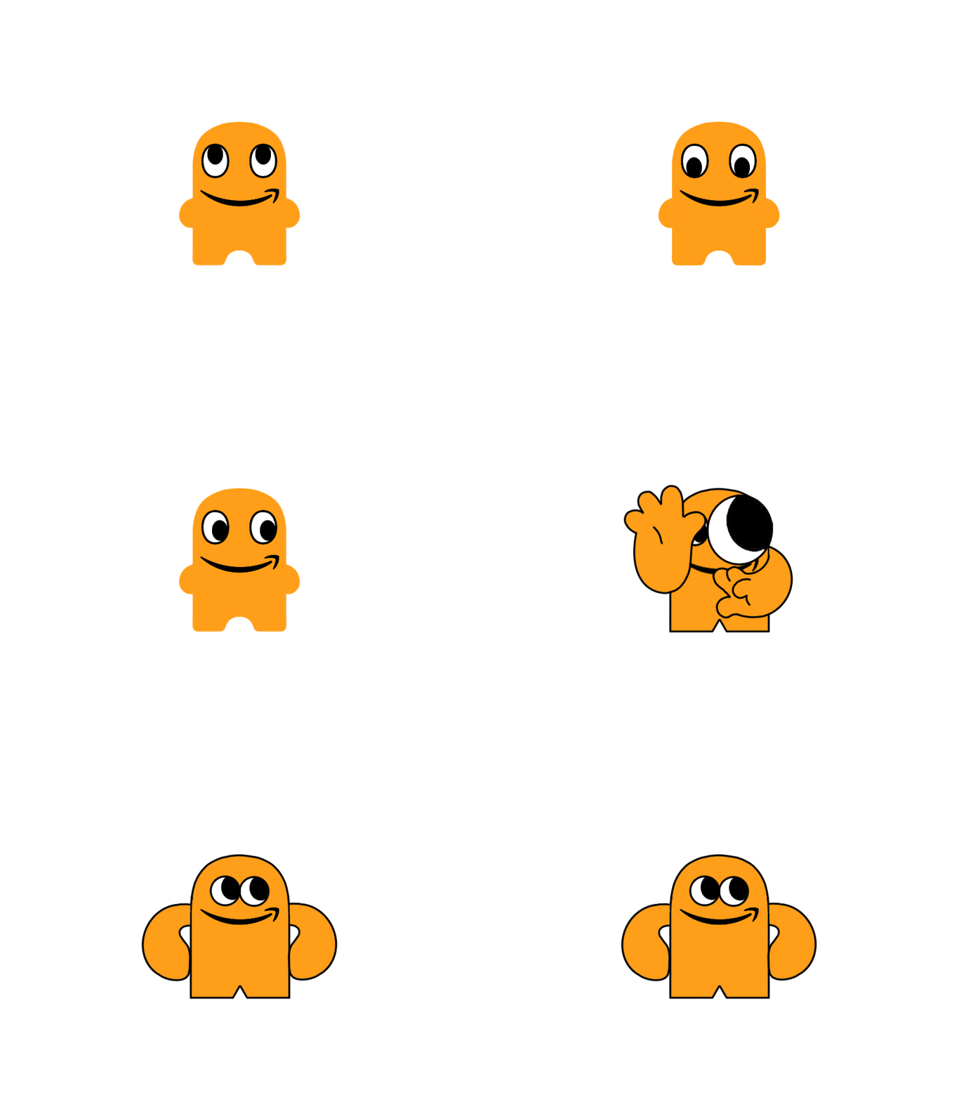
Above: Original > Update transition
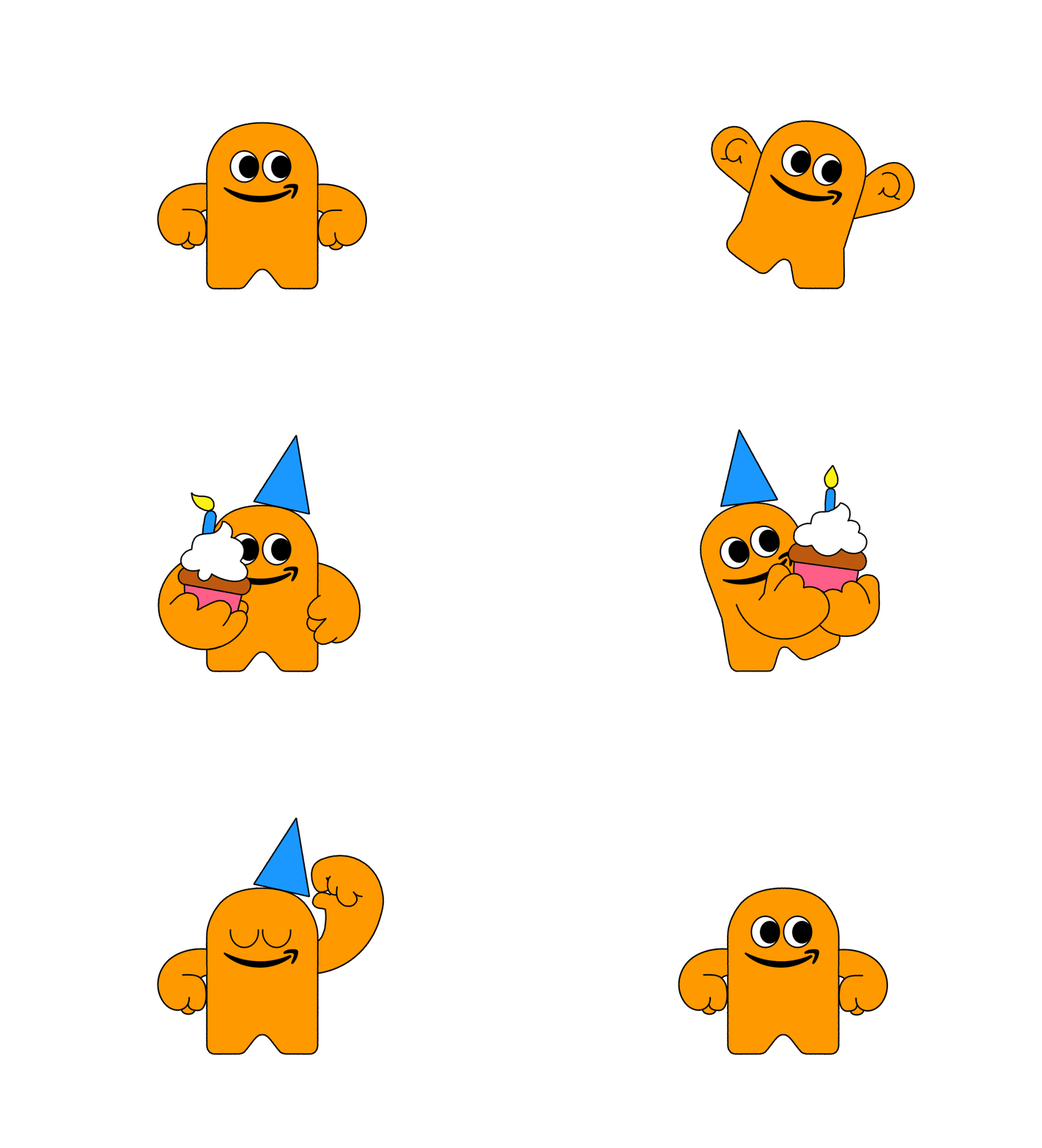
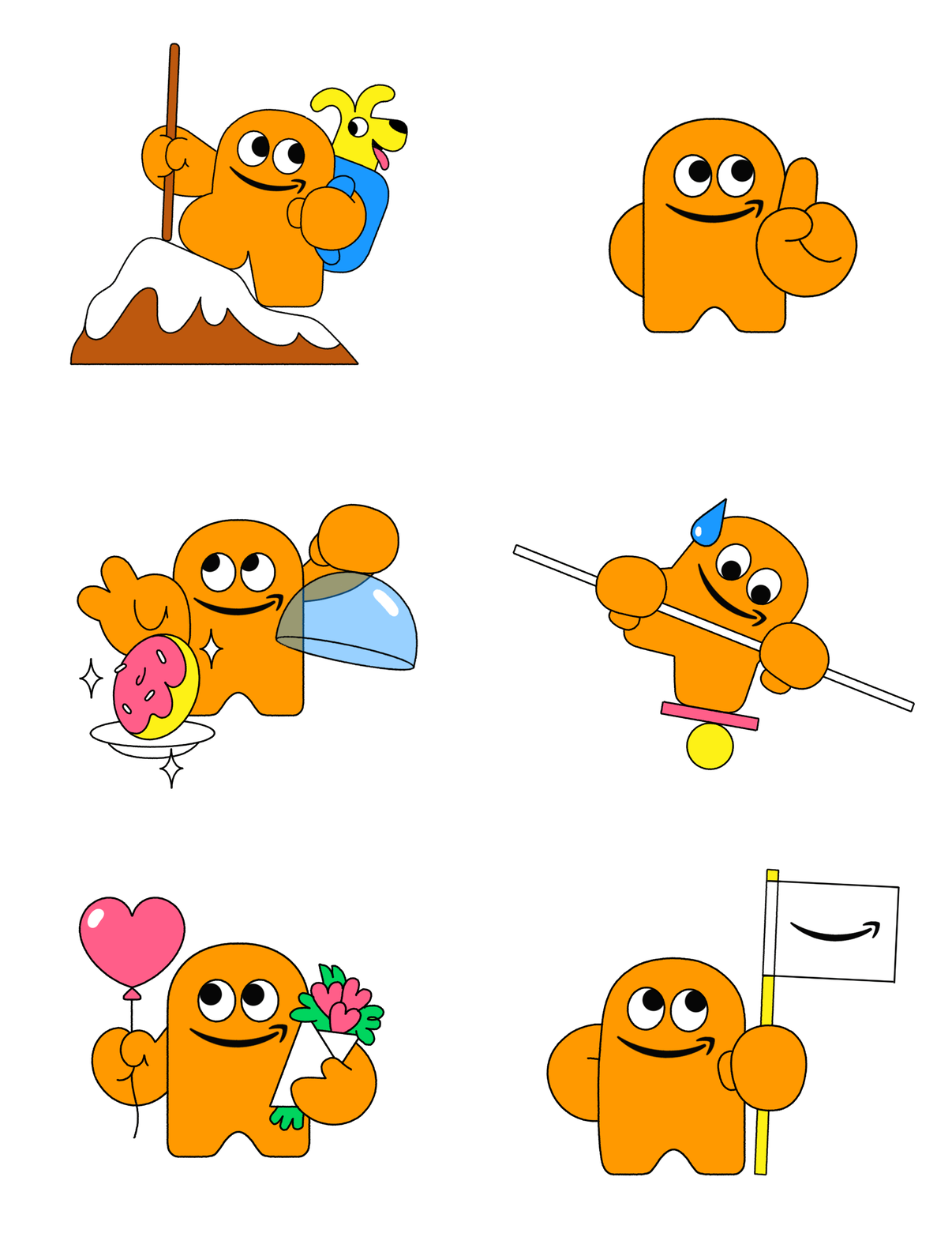
Eventually, we arrived at the desired look and feel for the new design. The next step was to focus on how the character could fulfil its functional purpose, so we began exploring hands and facial expressions. Expressions proved to be one of the more challenging creative tasks, as one of the non-negotiables of the design was retaining the Amazon smile logo as the character's mouth. This required some creative problem-solving to find ways of communicating different emotions within that constraint.
"That level of craft is what transforms a visual icon into scalable IP that people resonate with. "
Once we cracked the core facial expressions and motion rules, we created the first library of assets before the new Peccy was officially launched and the system rolled out globally across the business.
The beauty of designing a character with clear personality and strict structural foundations is that it becomes a living worldbuilding asset. Years later, I'm still brought back to expand Peccy's universe, adding new assets as the business grows.

So, what makes a character system work?
A few key principles for brands and creatives looking to create iconic characters:
1. Embrace imperfection to build trust. Turns out, no one likes perfect. Whether it’s leaning into analogue flaws or making villainous pollutants dangerously charming, humanising your character through funny little quirks makes your brand instantly approachable and relatable.
2. Translate abstract ideas into human traits. Complex or dry messaging like environmental statistics or brand values fails when it feels too literal or forced. Giving abstract concepts a distinct silhouette, posture, and personality makes an instant, human connection.
3. Design for scale and style. Characters can look cool and be designed for instant, global recognition. A great character is a living system. By establishing clear structural rules, you give teams around the world the creative freedom to adapt the character for different markets, channels, and visual contexts without sacrificing brand consistency.

Ready to give your brand some character?
Whether you want to turn your brand values into a friendly face, unite your team behind a mascot, or launch an animated campaign that builds real trust with your audience, we can help.