SS27 Key Colours
A journey through the SS27 Key Colours campaign
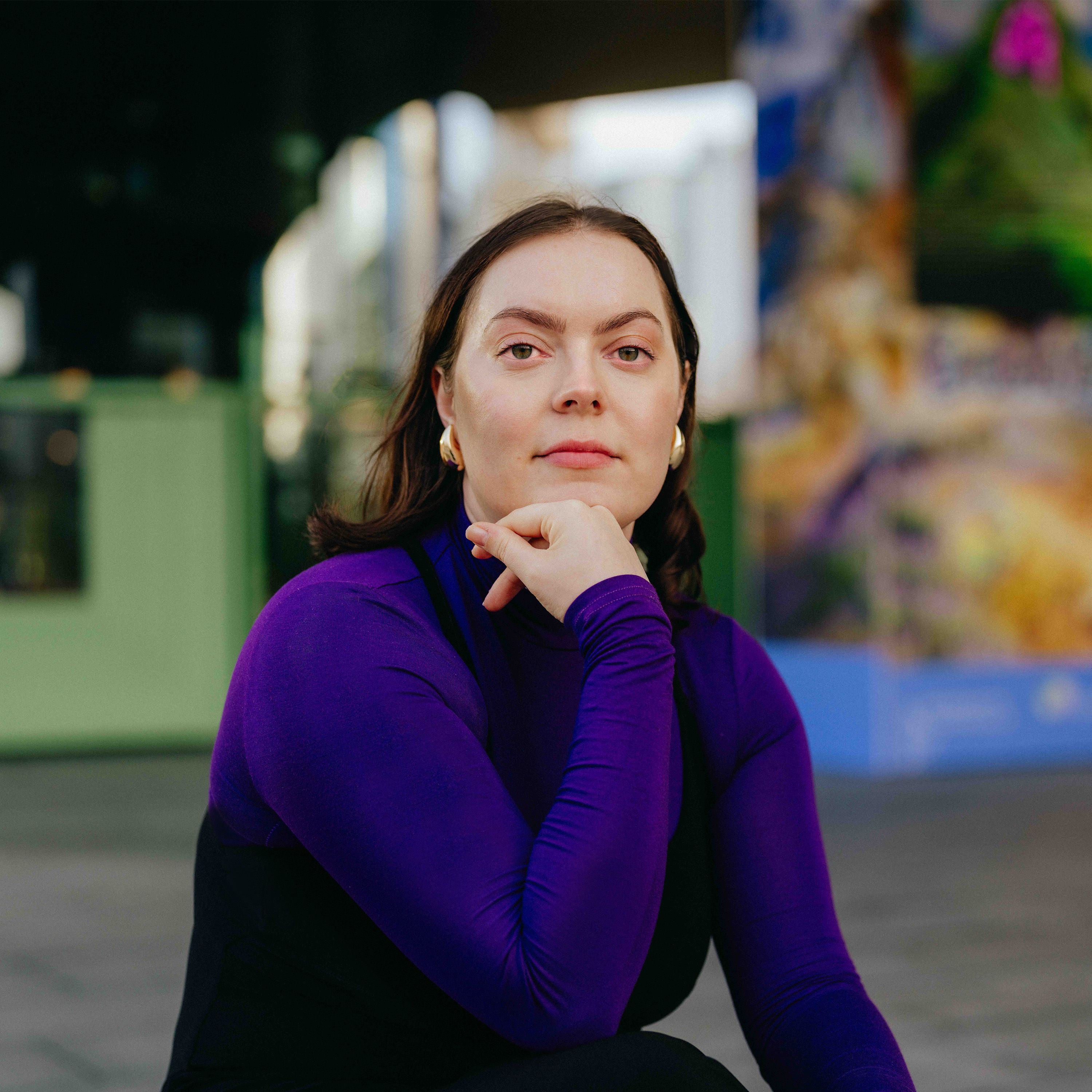
Lucy Hardcastle crafted a series of animated films and still imagery commissioned by WGSN and Coloro to embody the power of colour, creating narrative threads between the colours, materials and consumer insights that form the SS27 Key Colours.
Aiming to go beyond the power of colour to build emotional narratives around the trend concepts, each film is grounded in textures, organic shapes and nature.
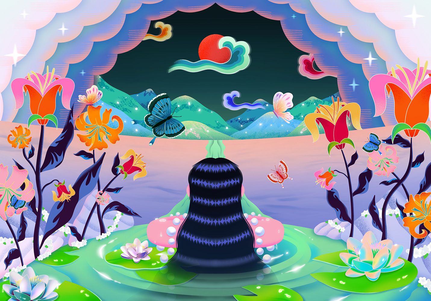
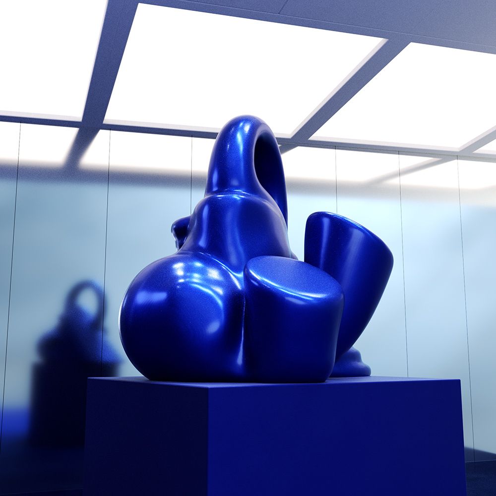
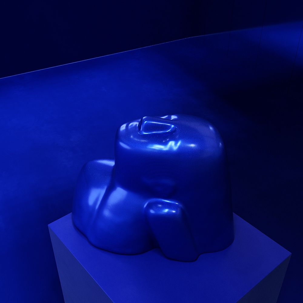
Luminous blue is WGSN's 2027 colour of the year and the aim was to bridge the gap between the past and future, with the abstract forms and flow being inspired by ancient arts and looking towards future innovations.
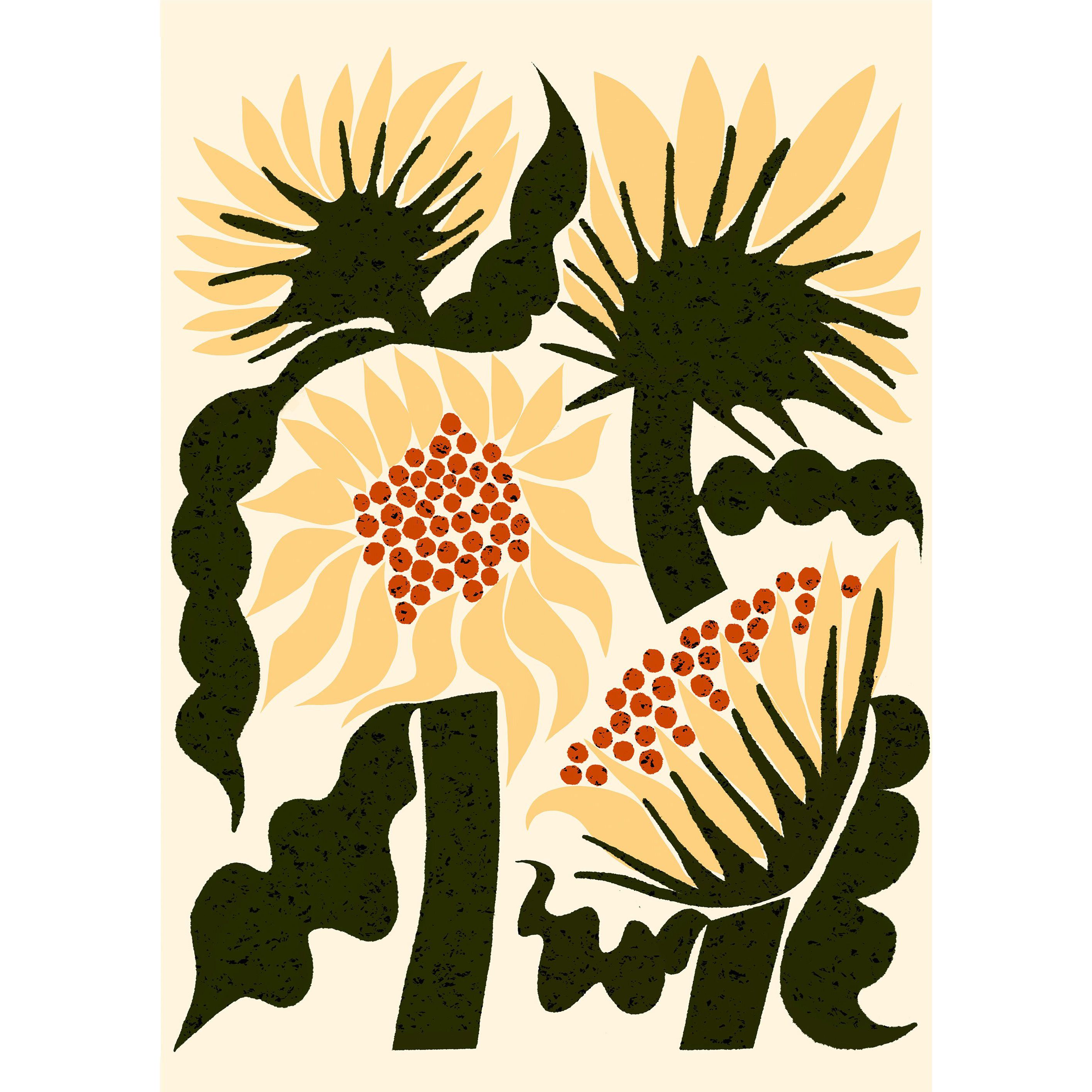
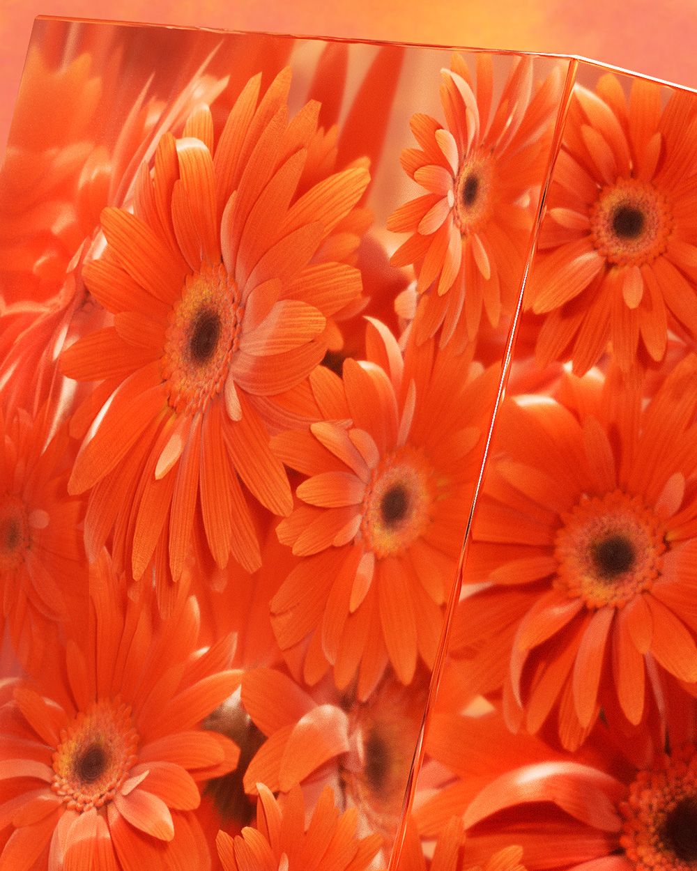
Energy Orange is a high-vibrancy hue that embraces consumer desires for safety and protection. Featuring vibrant flowers suspended in time, inspired by the Zinnia Nasa flower, the first flowers to grow and bloom in space.
Energy Orange embodies a state of vitality, abundance and positivity, looking towards a hopeful future.

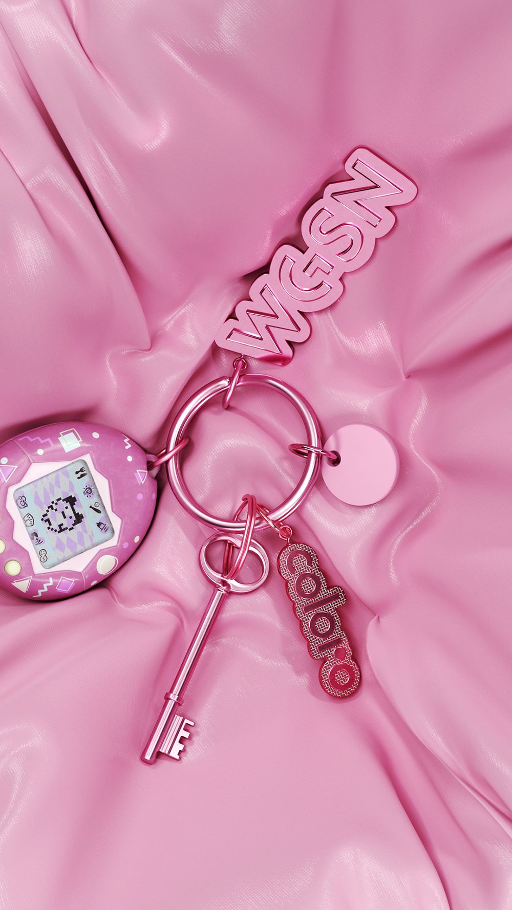
Pop Pink is a bouncy, tactile and bubbly film, embodying playful nostalgia and a big dose of y2k pop culture. Tapping into themes of self expression and personal identity, the concept of wearable trinkets comes to life.

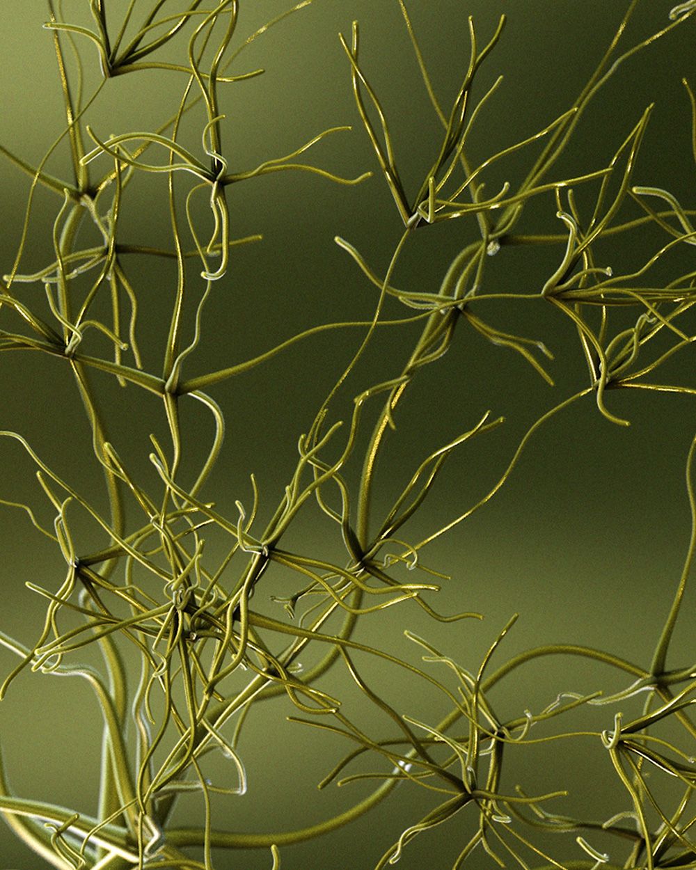
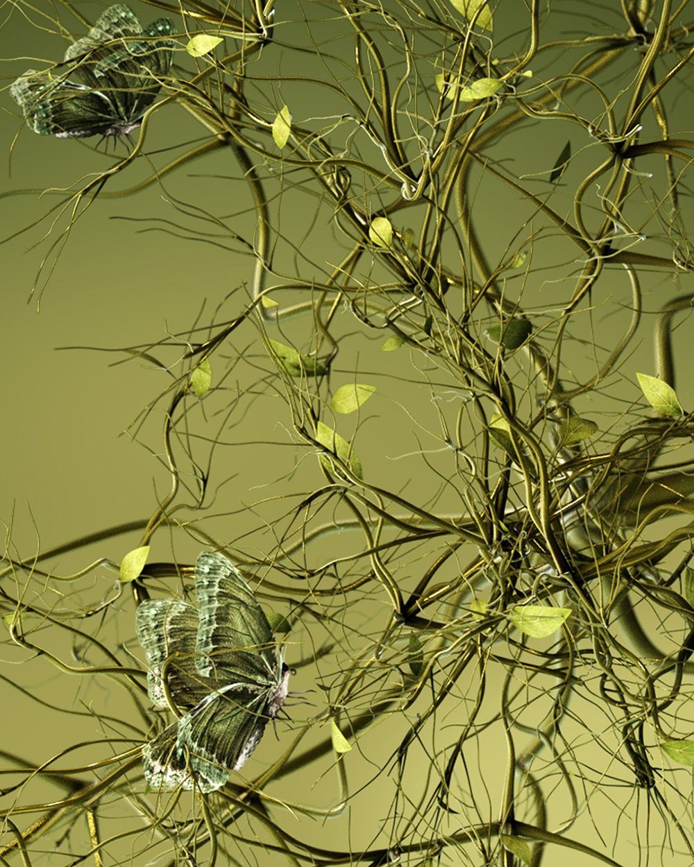
Meadowland Green is representative of a deep internal nourishment from our interconnected relationships with those around us and nature's own ecosystems. A floating seed, embodying new life, is seen to grow and expand, creating a network of organic branches.
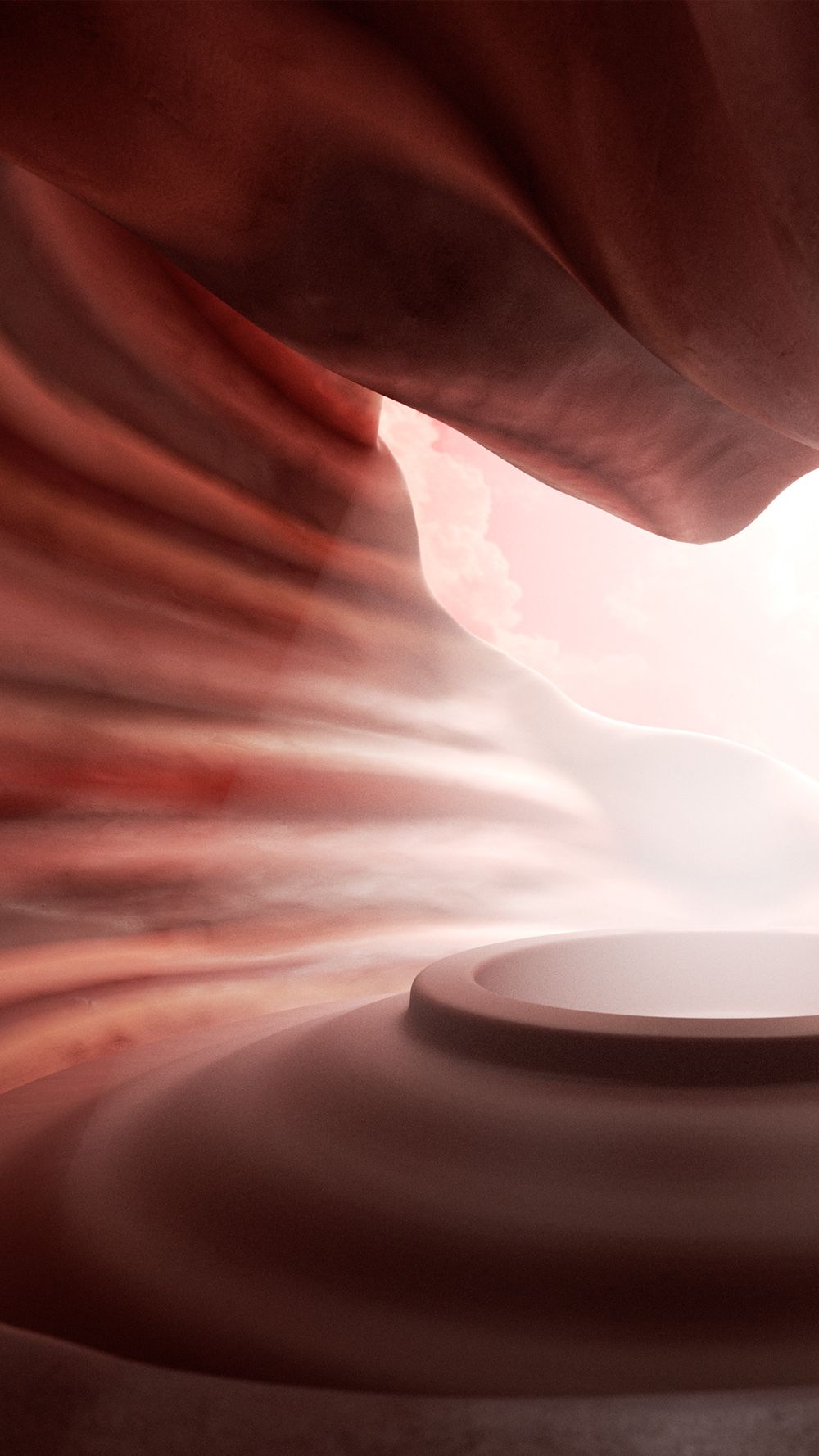
Clay is symbolised by a resilient and transformational abstract landscape designed to represent both past and future potential. Clay itself balances both its cooling properties and sustainable functionality to provide solutions for climate issues.