
Where has all the illustration gone?
A few months ago I sat in a judging room and, as poster after poster rolled by, one thing became increasingly obvious; it was all eerily uniform. Minimal logo. Maximum whitespace. Clean or cropped-in visual. Repeat. The creative quality was high. Art direction immaculate. But it all started to feel... the same.
OOH is in its Minimalism era, highlighted by this Creative Salon article released the other week. OOH Minimalism has officially peaked. Now, I don’t want to do these ads a disservice as I’m a huge advocate for top tier art direction and I’m not skipping over the ‘art of the poster’. This style of execution, led brilliantly by campaigns from BBH, Uncommon and others has reset expectations. It’s given brands permission to be smart, subtle, and design-led. It has re-established the poster as a canvas for craft. Simple and minimal done well is mastery. Yet when a restrained format becomes an expectation:
"Where’s the surprise? Where’s the tension? Where’s the feeling?"
Since then, it’s been going round and round my mind, gnawing away at my brain: Where has all the illustration gone? Specifically in advertising - the imperfect, human, energetic kind. There are some, sure, but very few examples that are entirely unexpected, or feel that they drive the medium or advertising forward. Noma Bar is an absolute master of his craft, but even this feels slick and minimal, ‘Reasons To Eurostar’.
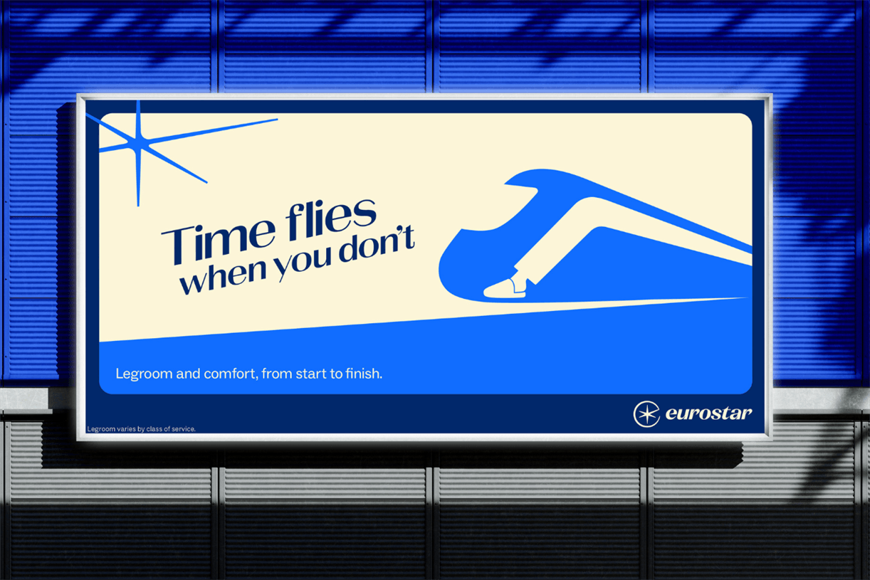
Above: adam&eveDDB & Noma Bar spotlight reasons to travel by train (2025)
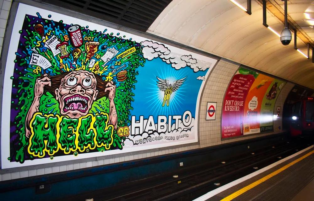
Above: The last absolute banger I can recall - Uncommon's 'Hell or Habito' with an artist synonymous with Santa Cruz’s rebellious skate style, Jimbo Phillips (2018)
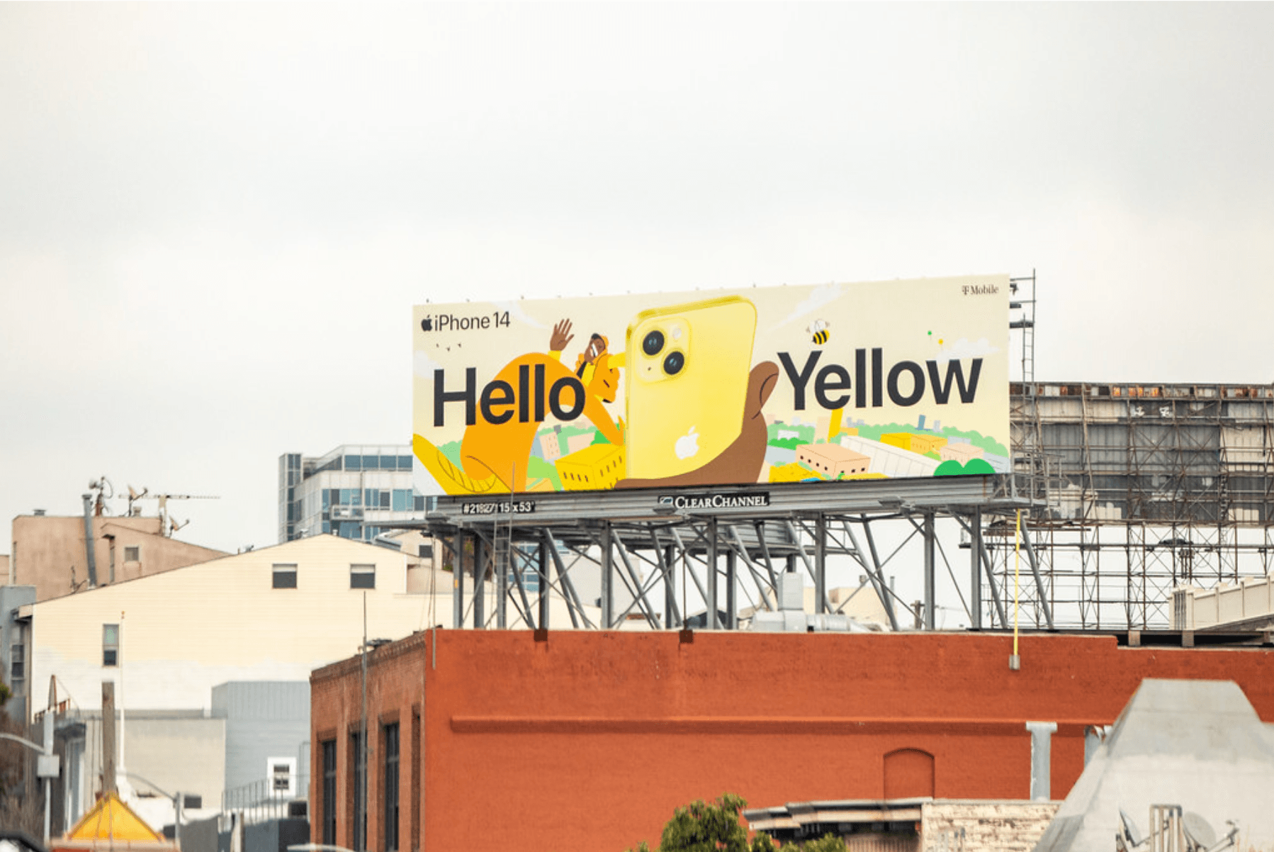
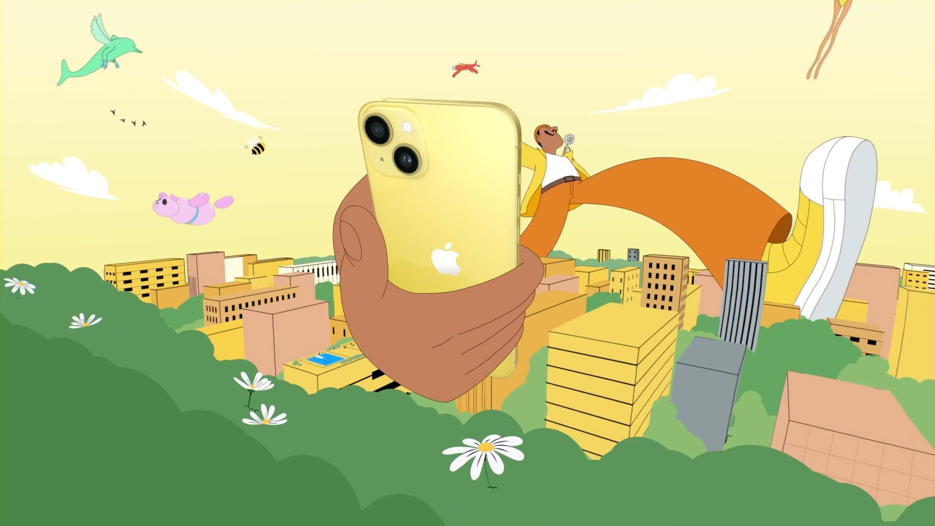
Above: Apple embraced illustration with Alva Skog for their Hello Yellow iPhone14 global campaign (2023)
Throughout COVID and beyond that there was a slight boost. As illustration and animation became production solutions in the absence of shoots and a lack of ability to be onset, it seemed as though the power of embracing them creatively was finally being understood. And let’s not forget, it can be vastly more economical both for budget and green than a big global shoot. Then the market went heavy on photography to reflect back the human experience and so audiences could see themselves in the work; a reflection of the connections that were lost and craved again; as always, these things are cyclical.
"Ironically, Gen Z - the first truly digital generation - are the ones buying vinyl records and shooting film cameras. They're seeking out imperfection because perfection feels fake."
Personally, I’m desperately craving to see some texture and physicality; seeing and feeling the touch of human energy in work. God, I want to see some texture. I think it's a reaction to all the clean perfection we’ve been seeing everywhere and us all living in such an online digital world. Ironically, Gen Z - the first truly digital generation - are the ones buying vinyl records and shooting film cameras. They're seeking out imperfection because perfection feels fake.
There's such richness in texture, layers, and detail. The energy it can communicate; pencil strokes, charcoal textures, brush strokes, drawing, sculpting, ink strokes, pattern work, layered complexity, collage, mark-making. Super artisan, physical, tactile work with great physicality. Where's that in advertising? That human touch, that messiness – where is all of that? It's so evocative. It makes you feel something. Is that what we’re all trying to do, even if at the end of the day, we’re attaching feelings to products and brands?
We all keep talking about making more of a creative leap and craft. And what more of a creative leap and investment in craft is there than trusting and working alongside people who are true craftspeople – artists, animation directors – bringing them to the front again? Collaborating with external specialists? Creating something with soul and depth. We’re seeing it take the lead in animation again; puppetry, stop motion, brush-work. Luxe brands are doing it, Hermés back in Jan declared 2025 with #DrawnToCraft. Burberry are realising that human artisanal work brings connection to their audience. Where luxury leads, the mainstream commercial often follows. So where’s the parallel movement in the ad world? Is it coming down the pipeline?
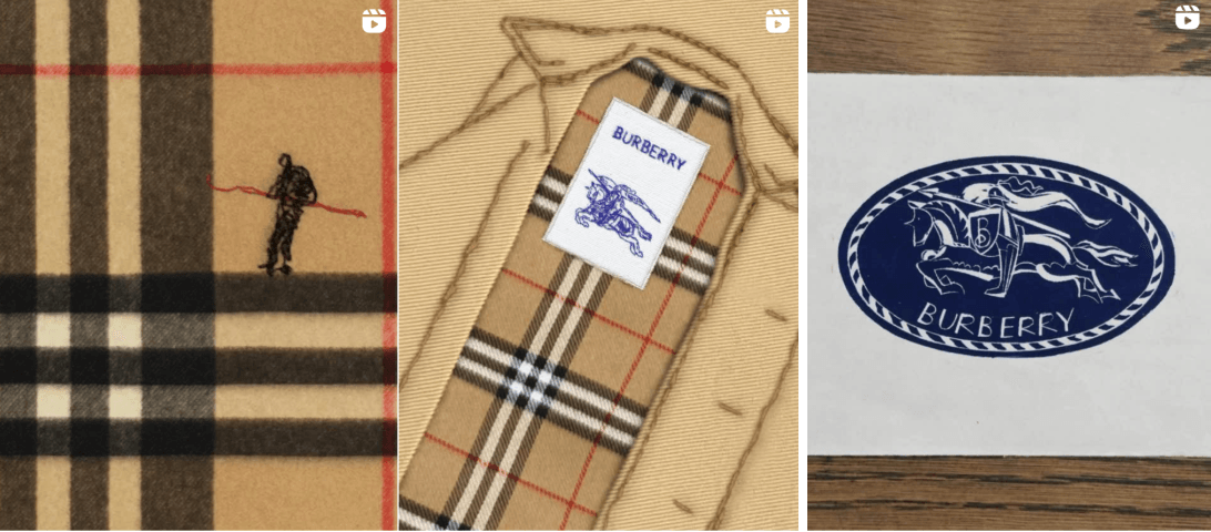
Above: From Burberry's socials. Artists L-R: Huw Messie x2, Jonathan Gibbs
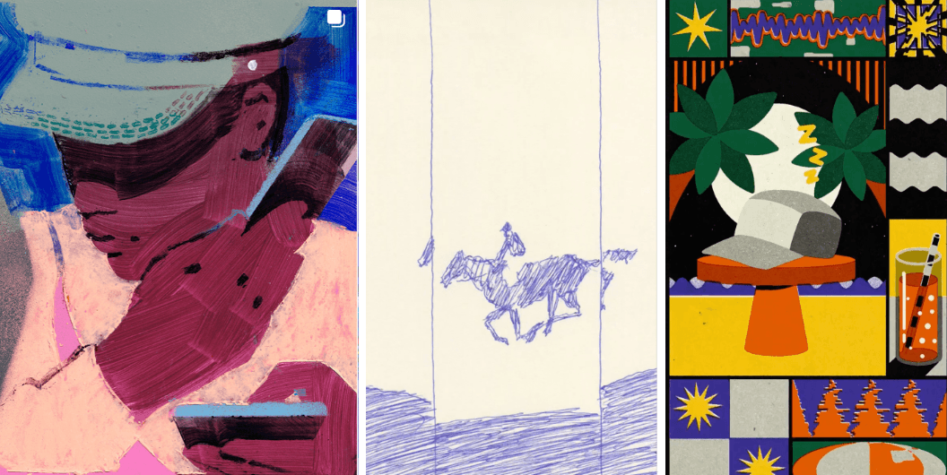
Above: From Hermes' socials. Artists L-R: Leonie Bos, Lee Kyutae, AROKE
Arguably minimal on the design side, yet Polaroid gave a deliberate anti-AI, anti-digi nod in their recent campaign here. There’s an energy, a celebration of analogue embedded in this work, lifted by some tactile, one-stroke lettering instead of a reductive, tight digital type-face. Or logo. Or no logo.
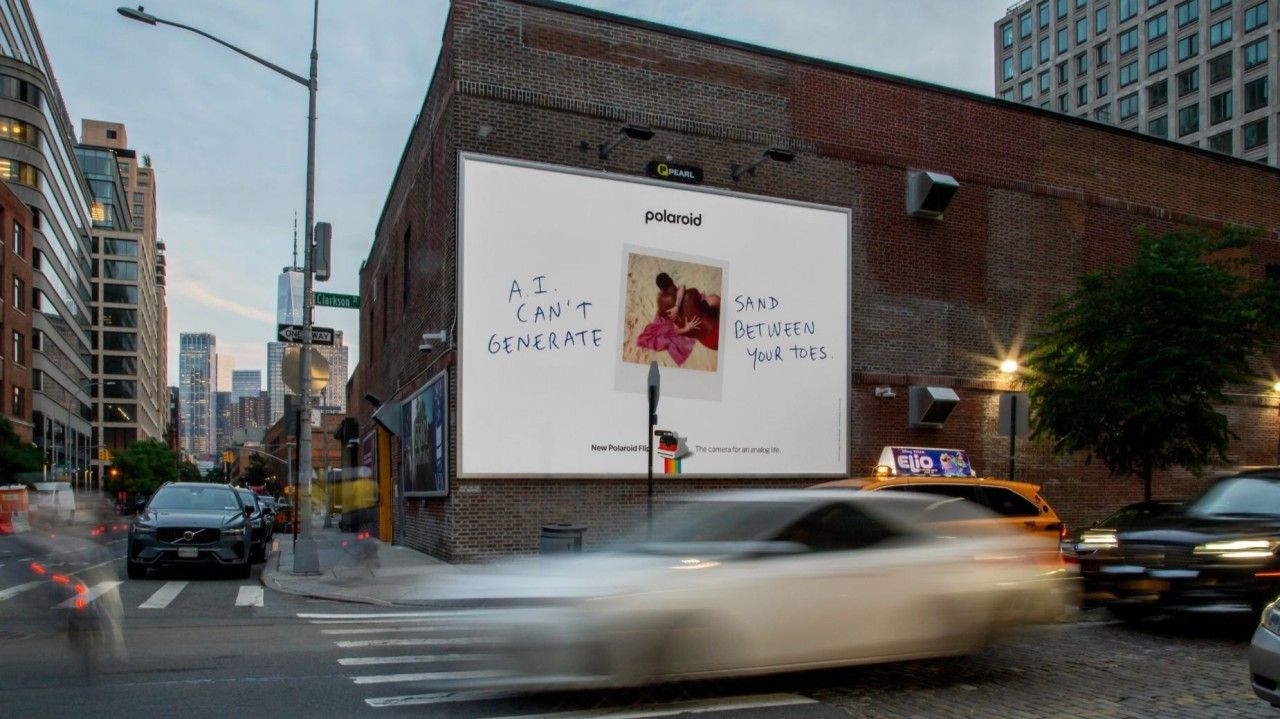
Above: Polaroid highlights the importance of connection (2025)
I’d like us to deliver on illustrative work that feels rich, surprising, and complex. Harnessing the ability to deliver complex messaging be it brand messages or narratives. Far from flat or formulaic. And yes, this all feels odd to be questioning poster design, when there's ongoing genocide, geo-political and economic turmoil and the world is quite literally on fire. But I think that's also where the role of the commercial artist is changing.
The ones who can capture the urgency of emotions and feelings and channel their point of view and perspective into the world through their artwork and voice as artists are the same who are the masters of their craft. Working commercially, alongside having strong points of view and perspectives on the world are what create standout work. You’d look for that in a director or photographer. Do you seek it in an illustrator? And seek to harness that in a culturally relevant brief?
"I was told "Illustration is boring". Would you ever say that about photography? Or any other entire discipline? How can a whole discipline be boring?"
Brands are increasingly tapping into micro-communities, aligning with creators who hold shared values, looking to create culture – add value not just borrow from it. I feel somewhere along the way, illustration got left behind - but it’s there. It’s just not being used right now. It’s been overlooked or not afforded the capacity to do this. Let’s bring some attitude back into it, far less ‘Corporate Memphis’, and much more progressive, rebellious, emotive work. In one previous conversation I had about this, and a whole creative department's interest in it, I was told ‘Illustration is boring’. Would you ever say that about photography? Or any other entire discipline? How can a whole discipline be boring?
The power to interpret the world, urgent feelings, a brief, a brand feeling, a brand world - and translate them through a lived experience, point of view and a singular unique skill-set or visual style - isn’t that an exciting journey to propel and guide as a creative? A creative collaboration to push and pull each other's complementary skills and vision to create something that stands out?
And so, this week, an article on LBB piqued my interest ‘Does Illustration Make Advertising Feel More Like Art’. Is this the start of a comeback? I feel in my bones it might be… If successful advertising these days is looking to entertain to bypass disengaged and distrustful audiences, then surely delivering ads that feel more like Art can do even more. But the most important thing about Art? It says something, it stands for something and it makes you feel it. Now that’s what I’m talking about. Let’s make it happen.
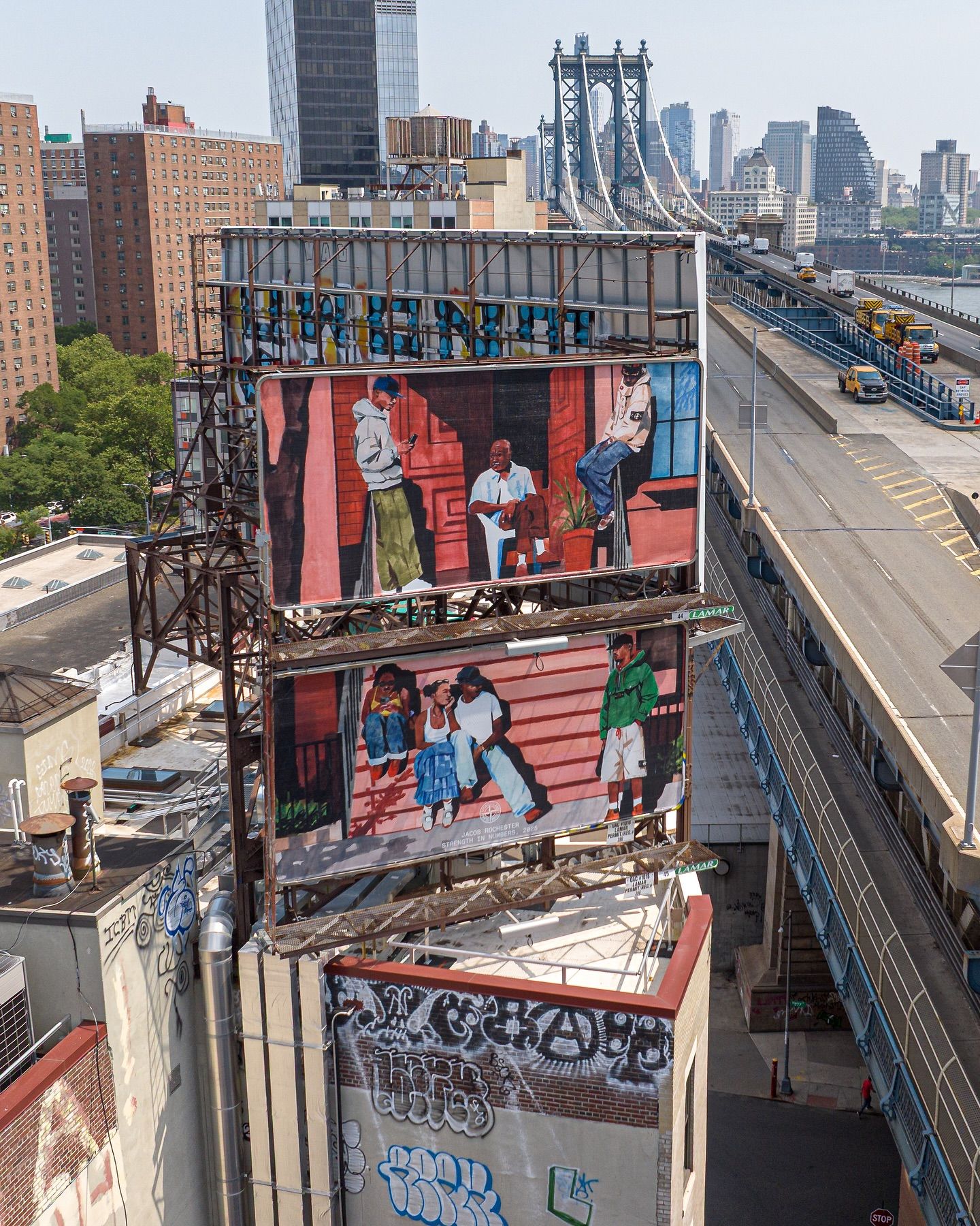
Above: Jacob Rochester for Stone Island, Dimes Sq. NYC (2025). Fully illustrated OOH ads, even the products, and perfectly culturally aligned with Stone island's consumer base. Bravo. More on Stone Island here.
The question isn’t whether illustration will make a comeback, it’s when - and whether you’ll lead it or follow it. With its unique power to interpret, distort, and reimagine reality, illustration can tell brand stories that feel impossible in any other medium.
Get in touch and let's talk about how we can collaborate.
What We Do
We specialise in bold visual content and brand storytelling.
