Knock Rebrand
Expressive and people-first illustrations for Knock's rebrand.
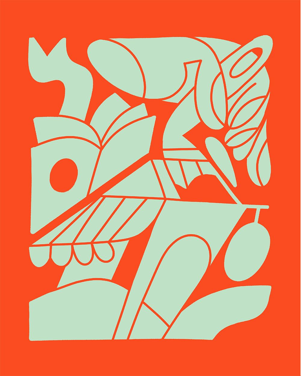
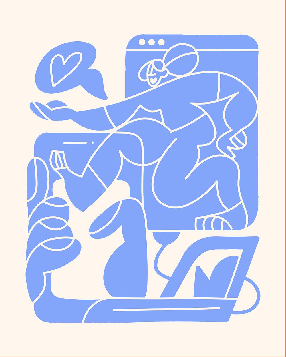
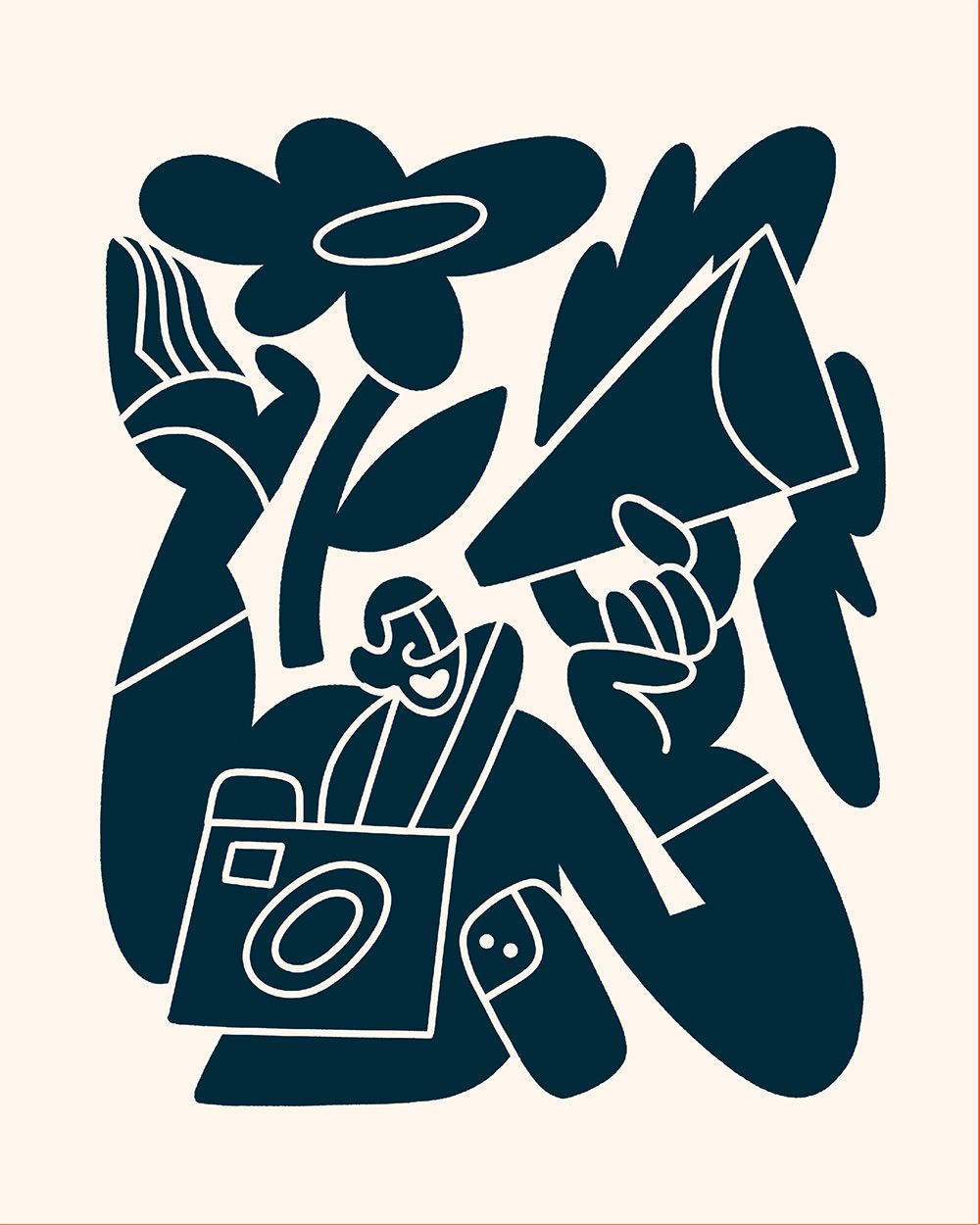
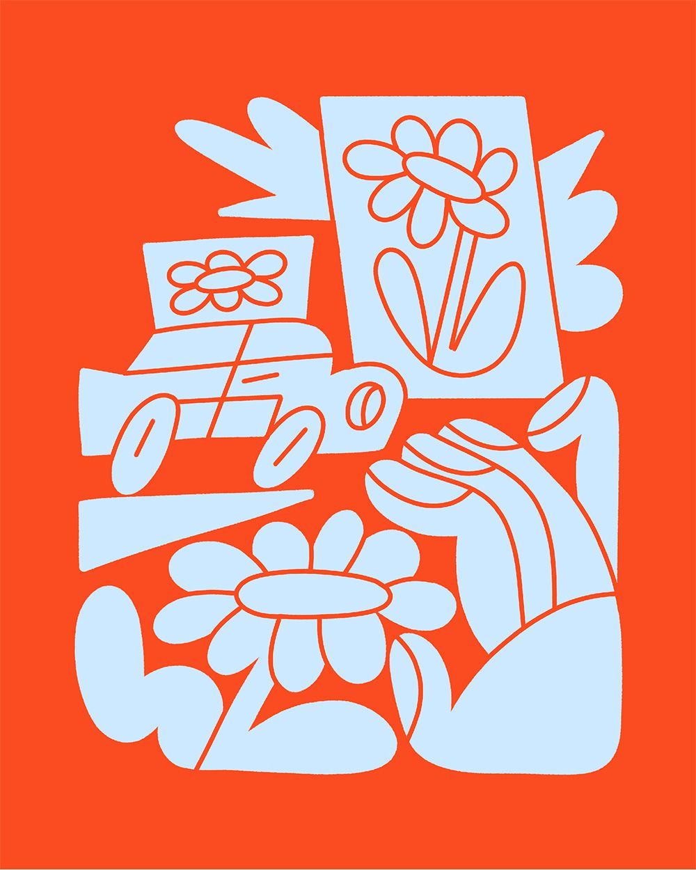
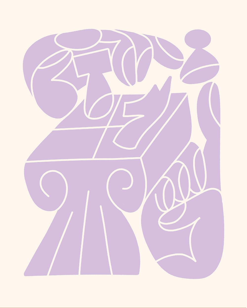
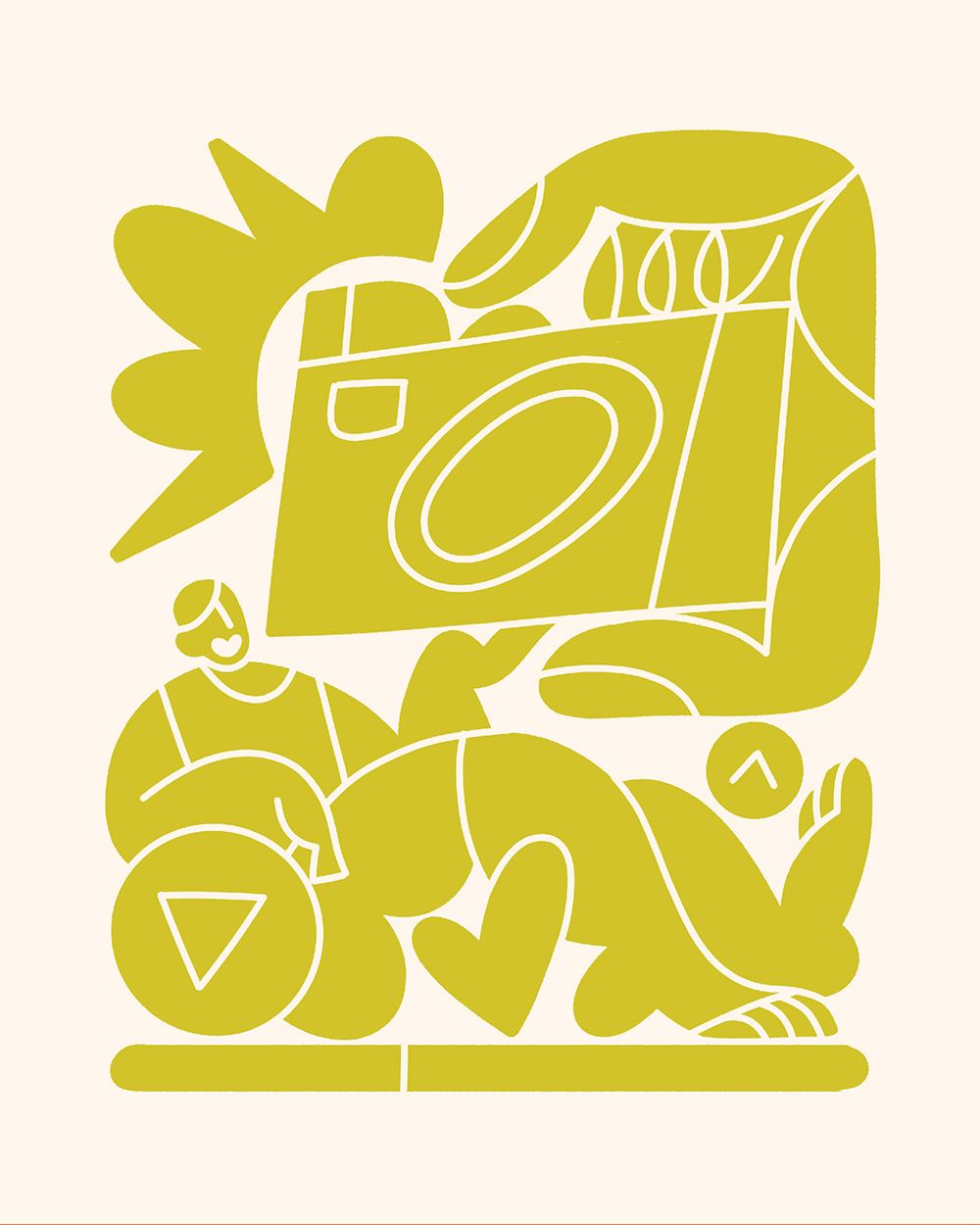
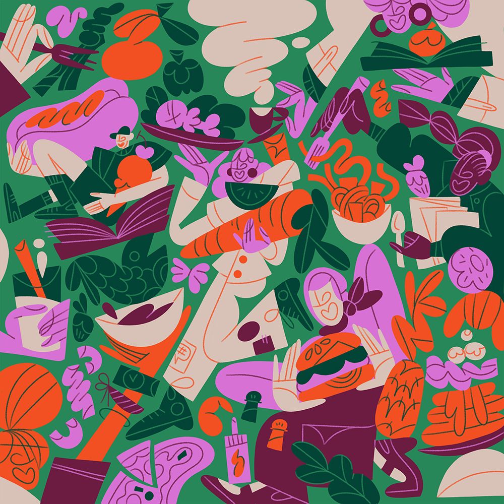
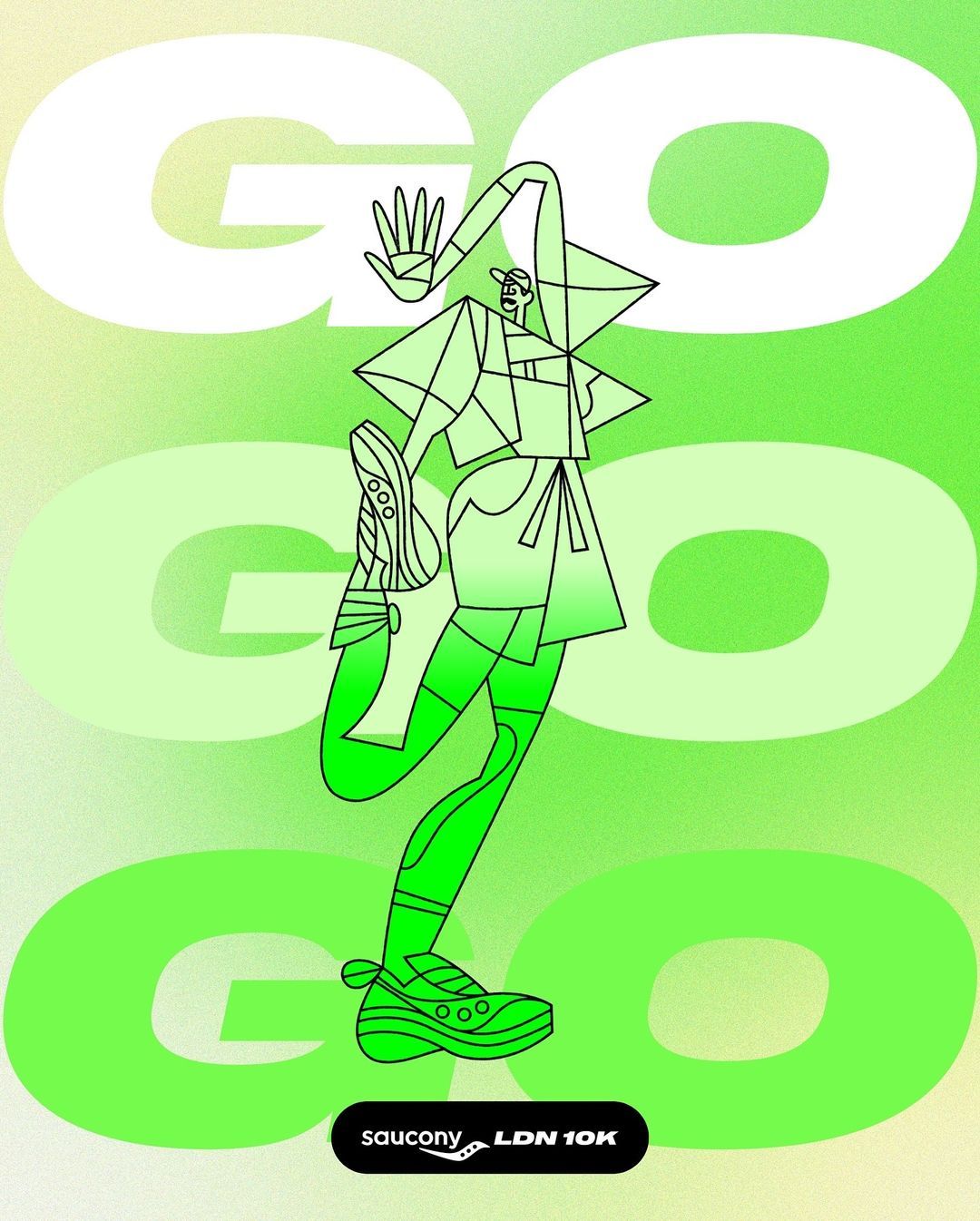
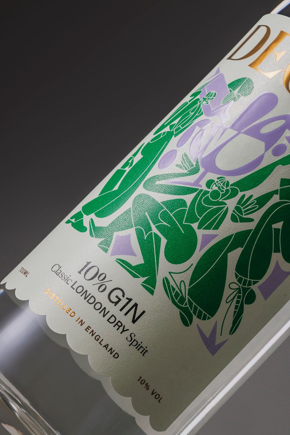
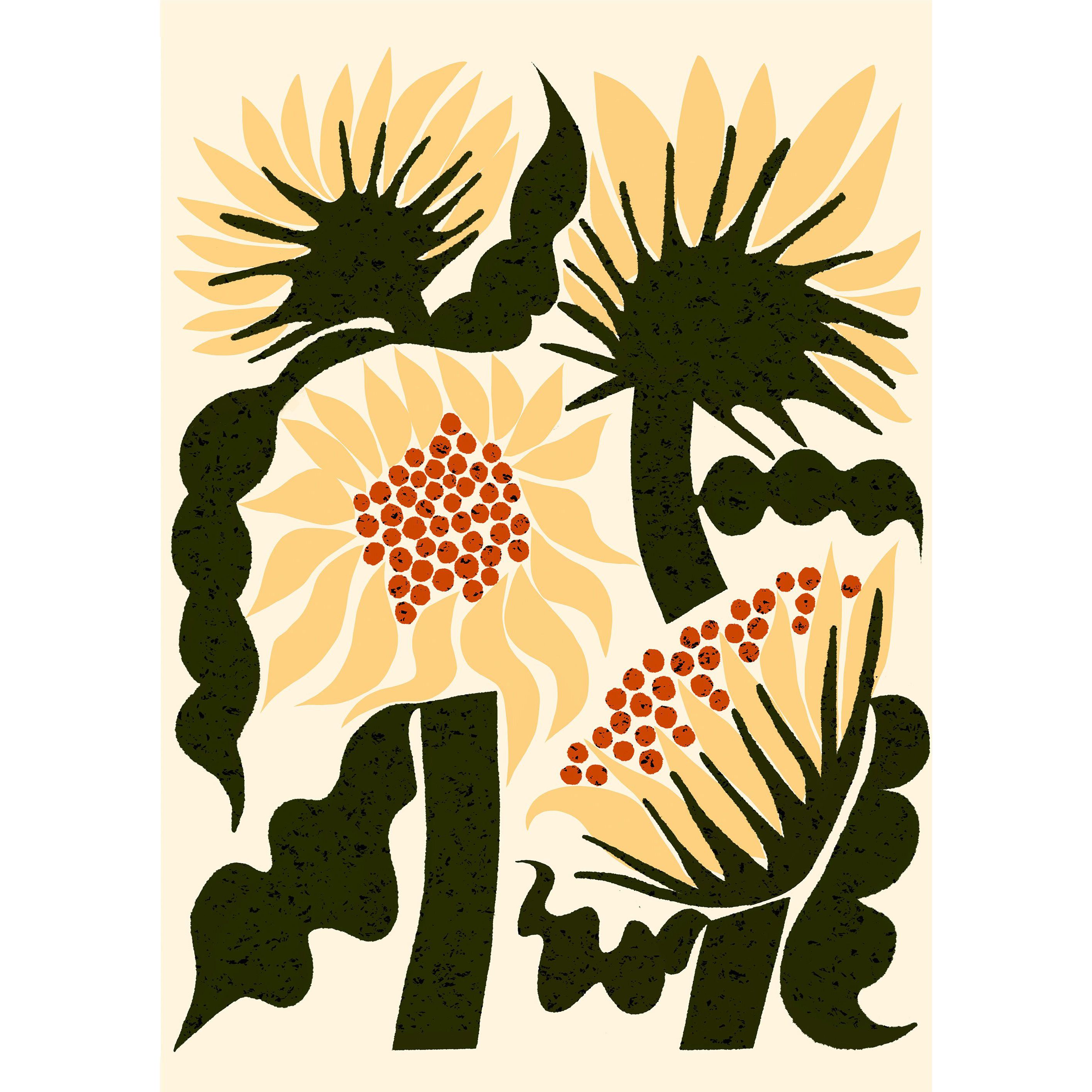
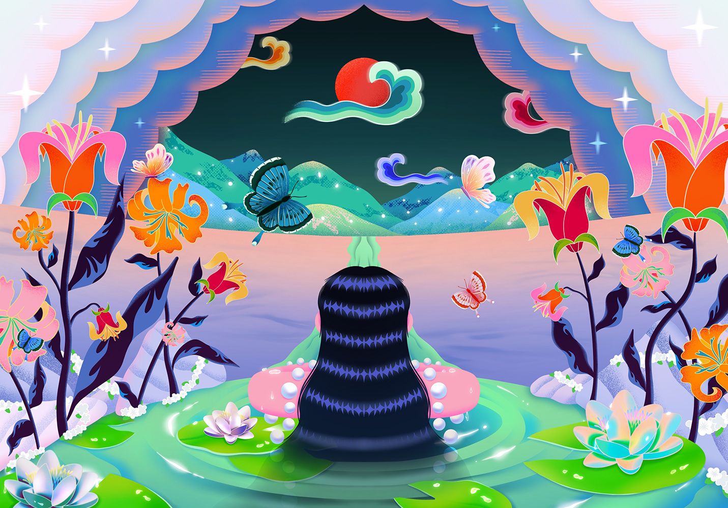
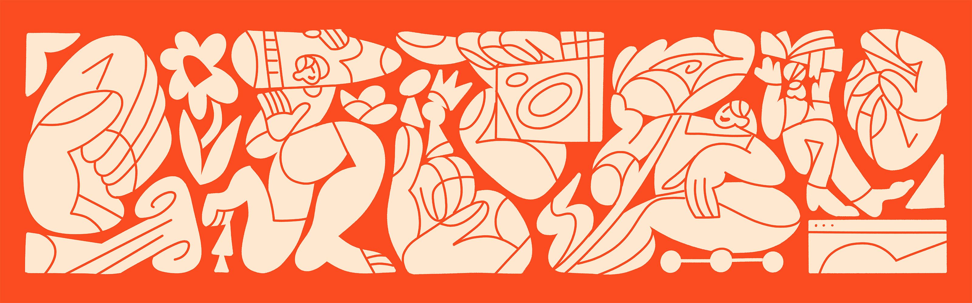
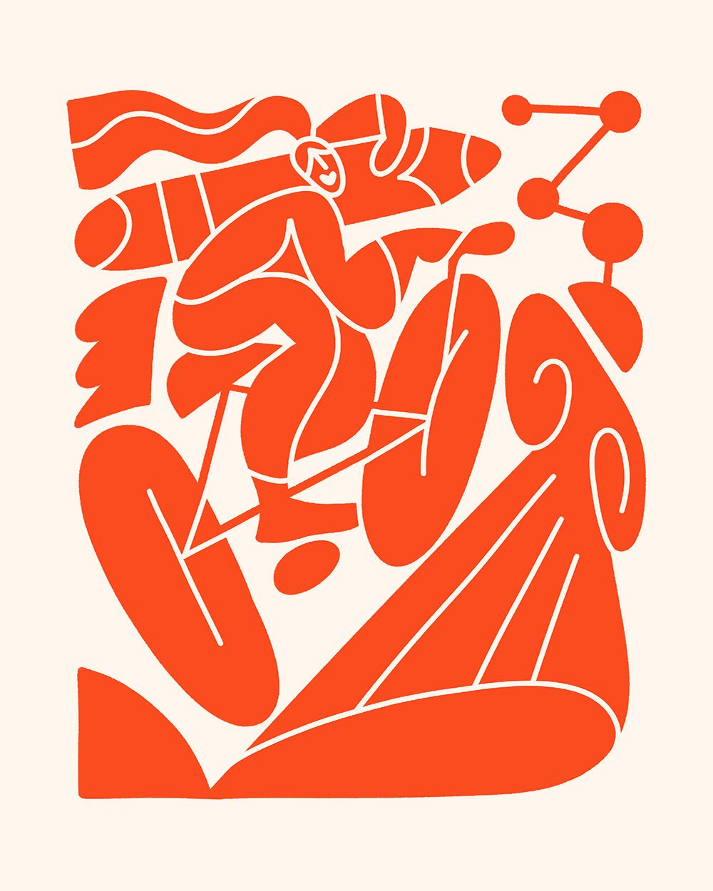
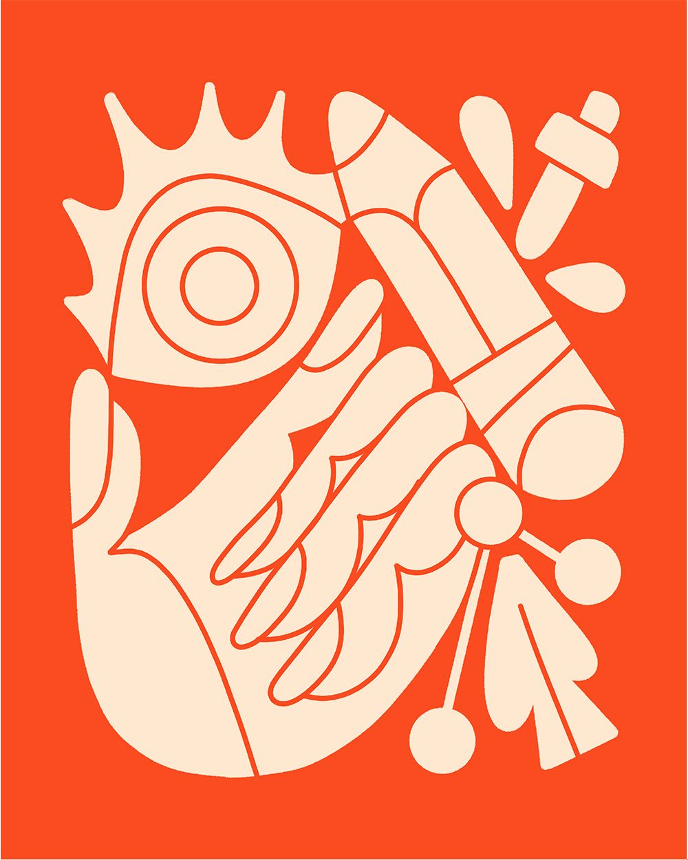
Approached by Knock Inc to collaborate on a rebrand expressing their capabilities and human-centred approach, Meredith crafted ten illustrations to be used across their website, editorial and social.
Brief & Approach
A brief that felt tailor-made to Meredith, working with an all-woman team that had a clear vision aligned with her own design style, resulted in illustrations that brought Knock’s design-forward and people-first approach to life.
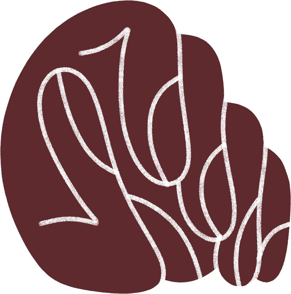
Crafting eight illustrations to explore Knock’s services, a hero illustration that encompassed them all, and a spot illustration for use across marketing, Meredith imbued each design with her signature characterful flair. With a passion for crafting compositions and characters that ooze joy and celebration, the key to the success of this brief was Meredith’s deeper understanding of branding as an extension of the services Knock offers.
Design
Chosen for her style that plays with shape, human forms and has an energetic and optimistic perspective, Knock wanted Meredith’s style to emphasise their values and ethos. Due to her background in design, Meredith was able to easily and quickly grasp Knock’s needs and what a rebrand means for them, creating a seamless collaboration.
Each illustration was designed to be bountiful and extend right to the boundaries of the compositions, in contrast Knock’s paired-back typography and serene colour palette. The illustrations were also designed to be used across multiple formats allowing for further touchpoints and connection.