Maoam 'What a Maothful'
Bold and colourful tongue-twisters for the confectionary brand.
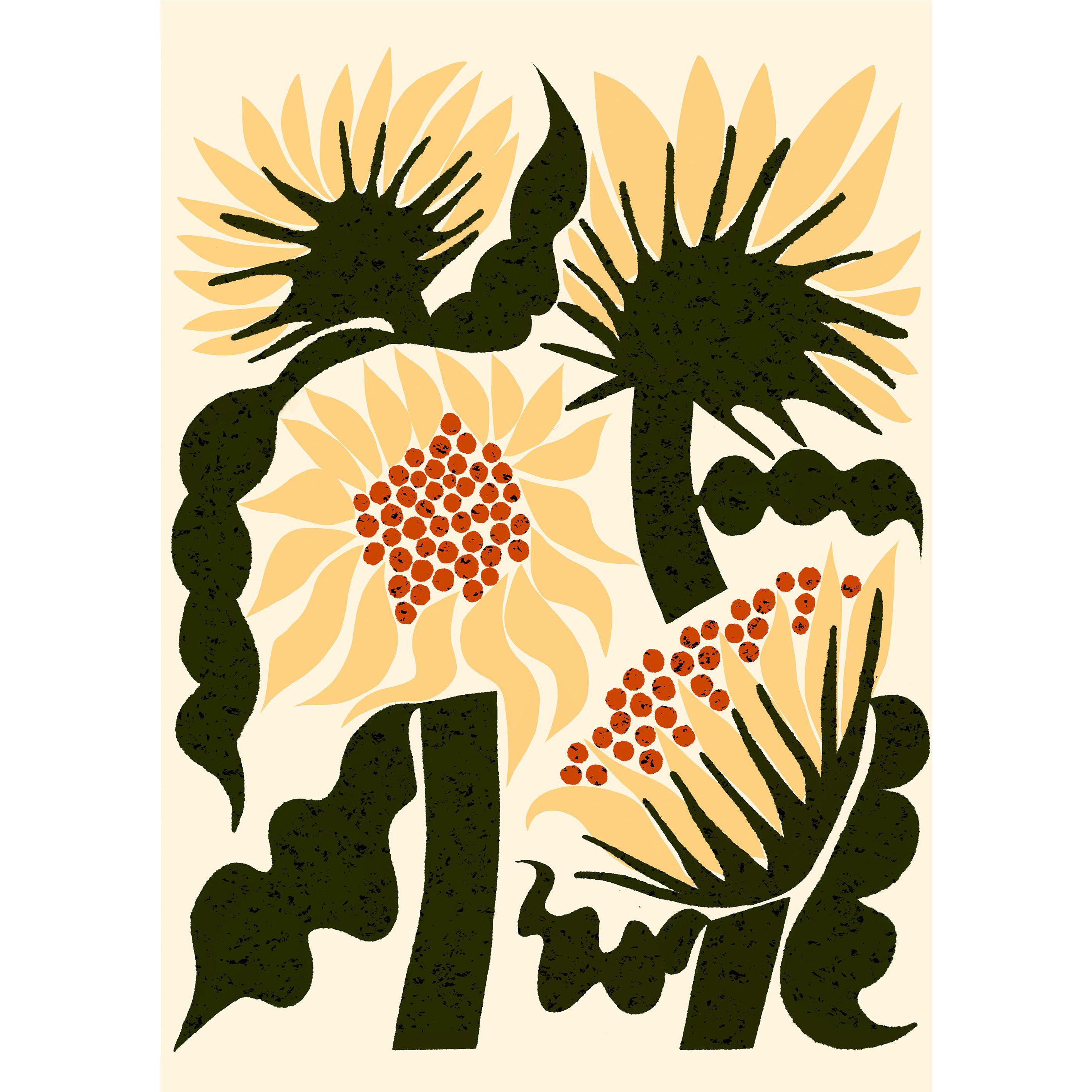
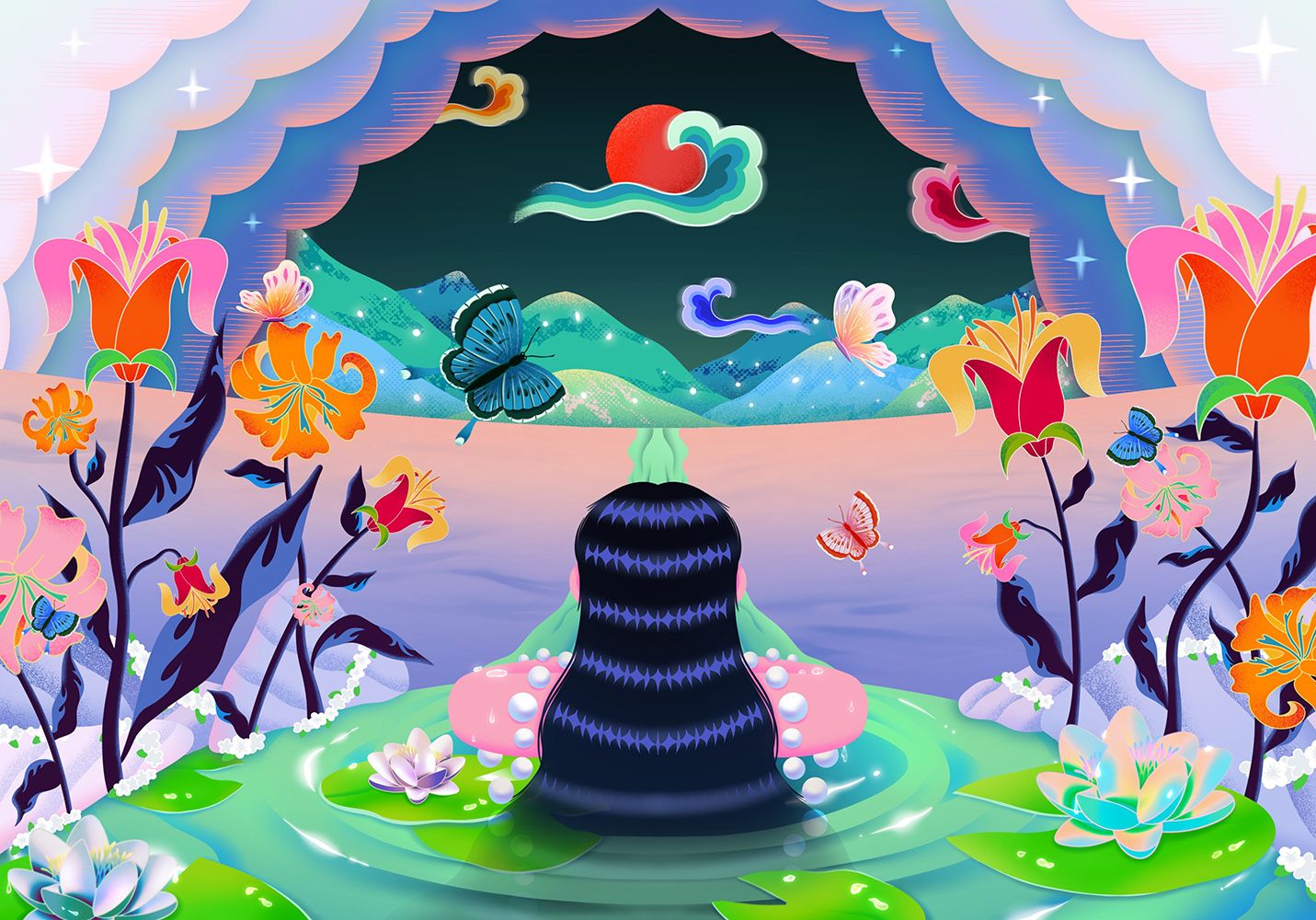
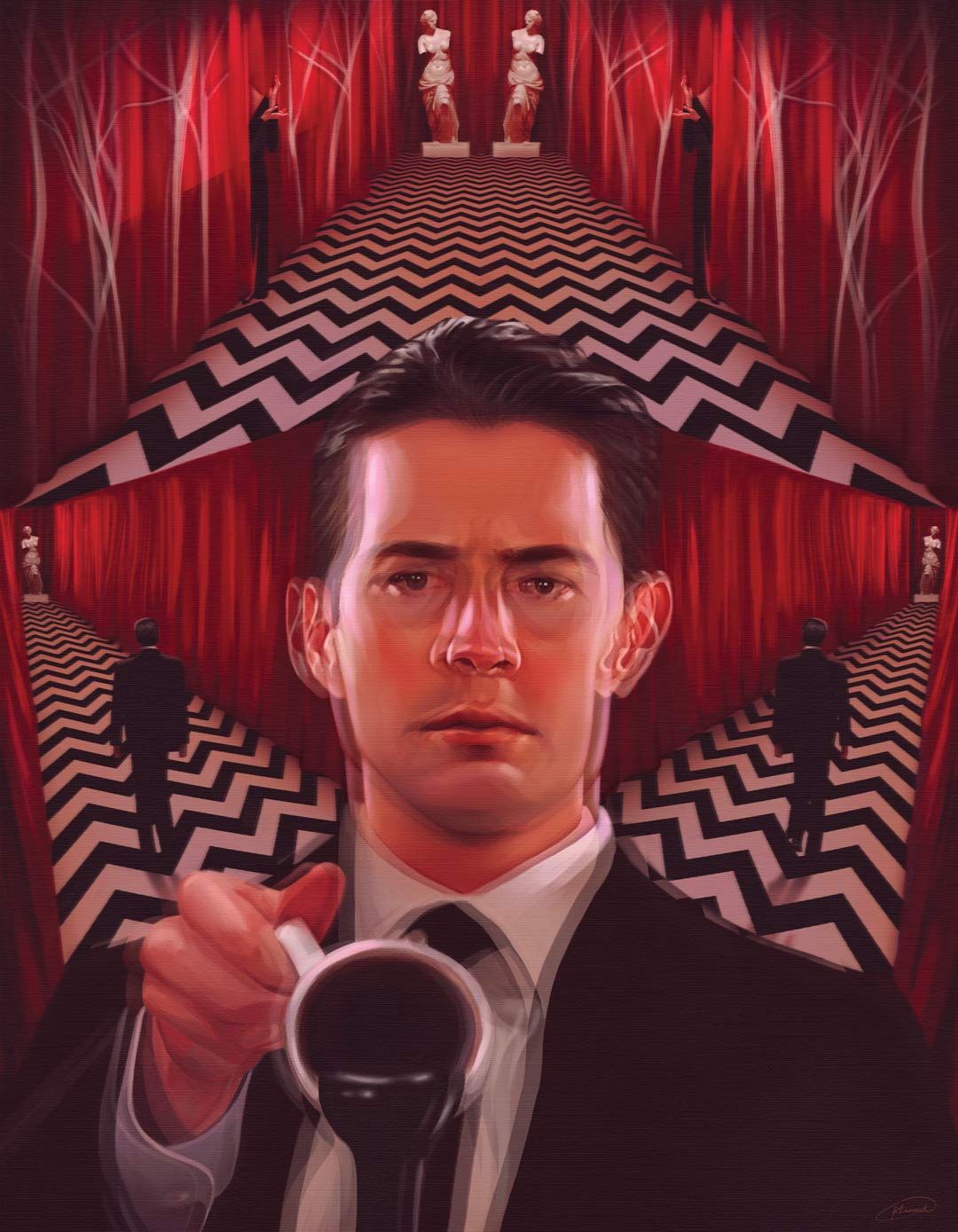
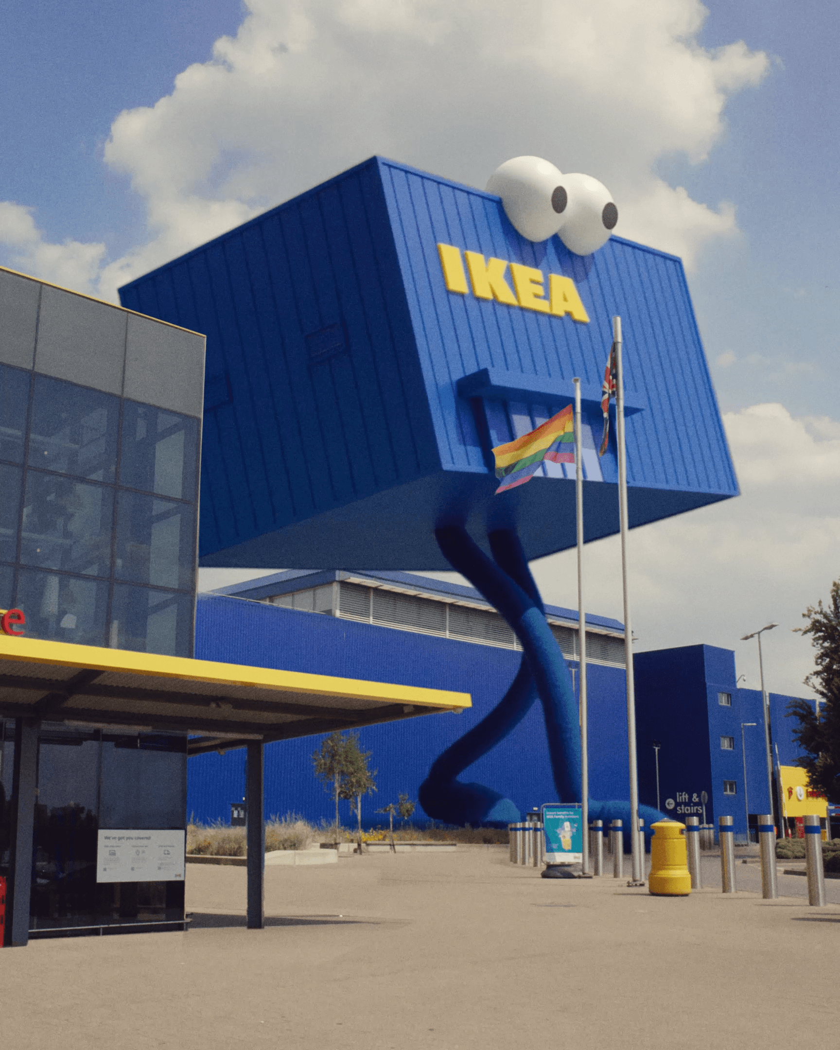
Bold, colourful and bursting with flavour, Studio Pum and KITCHEN worked with Lucky Generals to craft confectionary brand Maoam’s first campaign with the agency, designing four tongue-twisting illustrations to run across screens outdoor, and across social platforms.
Brief
Tasked with describing the indescribable experience of eating a Maoam sweet and the explosive taste sensations, each poster contains a jumble of exaggerated and invented words and phrases, taking visual cues from the flavours to create fun and colourful designs.
Design
Exploring their colourful and lively style through typography, Pum embraced the playfulness of the brief to craft three stand out designs, crafted to make passers by stop and look, and bring a bit of Maoam joy. Combining different typography styles, weights and textures, each illustration aims to show the unexpected and exuberant flavours of the sweets.
To bring extra life and vibrance to the typography, KITCHEN explored interesting ways to animate the lettering to further illustrate the campaign messaging, adding movement and texture to the words to visually emphasise the words. KITCHEN’s playful animation style paired perfectly with Pum’s colourful designs to create a striking campaign.