
Life on the Alternative Movie Poster Scene
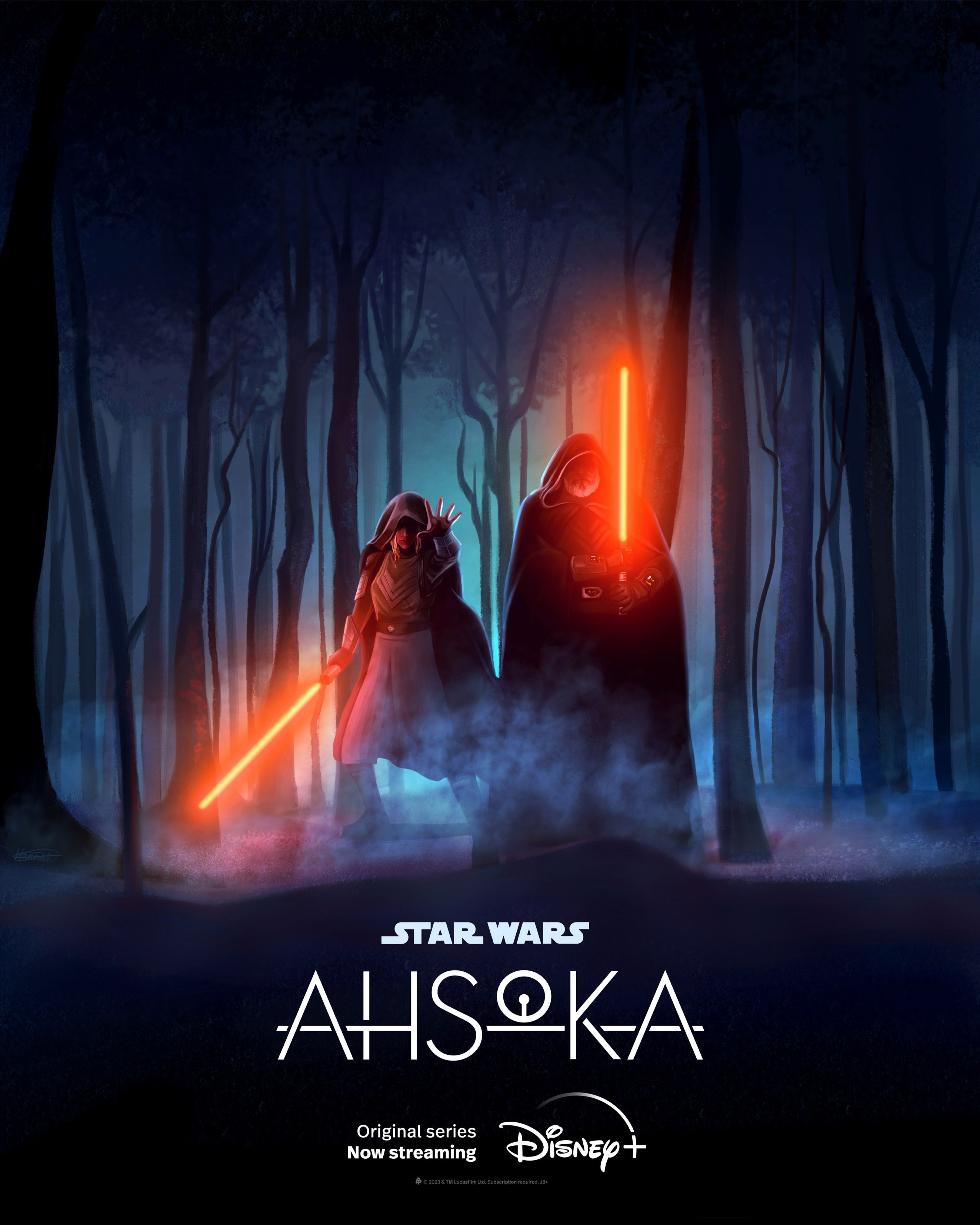
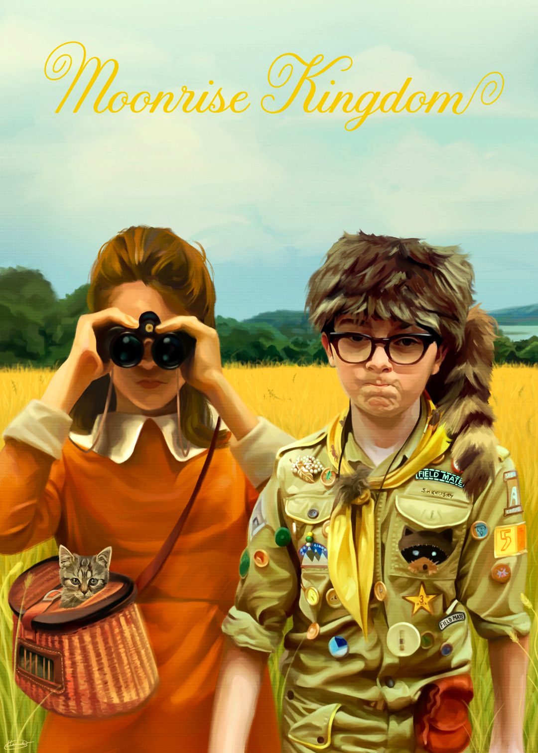
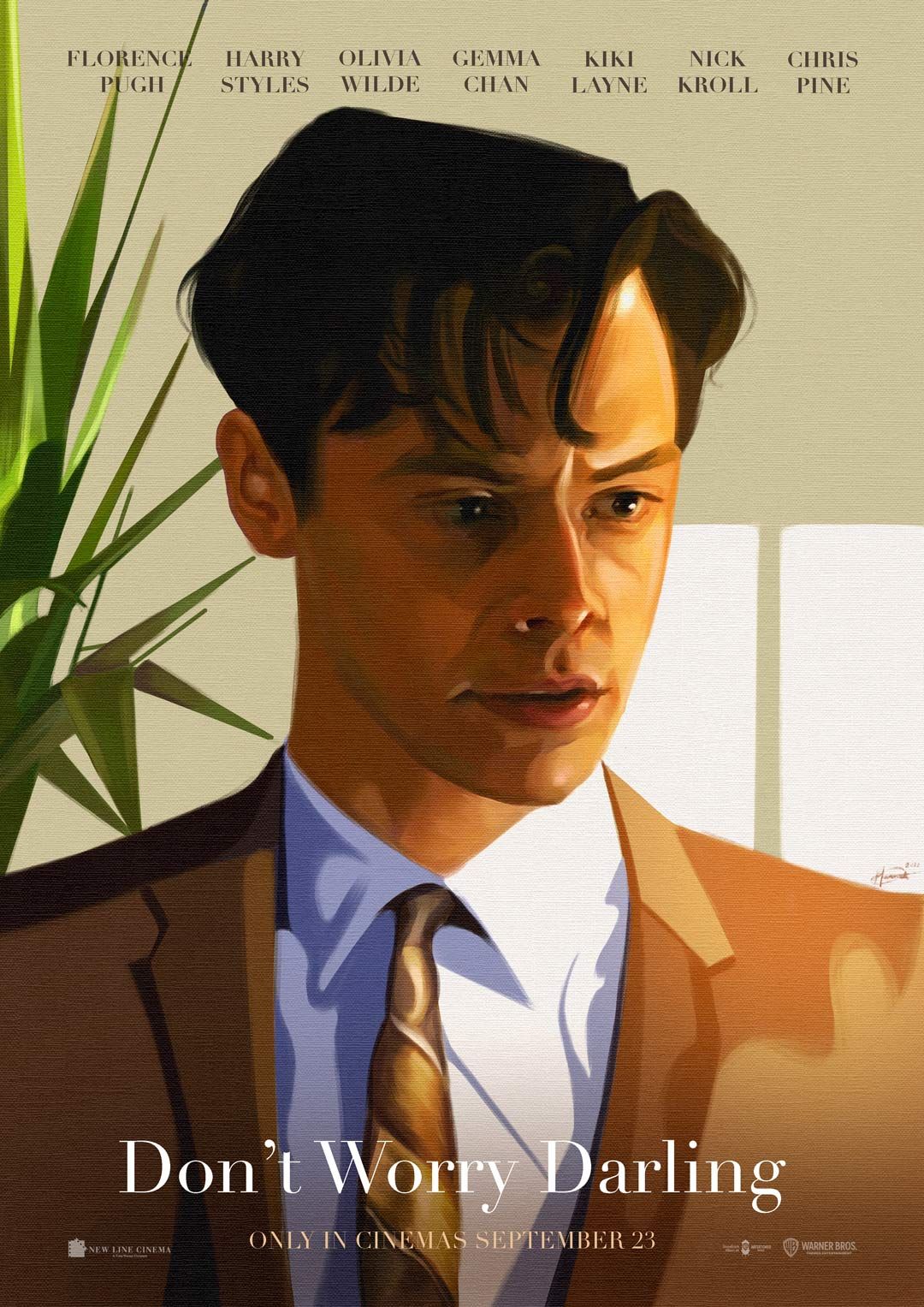
Driven by storytelling, illustrator Hannah loves exploring concepts, colour and composition to bring ideas to life in the most compelling way, capturing the true spirit of a story. In no place is this more evident than in her alternative poster art. Here, we delve into the who what why and how of creating alternative movie posters...
What originally drew you, and still draws you, to poster art? Why do you create film posters?
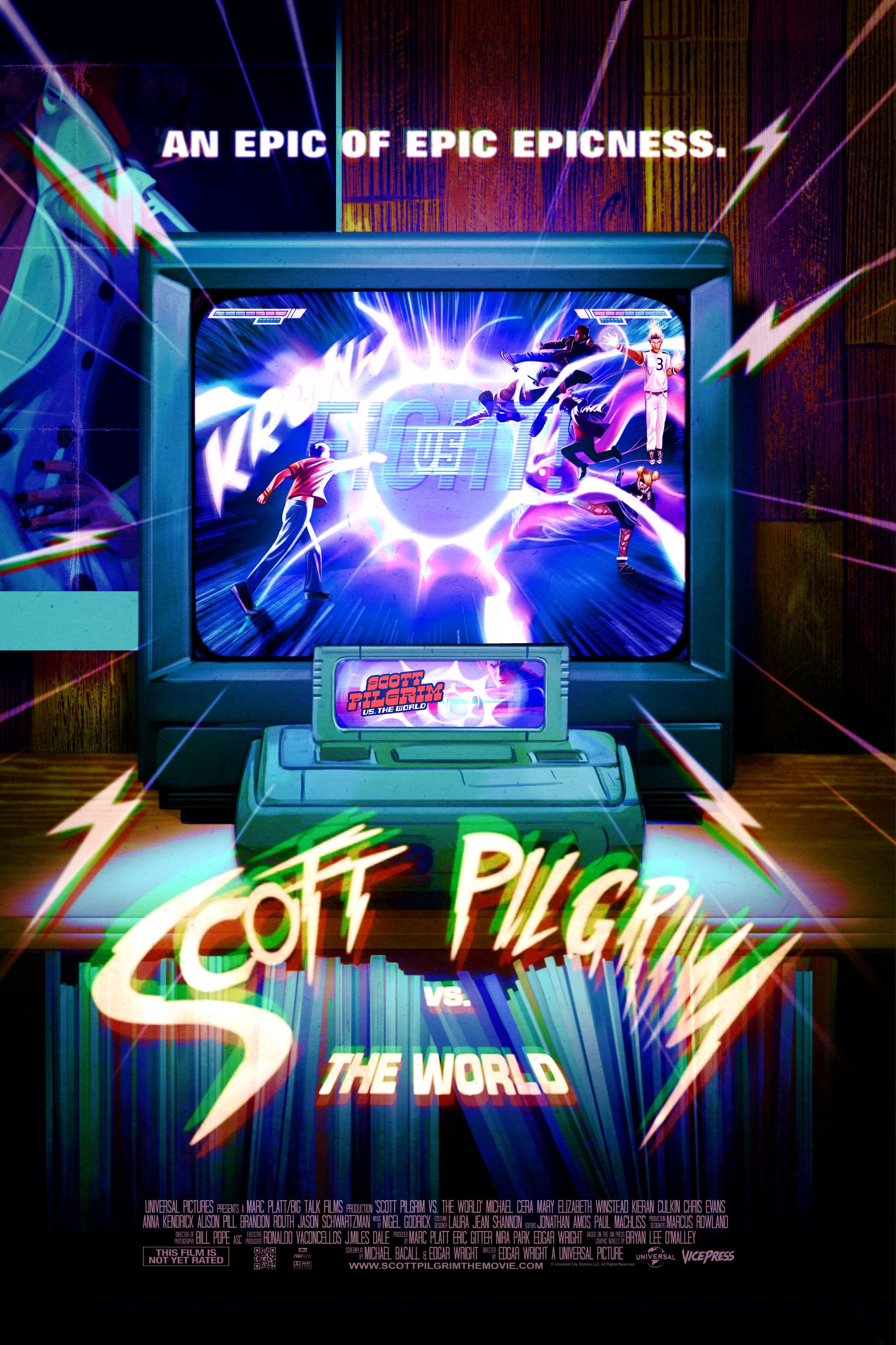
Whenever someone asks me what I am most passionate about my answer is always art/ illustration and film so when I first discovered I could merge these two and illustrate film posters I was instantly hooked. Shortly after, I discovered the AMP (Alternative Movie Poster) scene and was welcomed in with open arms by the most incredibly supportive artist community which I can now proudly call my friends. I love to illustrate film posters because, as like with all my art, it is driven strongly by storytelling and I get a great kick out of being able to capture the essence and atmosphere of a story in a single image or poster.
Talk us through your thought process when considering composition and which elements to feature…
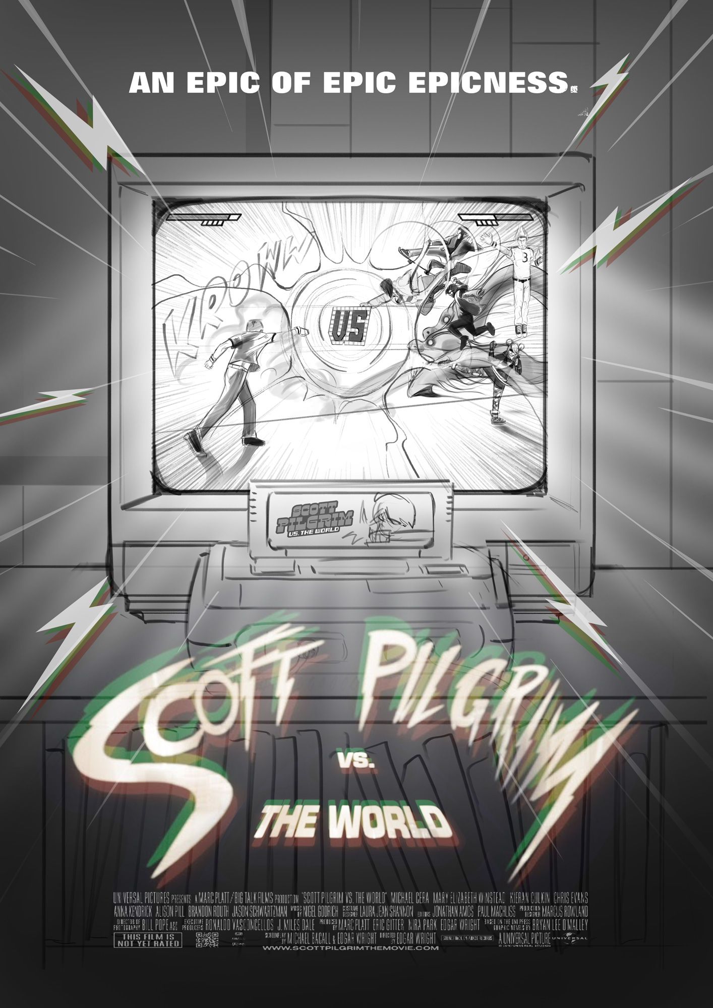
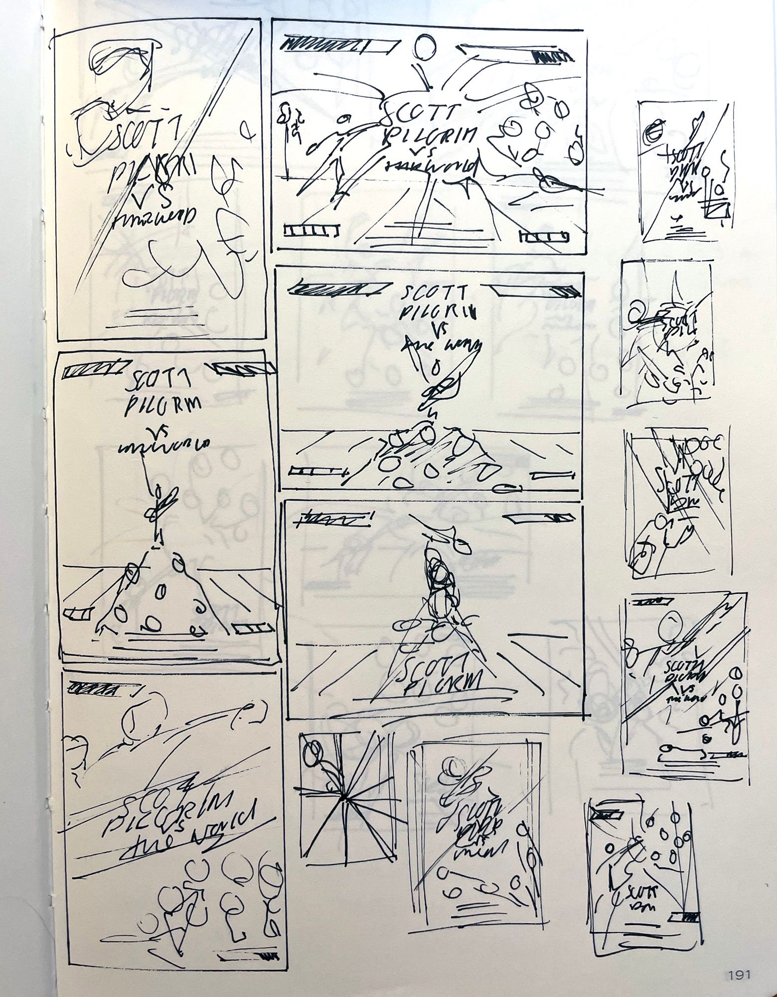
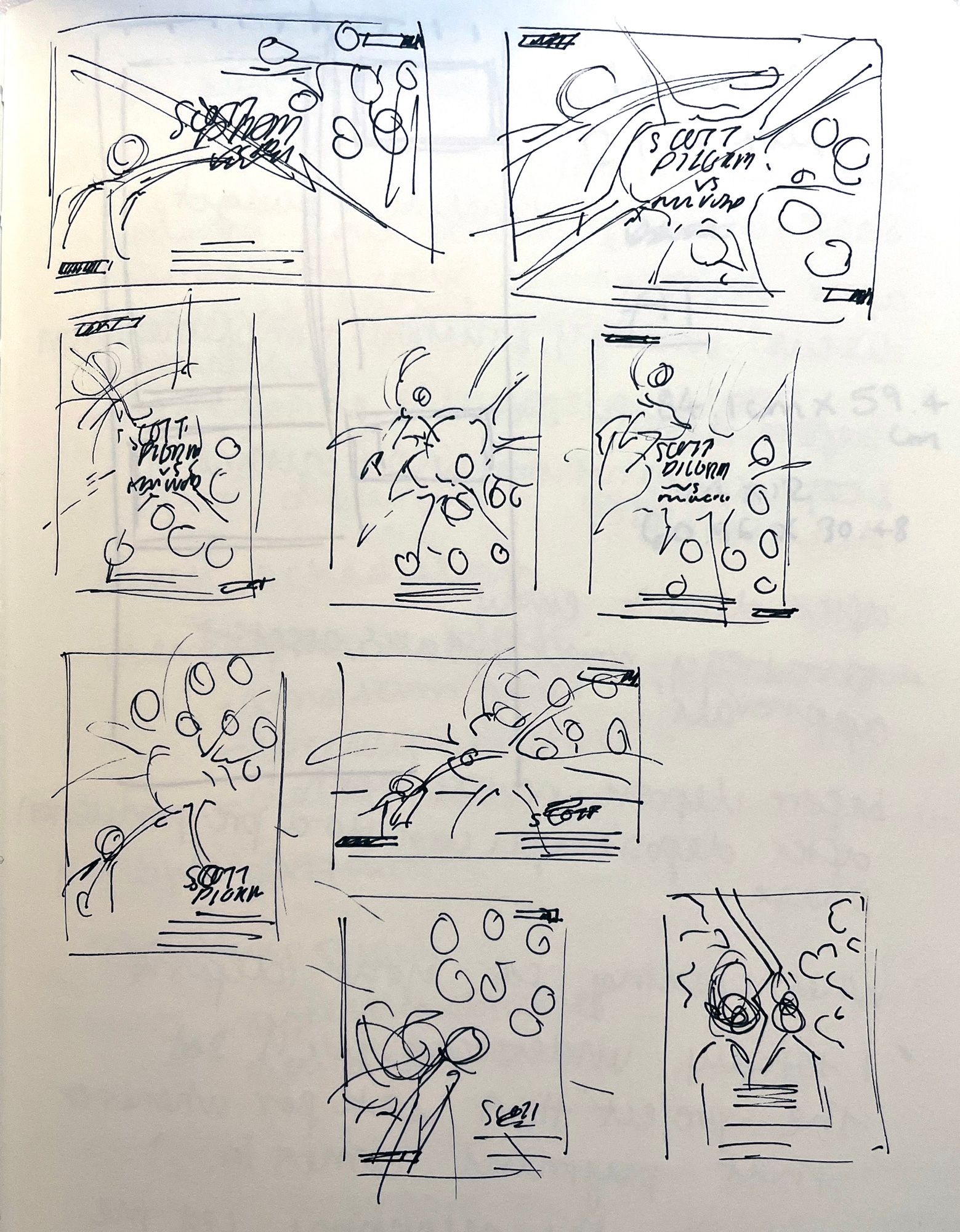
I usually start off in my sketchbook, where I create very rough thumbnails. My thought process is to get out any and all ideas out onto paper so that I can see which compositions are working and which aren’t and take it from there. Sometimes an idea/ composition will come to me quite easily which means I tend to stick with the first sketch I draw, however this isn’t always the case. I aim to create an image which I feel accurately captures the essence of the film and strongly portrays the atmosphere and feeling of the film.
What tools and techniques do you use to create your posters?
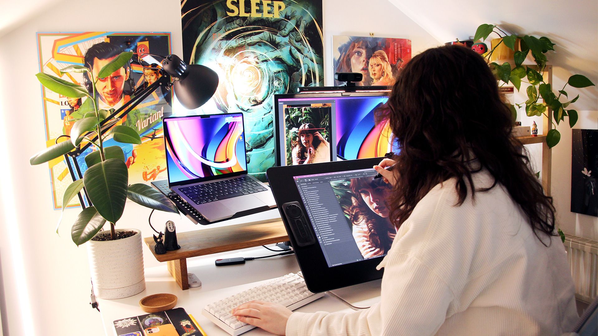
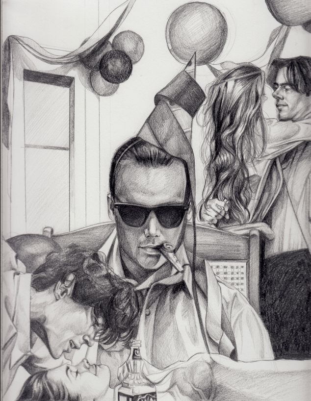
Depending on how much time I have, I will refine my chosen sketch with either pencil and paper or digitally on my iPad, and create a colour mock-up before beginning the final artwork digitally over on Photoshop. Most recently I’ve been leaning towards creating my linework on paper by hand as I feel like there is something about a pencil drawing that gets lost when translated digitally and it can become a little wooden.
How do you visually capture the essence of a film?
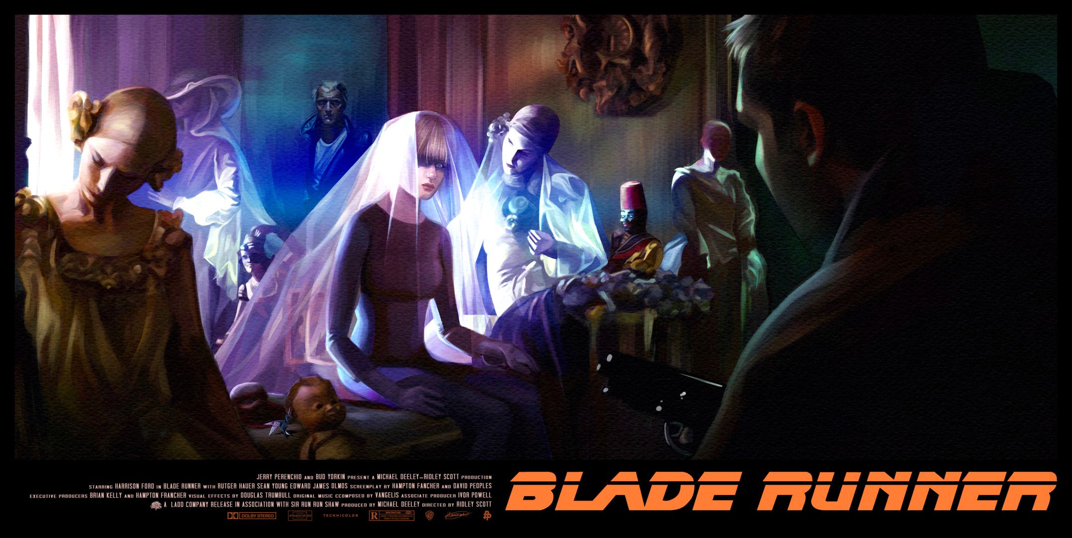
I think a lot of it is down to the use of colour and light as well as illustrating particularly well known scenes or environments from the film. For example when illustrating a poster for Blade Runner 1982, I wanted to capture how hauntingly beautiful the film was and the films iconic dystopian feel. I felt that I could do just that by illustrating my interpretation of toymaker J.F Sebastian’s house and the mesmerising lighting and colours, with the beams of flashing light from outside filling the rooms. An eerie and mesmerising scene.
Which are your favourite film posters of all time?
Oh that’s a tricky one... I do love the original Blade Runner poster by the extraordinary John Alvin. His portfolio is full of incredible posters. I am also a big fan of Drew Struzans Star Wars posters! When it comes to more recent film posters, more specifically alternative movie posters, I am a huge fan of Chris Valentine who paints all his posters in oils and Greg Ruth a master of the graphite pencil.
How important is recognisability with real people or well-known characters, and how do you ensure this?
It is very important to make sure the likeness is accurate when illustrating well-known characters as if you are off the mark even slightly it will be very noticeable as their famous faces are ingrained in peoples mind. To ensure that I capture the likeness accurately I make sure that I have a selection of high quality references to work from or find the best possible images available to me.
Which of your posters has impacted you most and why/how?
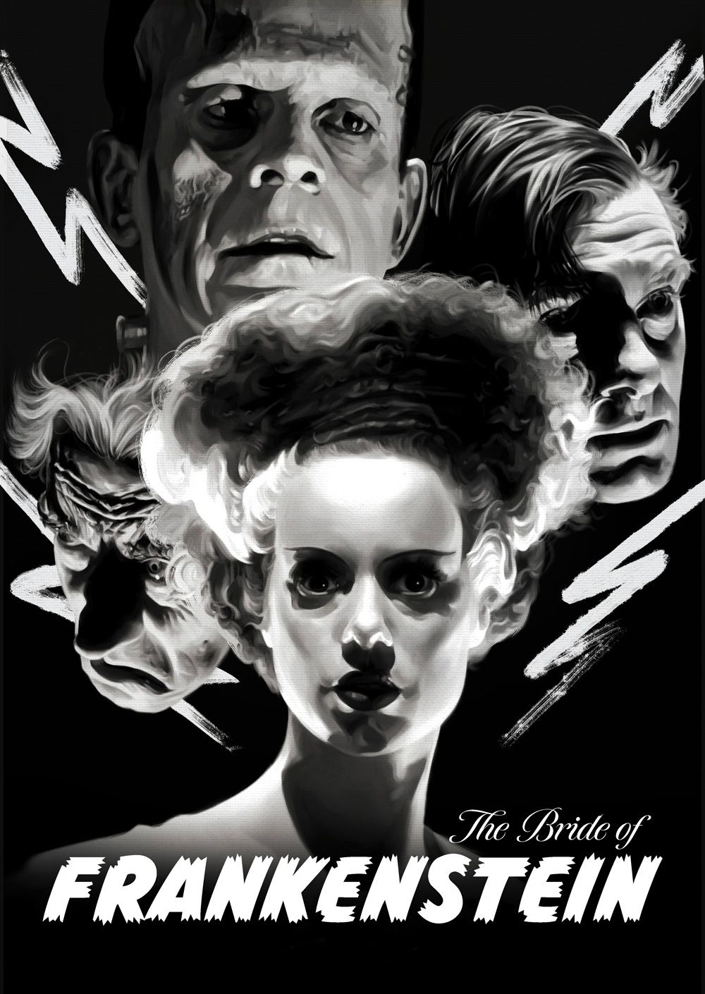
I think it may be one of my earliest posters ‘The Bride of Frankenstein’, which I created for a group show, that has impacted me the most. Not only was it one of my first ever alternative movie posters I illustrated but it was also my first poster to be exhibited in a gallery space. What originally started out as a fun fan art project turned into a group art show exhibited in a gallery in London! It was such a wonderful experience and allowed me to meet so many fellow artists in person, for the first time, after speaking with them online.
What’s your earliest film memory?
My earliest film memory is watching the classic Disney princess films as well as the Swan Princess which I vividly remember watching at home on VHS. These are very fond memories and I still till this day love to go back and watch the classic Disney films. I am in constant awe of the background painting and art styles within the films like Cinderella and Alice in Wonderland. They are hugely nostalgic for me. The first film I watched in the cinema was Toy Story 2!
What do you think makes a good/captivating film poster?
A film poster should encourage people to go watch it or go back and rewatch. What I love so much about the AMP scene is that the illustrated posters are always so creative and unique which sometimes is hard to do with official key art as there are a lot more hoops to jump through. A high quality film poster is visually striking using its own form of storytelling to capture the essence of the film. Eye catching, grabbing the viewers attention and evoking emotion. A captivating poster should have a thoughtful composition which intentionally leads the viewers eye around the poster, guiding the viewer’s attention and holding it there.
What type of genres, stories or characters do you enjoy depicting most in your posters, and why?
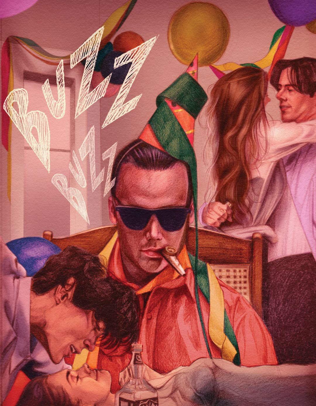
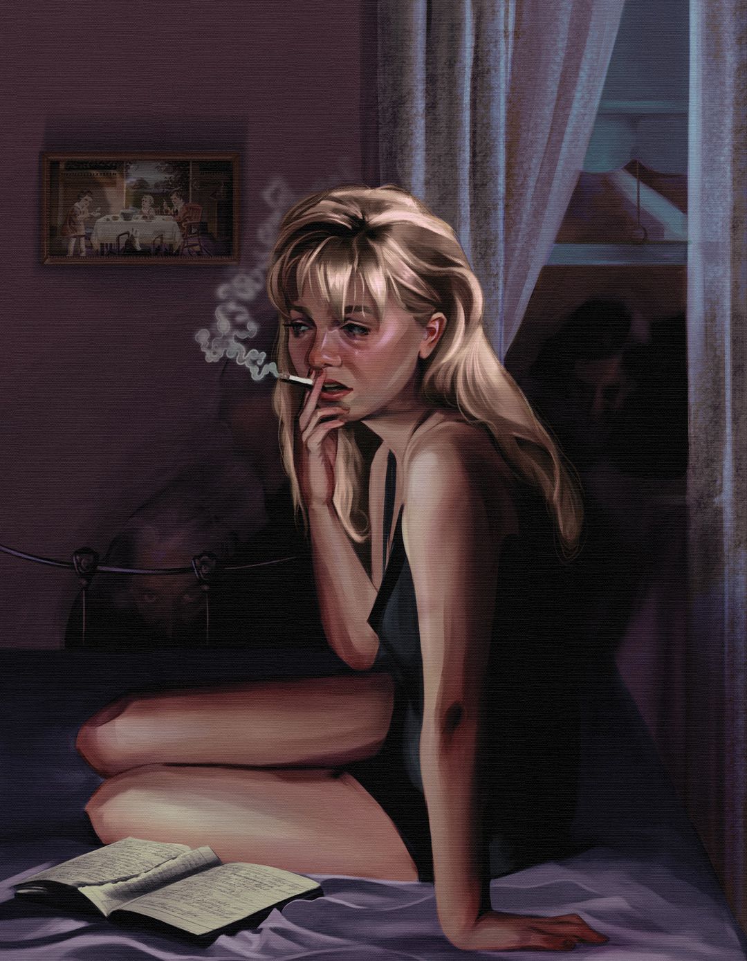
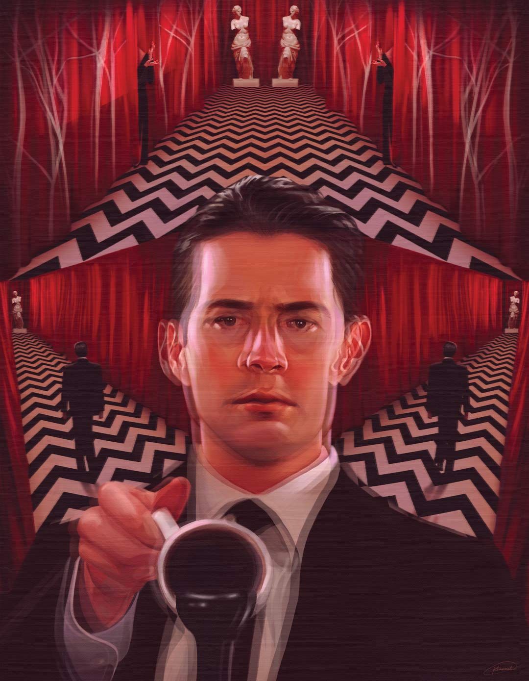
Science fiction has got to be one of my favourite genres, specifically film genre, as I am just so fascinated and intrigued by all of the imaginative and creative ideas within it. I believe that science fiction is one of the most creative genres and allows for some really powerful and compelling storytelling. My all-time favourite TV show ‘Twin Peaks’ is a mix of sci-fi and supernatural which contains the most eccentric characters. I just can’t get enough of it, which you might probably be able to tell from my Twin Peaks personal work.
If you could choose one film to rewind time and make the official poster art for, which one would it be, and why?
This is a very difficult question and I am torn between two very different films. I think it would fulfil a childhood dream of mine to create an official film poster for one of the classic Disney princess films, such as Snow White, as they hold such a precious place in my heart and are so nostalgic to me. However, on the other hand I’d kill for the chance to create official poster artwork for David Lynch and his Twin Peaks film ‘Twin Peaks: Fire Walk With Me’ as I am a die hard Twin Peaks fan.
See Hannah's full portfolio of posters and commercial illustration work here.
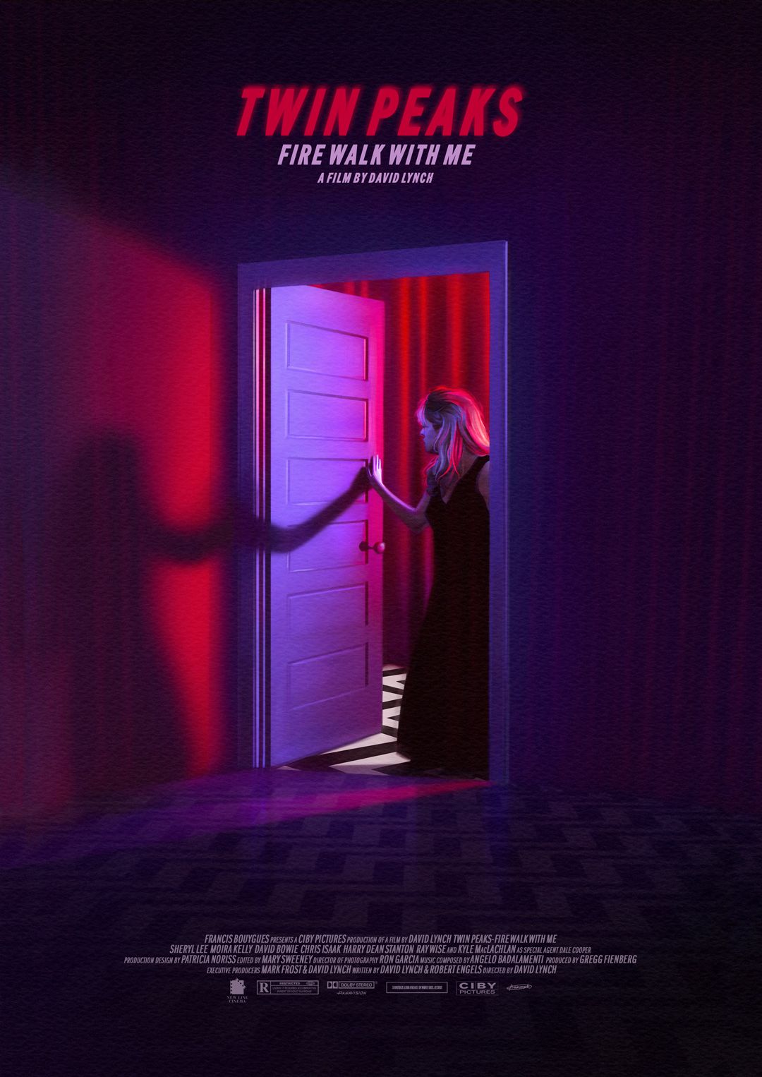
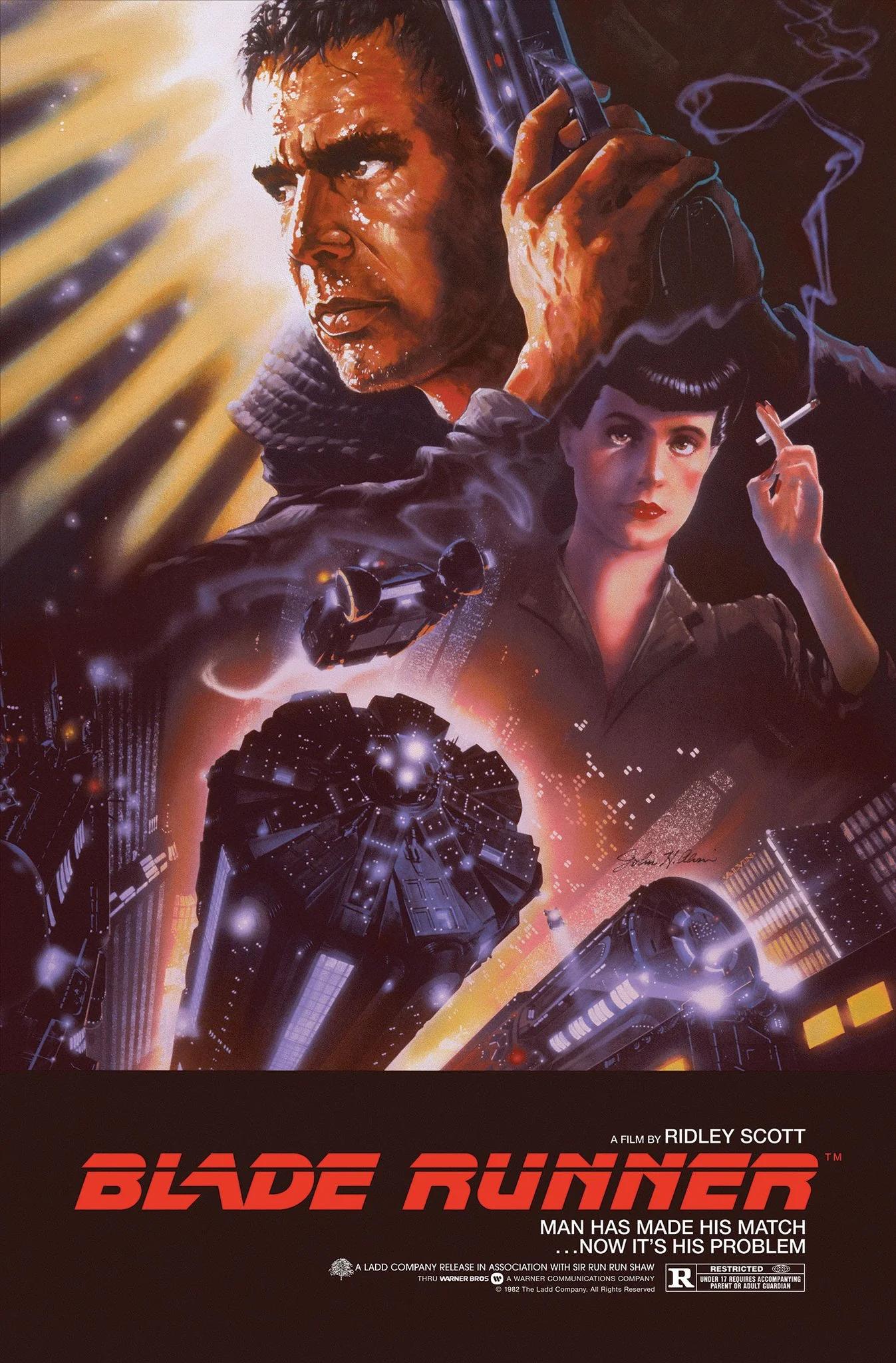
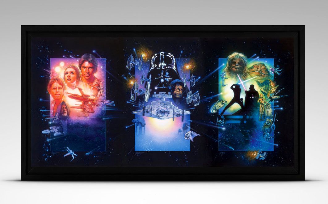
Above T-B: Hannah's Twin Peaks Fire Walk With Me, John Alvins' Blade Runner, Drew Struzan's Star Wars.
What We Do
We specialise in bold visual content and brand storytelling.
