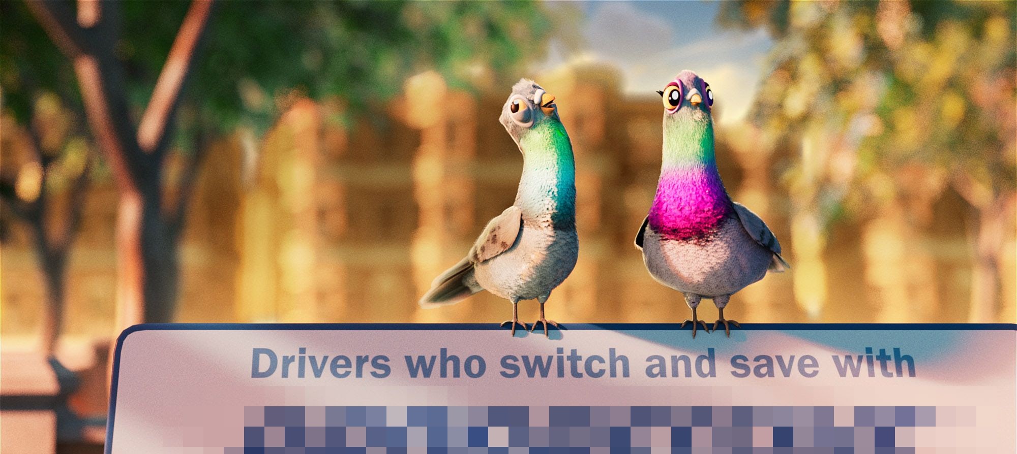

#PitchGraveyard: The one that didn't take flight...
A little bird told us there’s a new campaign out in the world featuring a funny feathered duo…
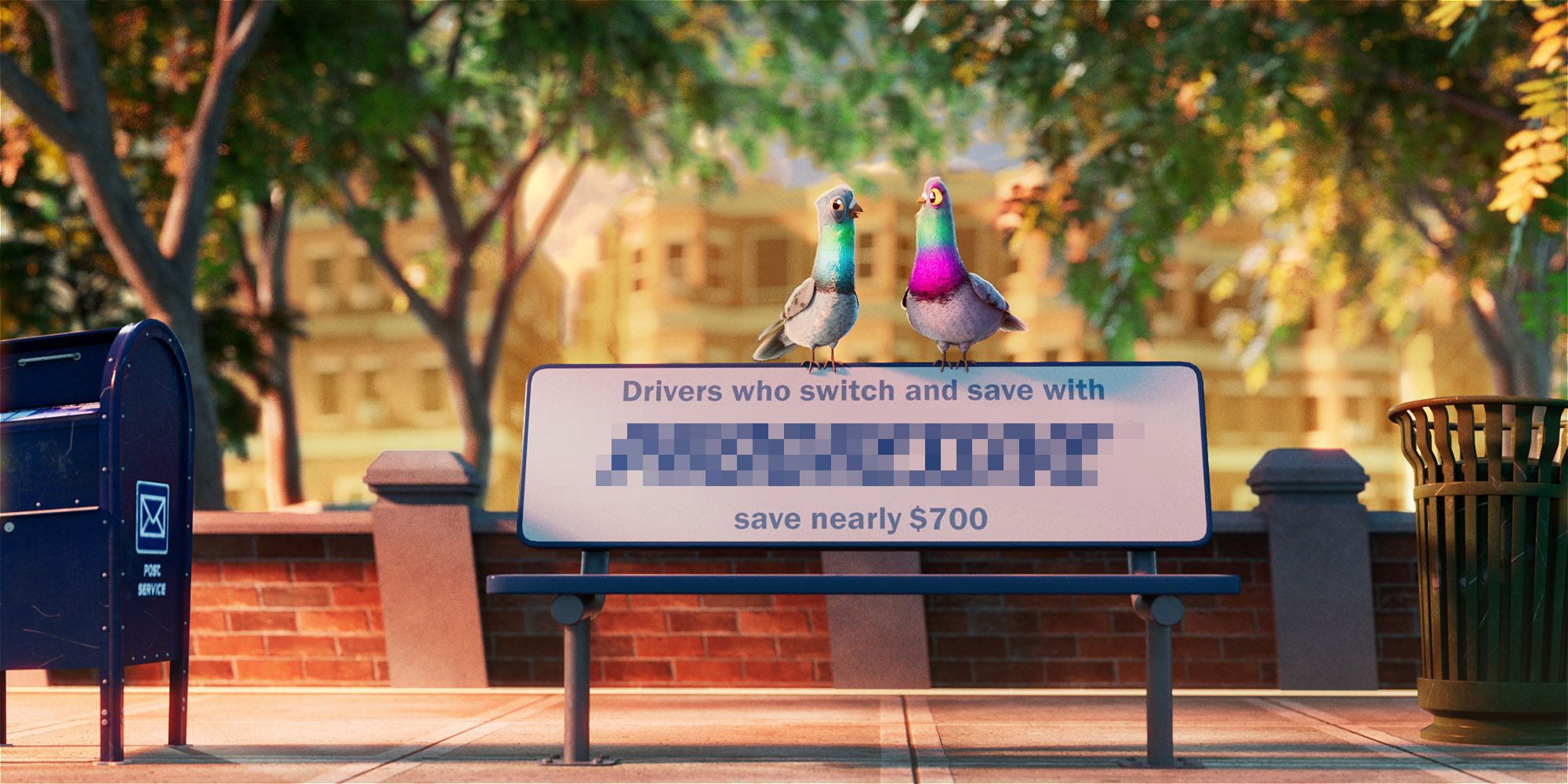
This brief came to us from the largest motor insurance carrier in the U.S, and though they didn’t progress with our route, we wanted to give a little glimpse behind the curtain and show you how the Jelly team and director Neil Stubbings proposed to give the idea wings.
Known for their track record of producing long-running campaigns and beloved characters, the brand wanted to create and introduce a dynamic new duo or pigeons that had the potential to become similarly-endeared recurring brand ambassadors.
And who better to tackle a relatable character design-led brief with humor and heart than epic storyteller and comic genius Neil Stubbings?
Character Design
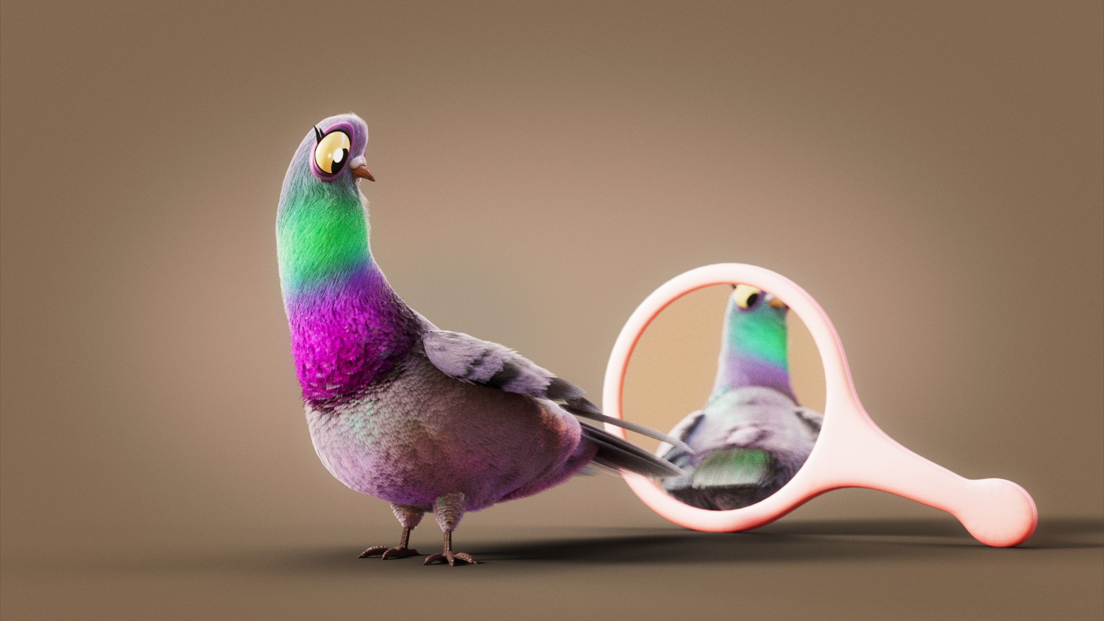
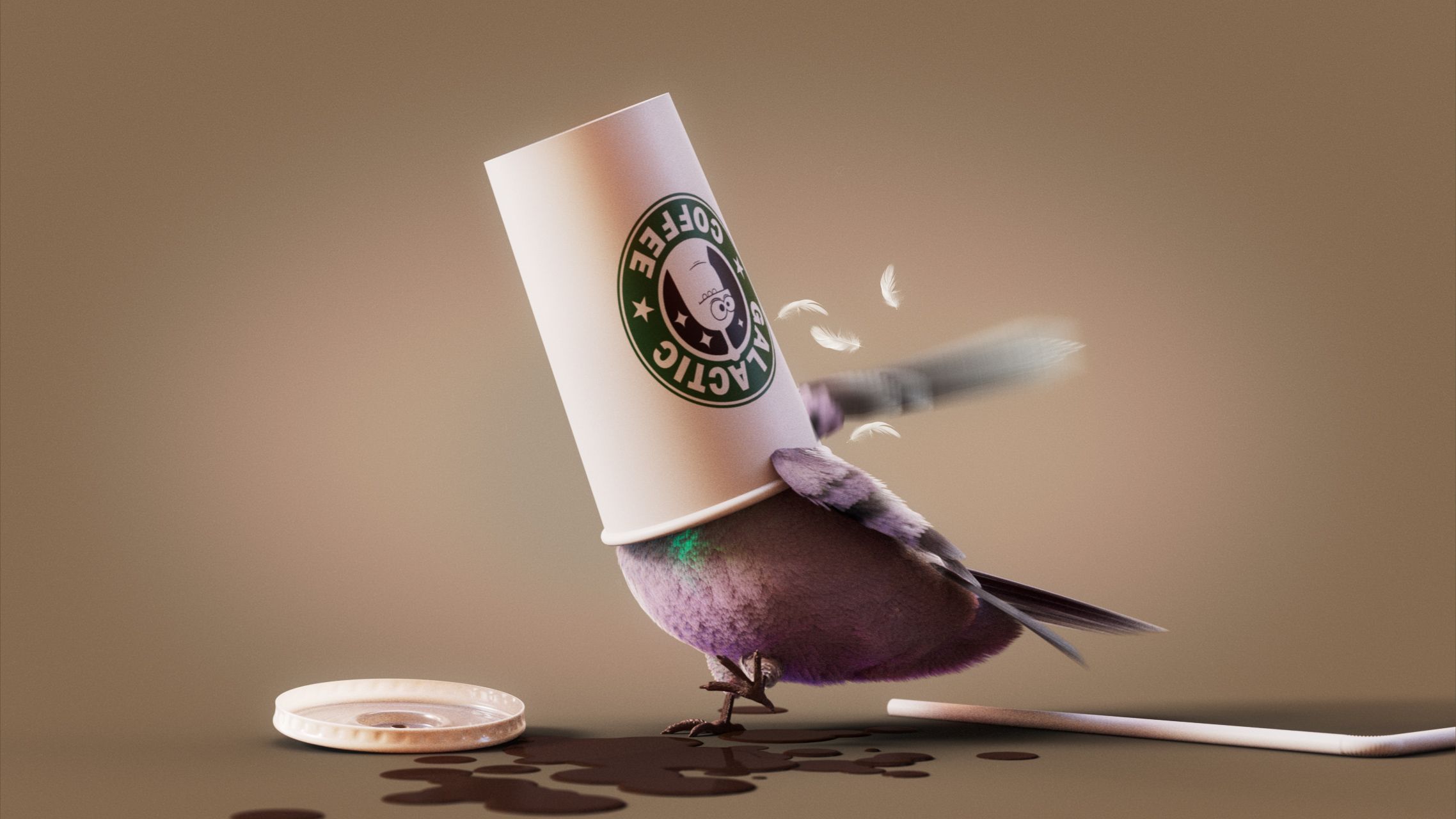
Starting with the design of the characters themselves, Neil dove deep into ideation and exploration - focusing on features, shape, personality, and details. It was important to have them read clearly as pigeons, but to imbue them with a charm and approachability that may not always be associated with the actual city-dwelling birds themselves:
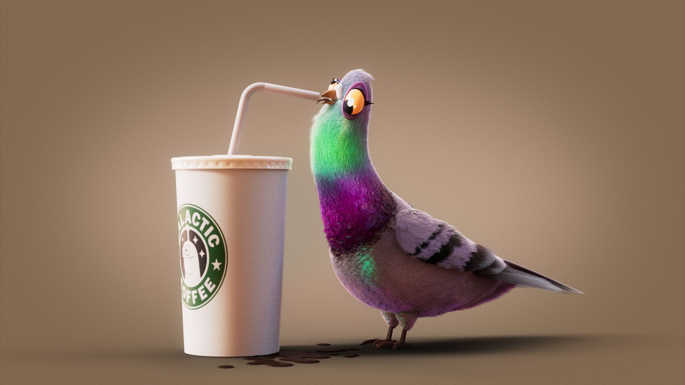
“Chuck and Gina are two pigeons that embody human traits, such as hopes, dreams, loves, dislikes, awkwardness, and a secret penchant for junk food… all infused with a dash of peculiar pigeon behavior.
In building up their unique personalities and how I would physically manifest them so that they possessed captivating personalities, I kept in mind that they should not be without flaws, much like the majority of us. The intention behind their character design was to make them approachable, relatable, and human-like, while still retaining their distinct pigeon qualities, and steering clear of any cues of being unclean or pesty. Above all, they needed to be engaging and recognizable.”
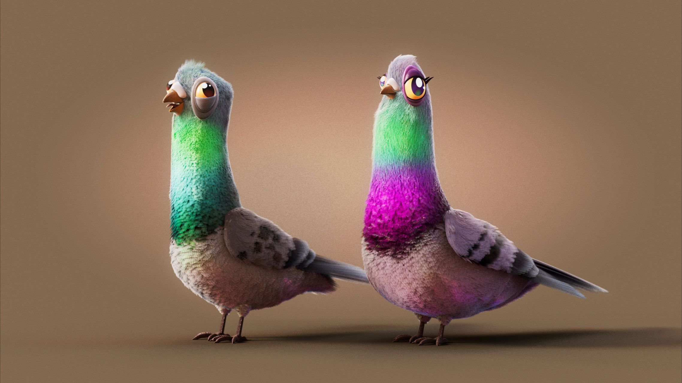
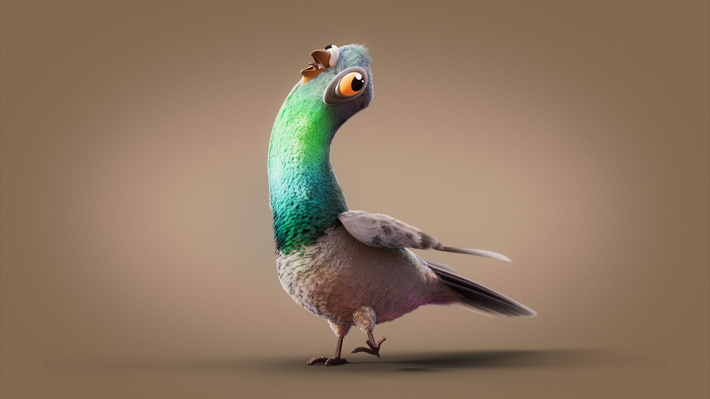
"In reality, distinguishing between male and female pigeons is remarkably challenging - something I now know more about than I ever thought I would in this lifetime! However, it was essential to create two distinct personalities, which is also evident in their unique visual representations. I incorporated a squarer shape for the male character, to emphasize his masculinity whilst also giving him a harmless goofiness, and used softer, rounded forms to convey the female characters femininity and queenliness."
Neil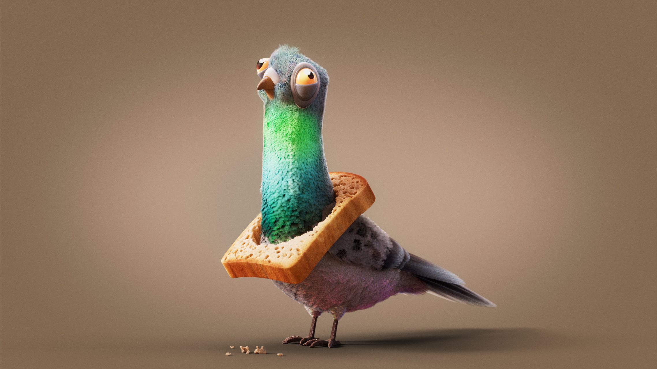
With experience creating brand ambassadors for several well-known consumer goods brands, Neil is well-versed when it comes to creating appealing characters that can embody and deliver on a brand’s messaging and hit the mark with the intended audience - and building trust and loyalty in a particular insurance offering is no different. So Neil purpose-built his characters in a “style that is clearly aimed at adults, ensuring it didn't come across as overly juvenile or get mistaken as a trailer for a new kids’ movie”.
Environments
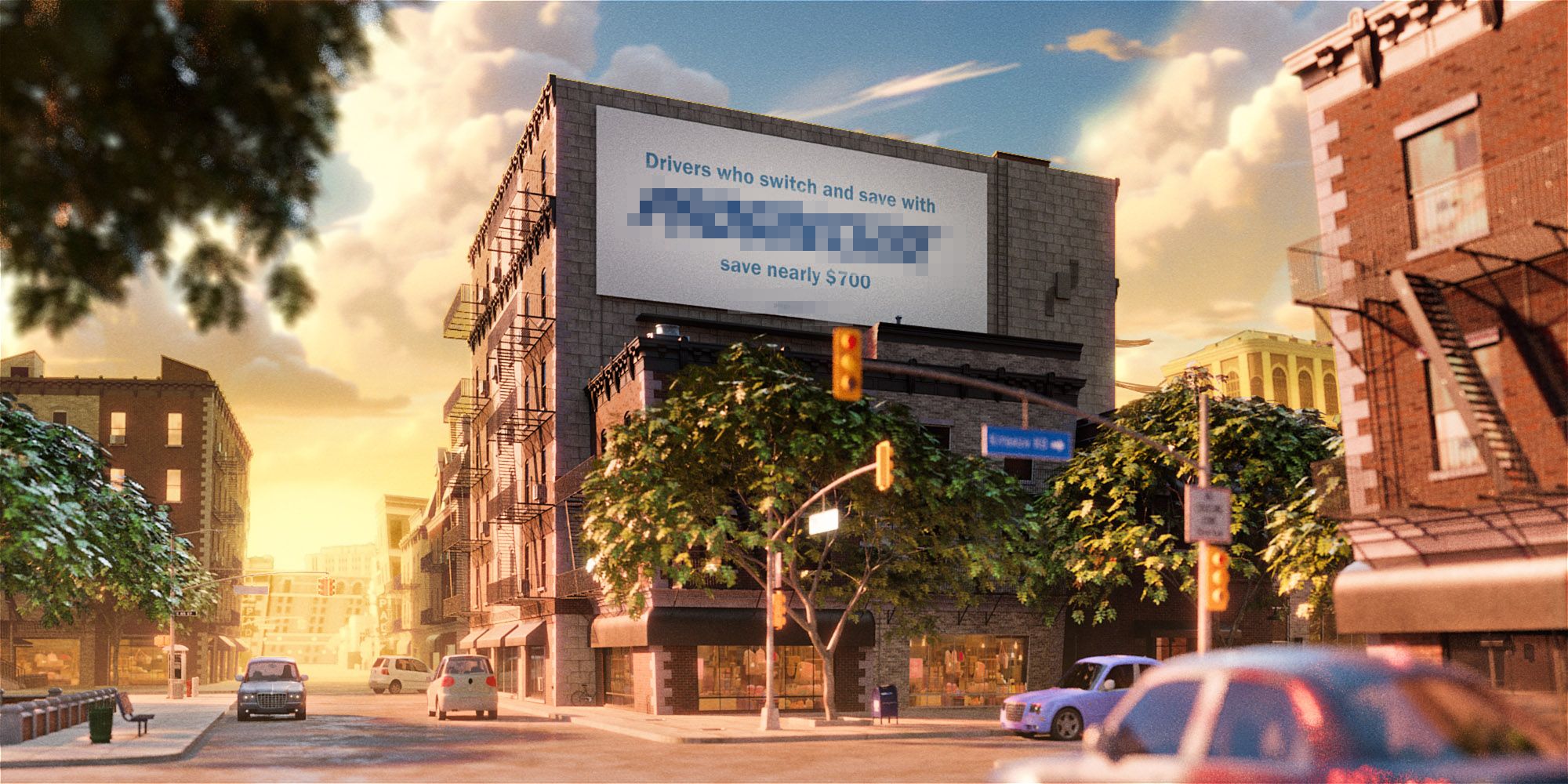
When it came to world-building, Neil opted for an approach that was Pixar-level quality - but executed in his distinctive light-infused, somewhat fantastical, richly detailed style, so that it would completely ownable by the brand, and allow the main character duo to ‘stand out’ from the world around them.
The cityscape presents a distinctly American vibe, yet remains purposefully nonspecific in its identity and season-agnostic, in order to appeal to a nationwide audience. With special care given to meticulous details that breathe life into the scene, Neil also added elements of whimsy and a slight bend on reality to increase the overall charm. For example, the buildings are imbued with a cartoon-like flair, featuring subtly exaggerated proportions and lines that aren't strictly perpendicular, giving the environment a lively, animated feel.
Style
“In terms of style, I chose a detailed yet stylized form of realism. The pigeons are fully feathered and possess all the characteristics of real pigeons, including similar proportions and postures, that would allow them to perform in a typically pigeon-like manner, while also acting out some of the more specific tasks that the scripts called for. However, they also have a distinctly cartoonish style. This approach kept the world believable without veering into excessive realism, which could seem unnatural.”
While we wish we could’ve soared into the bright, blue yonder with this brand, it’s always a joy to see Neil’s expertise in thoughtful and relatable character ideation, and his unique sense of design and environmental styling take shape, even if only in treatment form.
His unique approach of blending a cartoon-like spirit and his subtle sense of humor, paired with his expert 3D design skills and fidelity, breathe life into brand narratives and contemporary CG animation - so keep the briefs coming ;)
What We Do
We specialise in bold visual content and brand storytelling.