Tangra
Jelly and Boomranng partner with Kuba&Friends for the launch of Indo-Chinese concept restaurant Tangra.
Jelly and Boomranng partner with Kuba&Friends for the launch of Indo-Chinese concept restaurant Tangra.
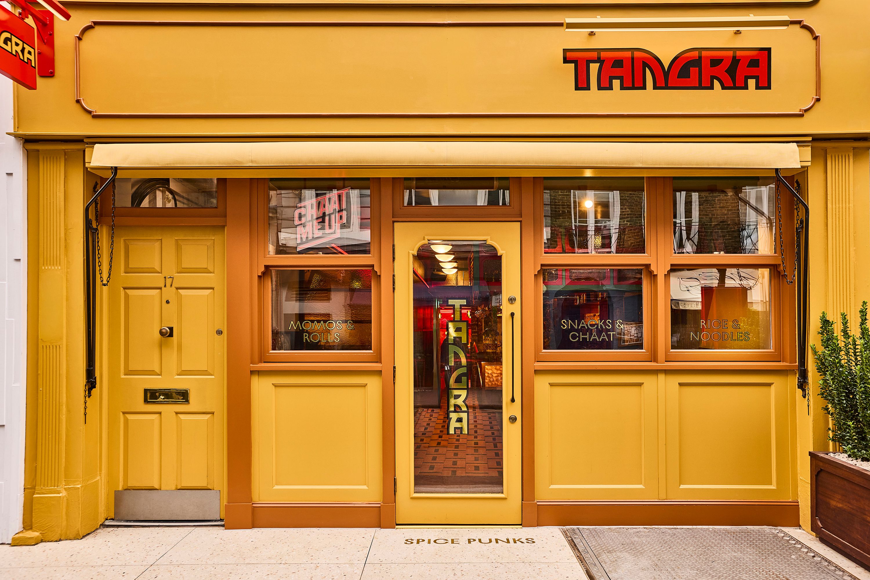

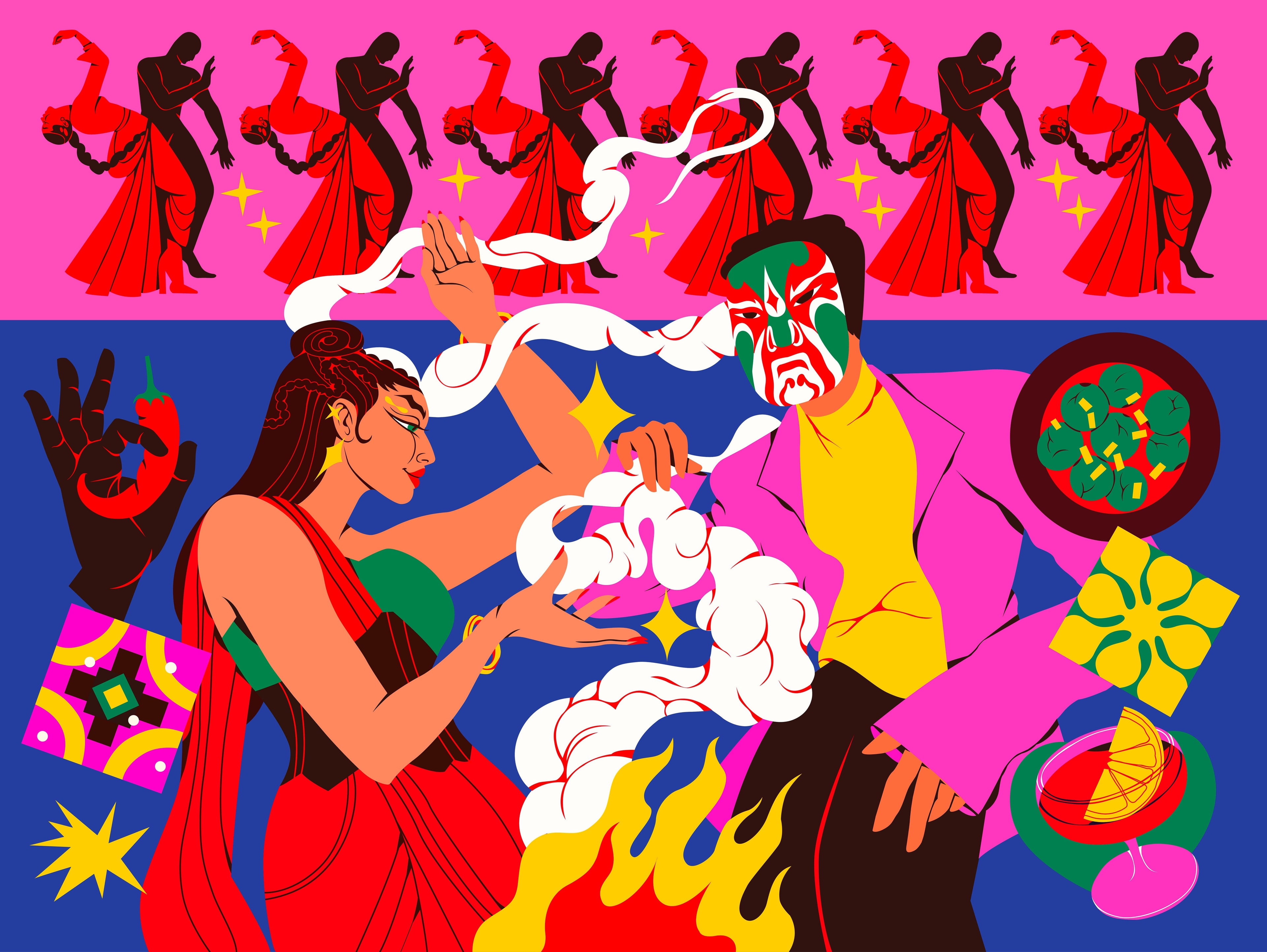
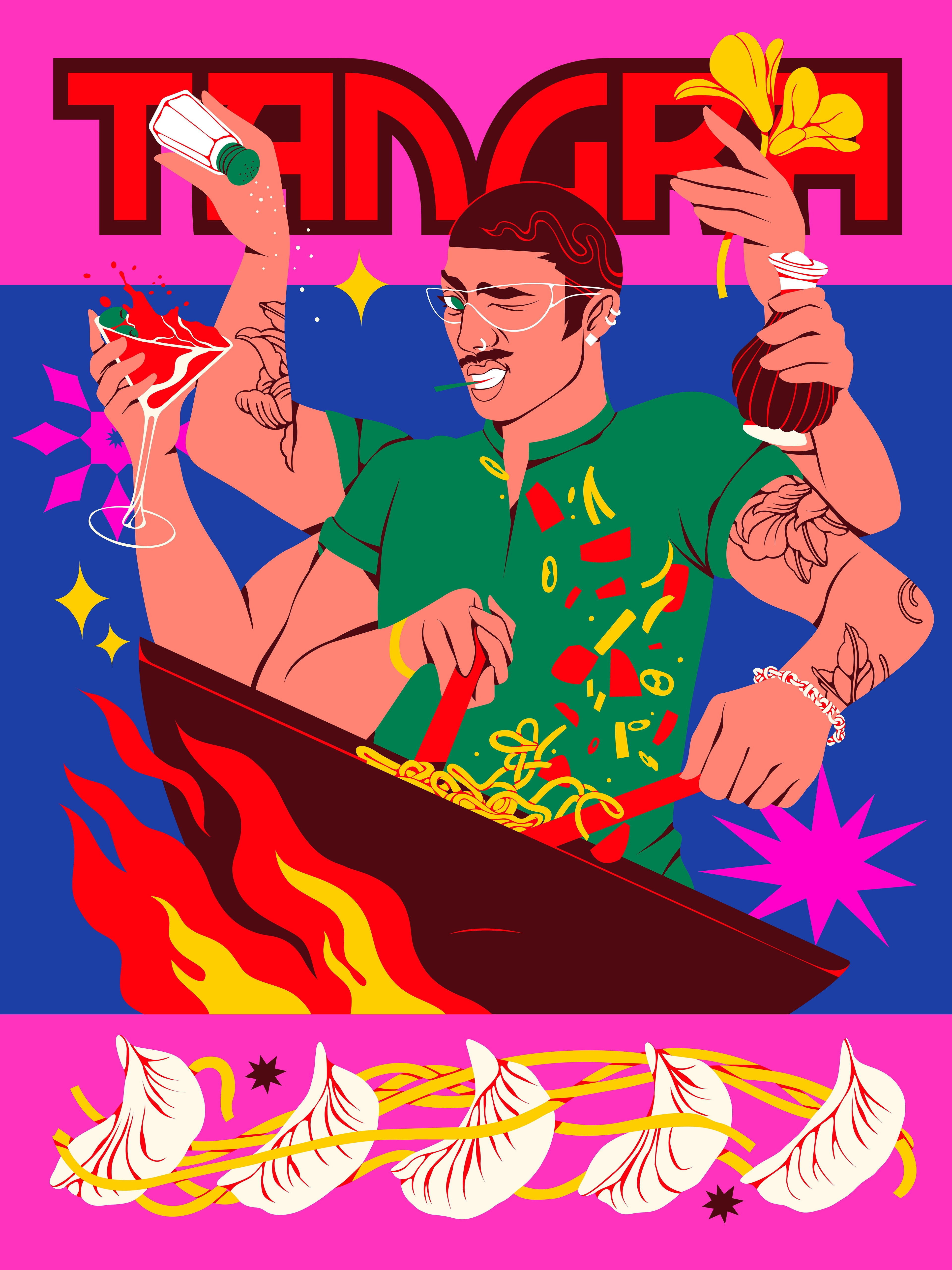


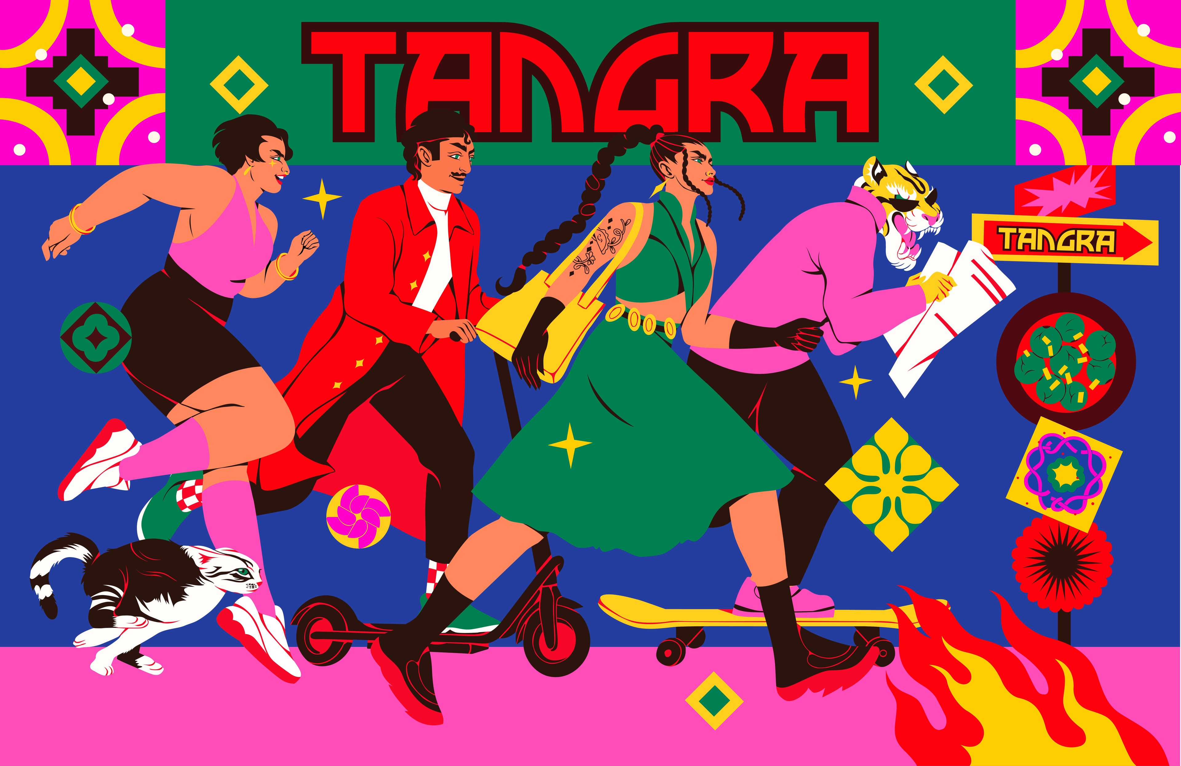
Fresh, contemporary and electric, Jelly and Boomranng partner with Kuba&Friends for the launch of Indo-Chinese concept restaurant Tangra.
Embedded within the creative process from the outset, the collaboration with the Tangra team marked a progressive breakaway from traditional models of creative partnership. This integrated approach allowed for creative strategy to be at the forefront of all decision-making and branding execution, with the Jelly and Kuba&Friends team working closely to help develop Boomranng’s creative output.
Injecting energy and authenticity into the restaurant scene is no small feat in a saturated market, Tangra approaches the needs of today’s consumers with a zest and vibrancy much needed amongst competitors that lean heavily into nostalgia and the past.
Aiming to capture the spirit of a modern India, with a menu of fresh innovative ingredients that emphasise quality and sociable eating, the Tangra team wanted collaborators that deeply understood their mission and could collaborate to craft something distinct and memorable.
When kicking off the project we knew we needed a bespoke team to bring the brief to life, so teaming up with Kuba&Friends, designer Esther and strategist Isaac ensured that the creative strategy and expertise was fully immersed in the process from the beginning.
Involving Boomranng's creative expertise at the beginning strategy stage brought a wonderfully intertwined process of deep thought and consideration to every aspect of the project.
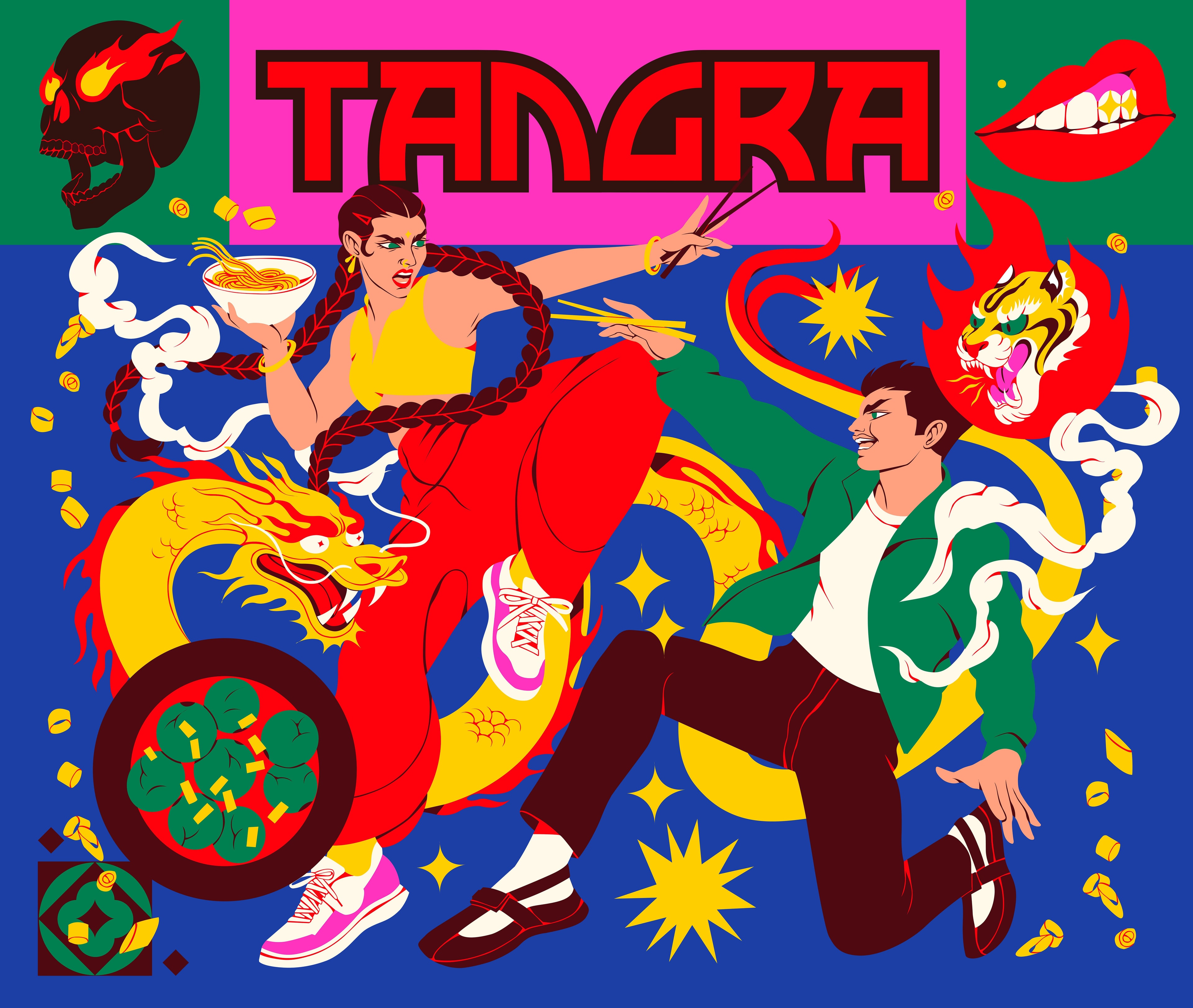
Boomranng brought the branding to life with their signature style and fervour, infusing the brand language with colour, energy and dynamism. Passionate about representing a modern and futuristic perspective of their hometown, Boomranng designed a range of versatile assets to make up the visual identity.
“Our creative approach was to treat the brand like a sensory journey. We wanted people to almost taste the flavour and feel the rhythm of the kitchen through the visuals. That meant drawing inspiration not just from the cuisine itself, but from the culture and movement around it, the clash of fire and aroma in the wok, the bustle of Soho, the layered history of Tangra.”
Involved in all aspects of the brand visual language from the logo to the interior design accents, Boomranng’s style combined with the energy of the Tangra brand to flow through every moment of the consumer experience.
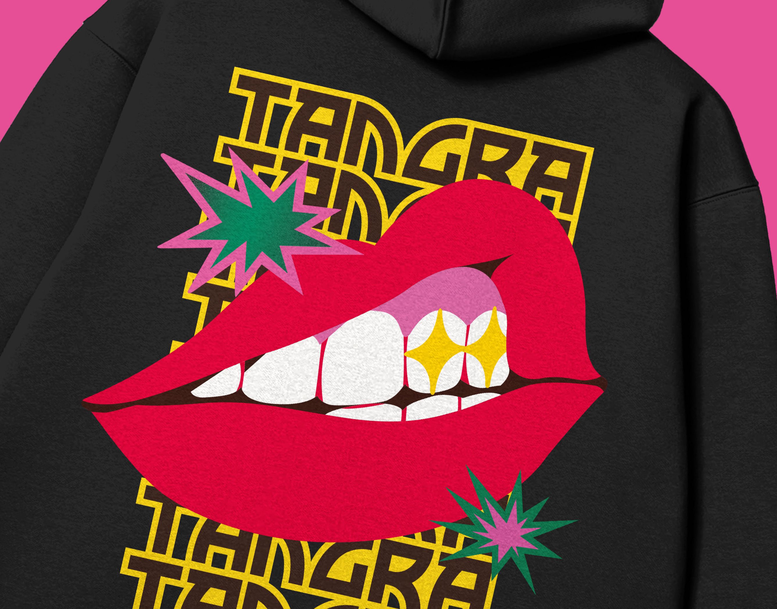
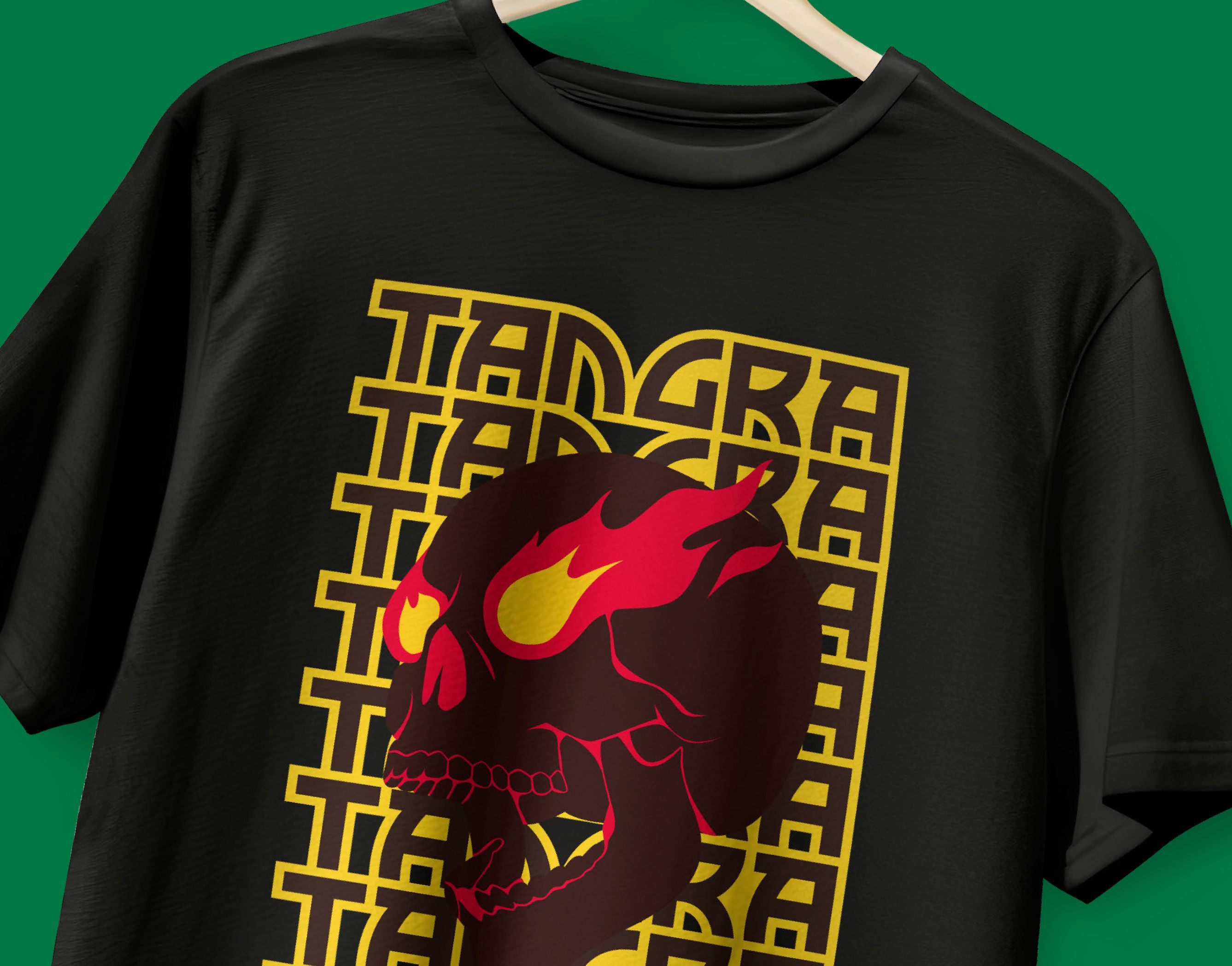
“The logo took inspiration from Indian hand painted type. The colours came straight from the food. Even the patterns grew out of ingredients like chilies, garlic, and spring onions, reimagined as bold, tile like motifs. Alongside these, we created a series of illustrations and stickers that brought the brand’s personality to life, playful, energetic skate punk aesthetics artworks that celebrated ingredients, textures, the motion of cooking and people.”
The final outcome was not only a bold and impactful look for Tangra but also one where all branding elements blend seamlessly together, ensuring the brands ethos and strategy came through from start to finish.