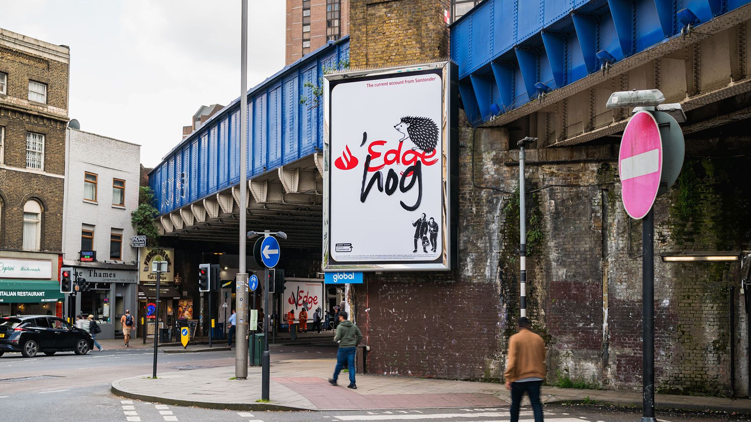
Santander Edge
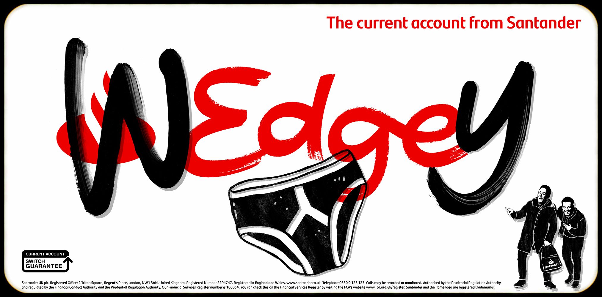
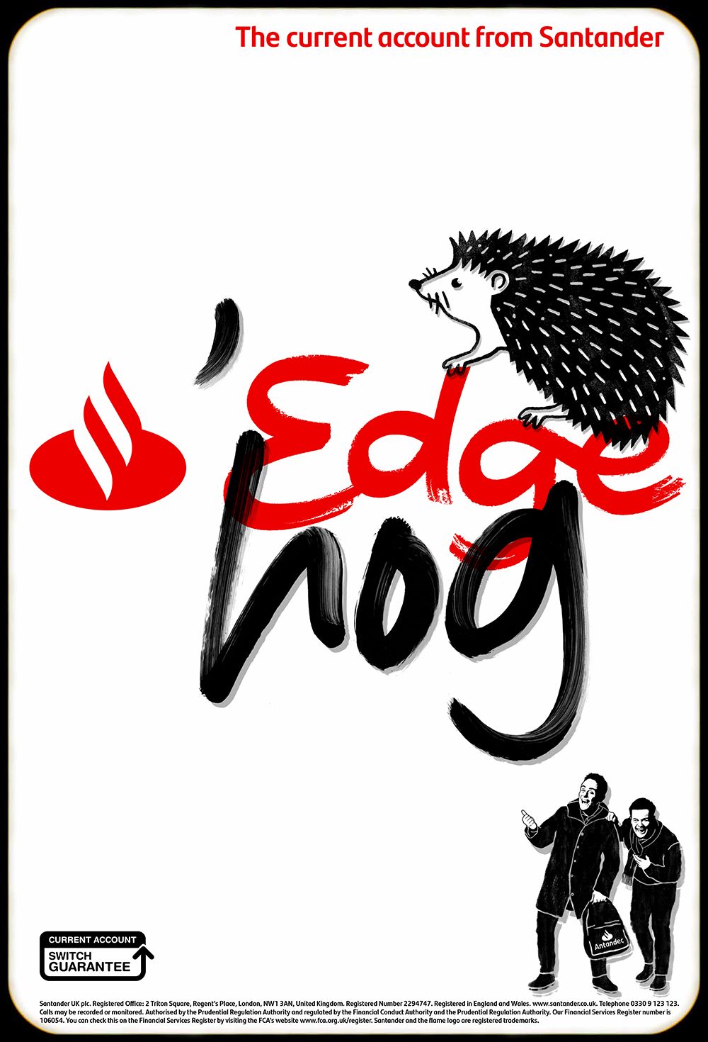
Playful prank lettering for the 'Bank of Antandec'.
Bringing playful lettering and illustration to House 337's latest campaign for Santander and it's prankster rivals the 'Bank of Antandec' lettering artists Alison Carmichael and crafted bespoke typography and illustrated assets to transform the brand's TV and OOH advertising.
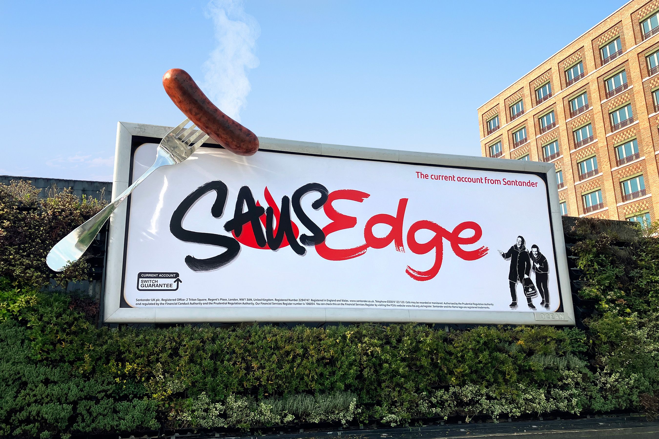
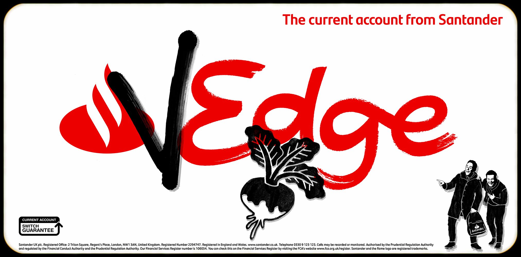
The concept of the campaign was to continue the comedic feel of the previous spots and have the Edge logo sabotaged by Ant and Dec, projecting comedic phrases and drawings over the top to create new words such as 'sausedge' and 'wedgey'. Both Biff and Alison created artwork that was designed to look as if it had been written/drawn by Ant and Dec so needed to have a hand-crafted feel.
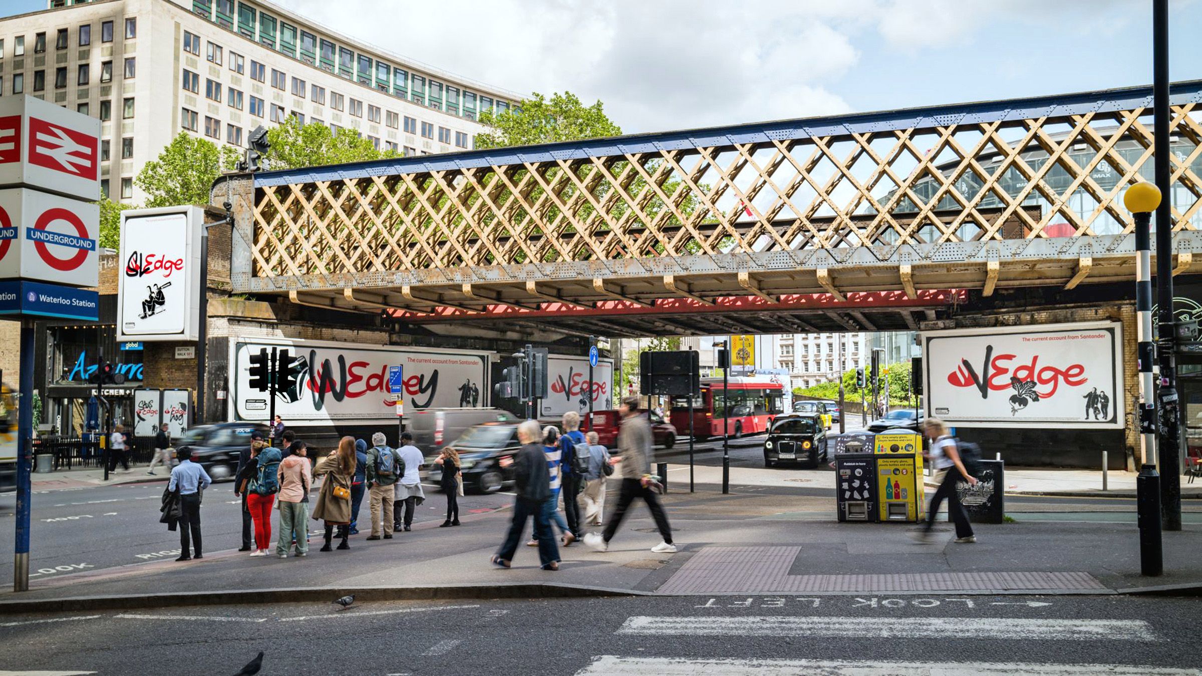
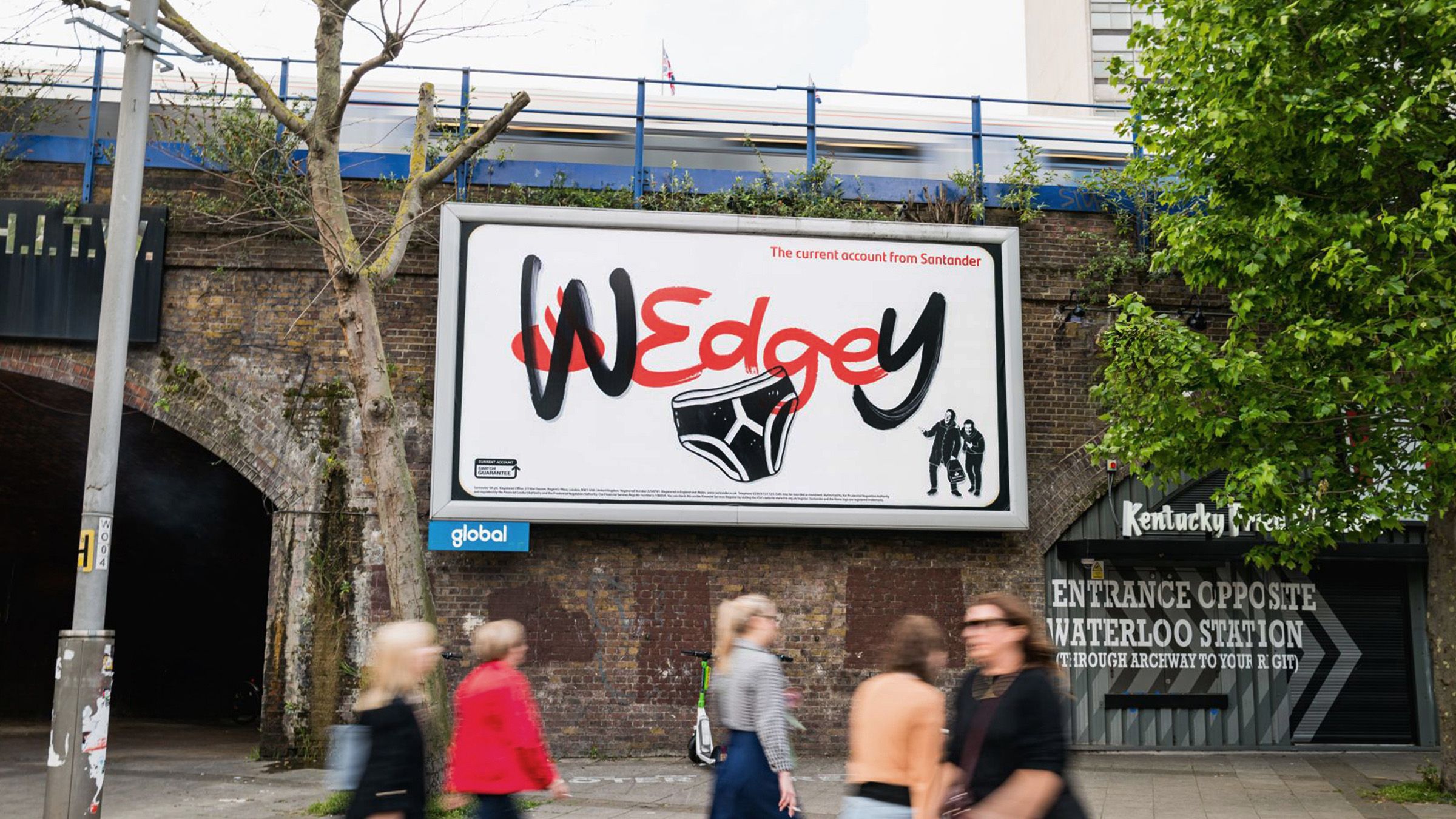
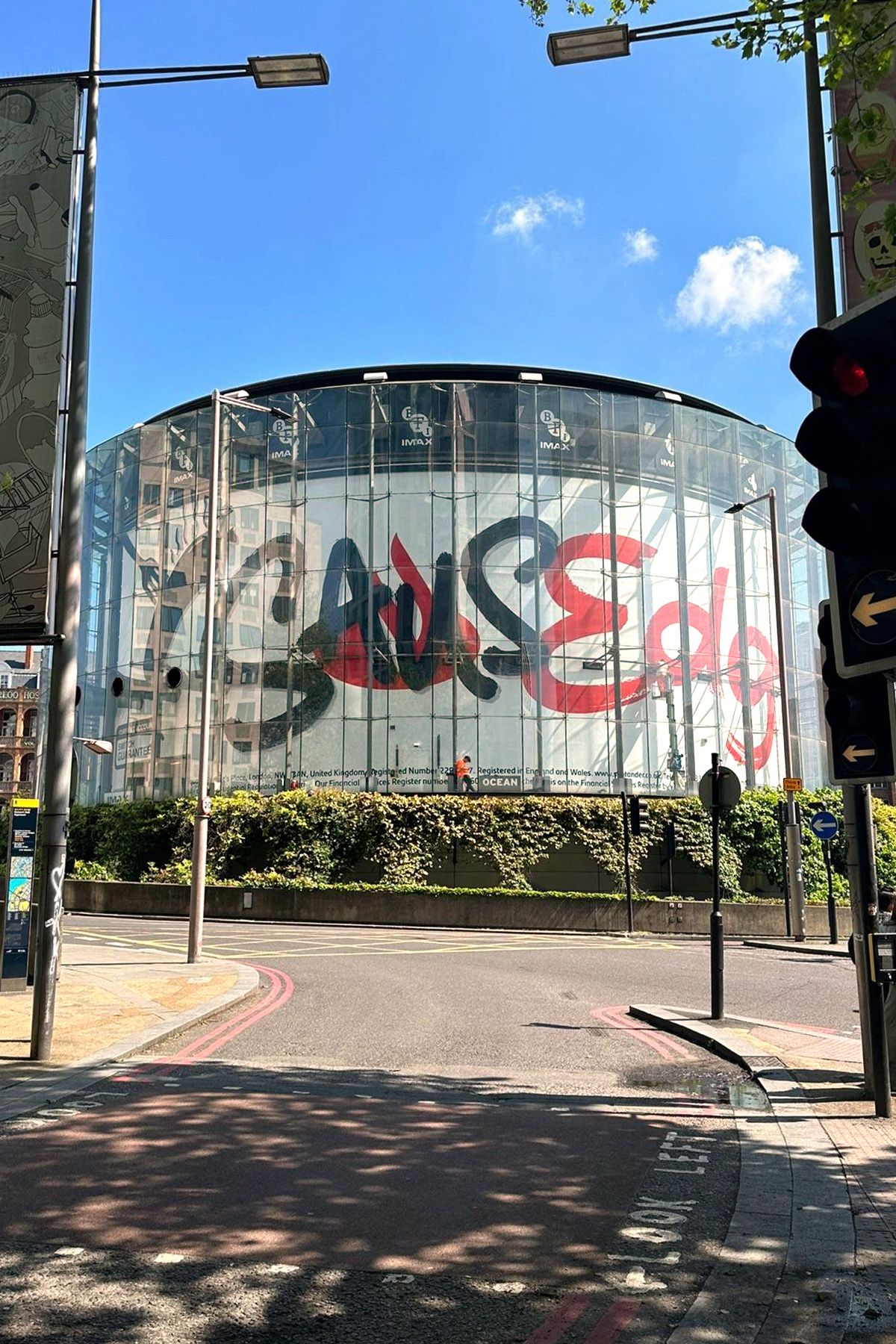
The 'prank' was revealed several days after the initial Edge campaign TV spot through out of home billboards and activations.
Alison designed a full alphabet to be used to form the wording across the designs, utilising her skills at crafting hand-drawn writing to bring an authentic touch to every poster and an 'imperfect' approach to the design which furthered the concept of the writing having been written by Ant and Dec.
Biff used his characterful style to add the illustrated 'doodle' elements to the campaign, while ensuring Ant and Dec remained recognisable. Both artists had to work in a similar style to remain cohesive between the elements but also had to develop throughout the process, a visual language that looked as if it could have been done by non-professional pranksters.